Here’s a quick look at all 11 sectors with the S&P 500, along with some nearby support & resistance levels. The stock market is simply a sum of its parts, so in the case of the S&P 500, that would be the 500 largest publicly-traded companies in the US or the 11 sectors that comprise the index.
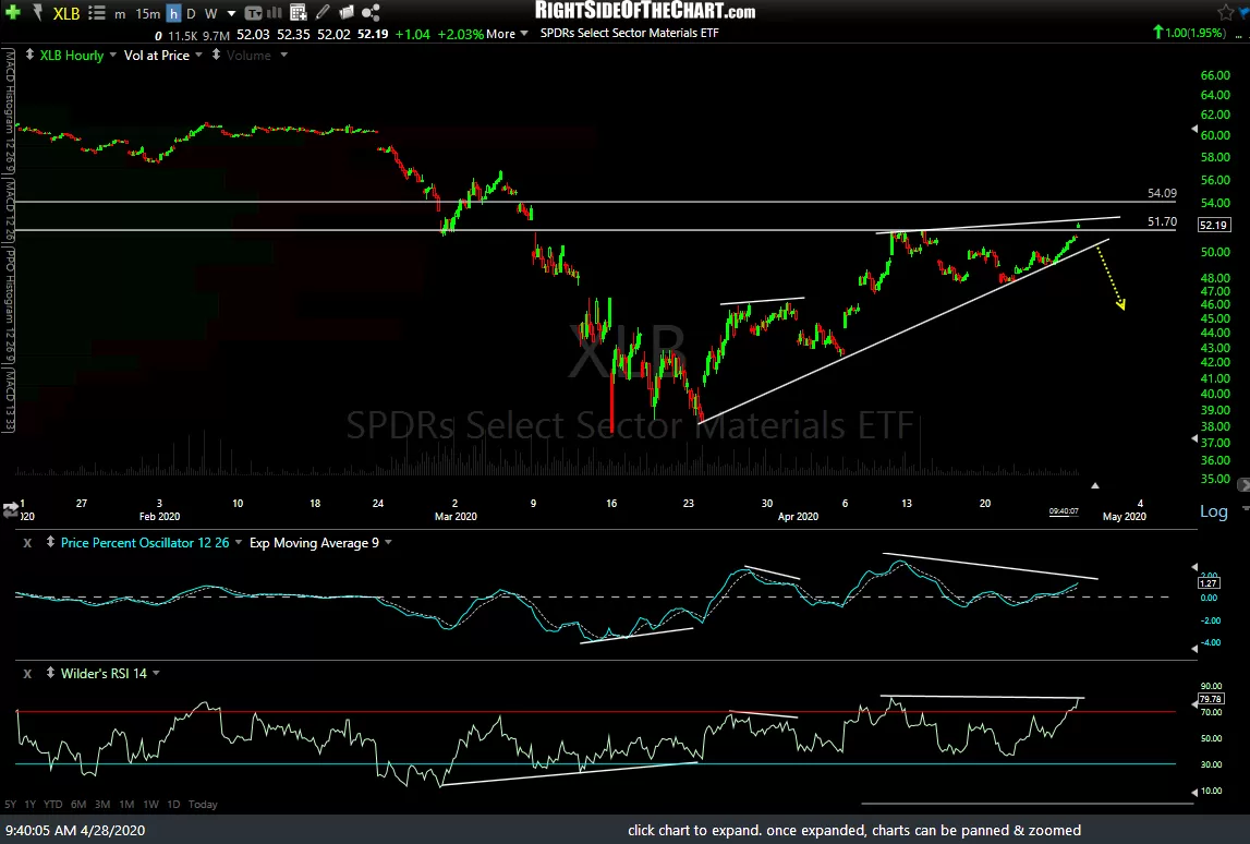
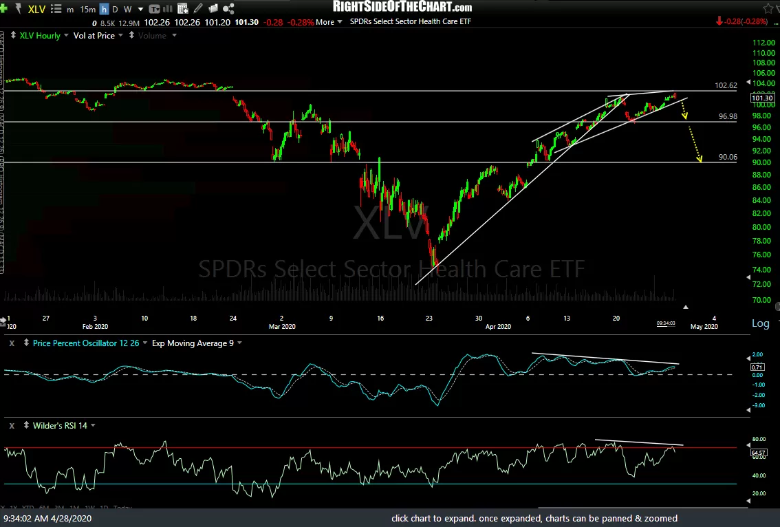
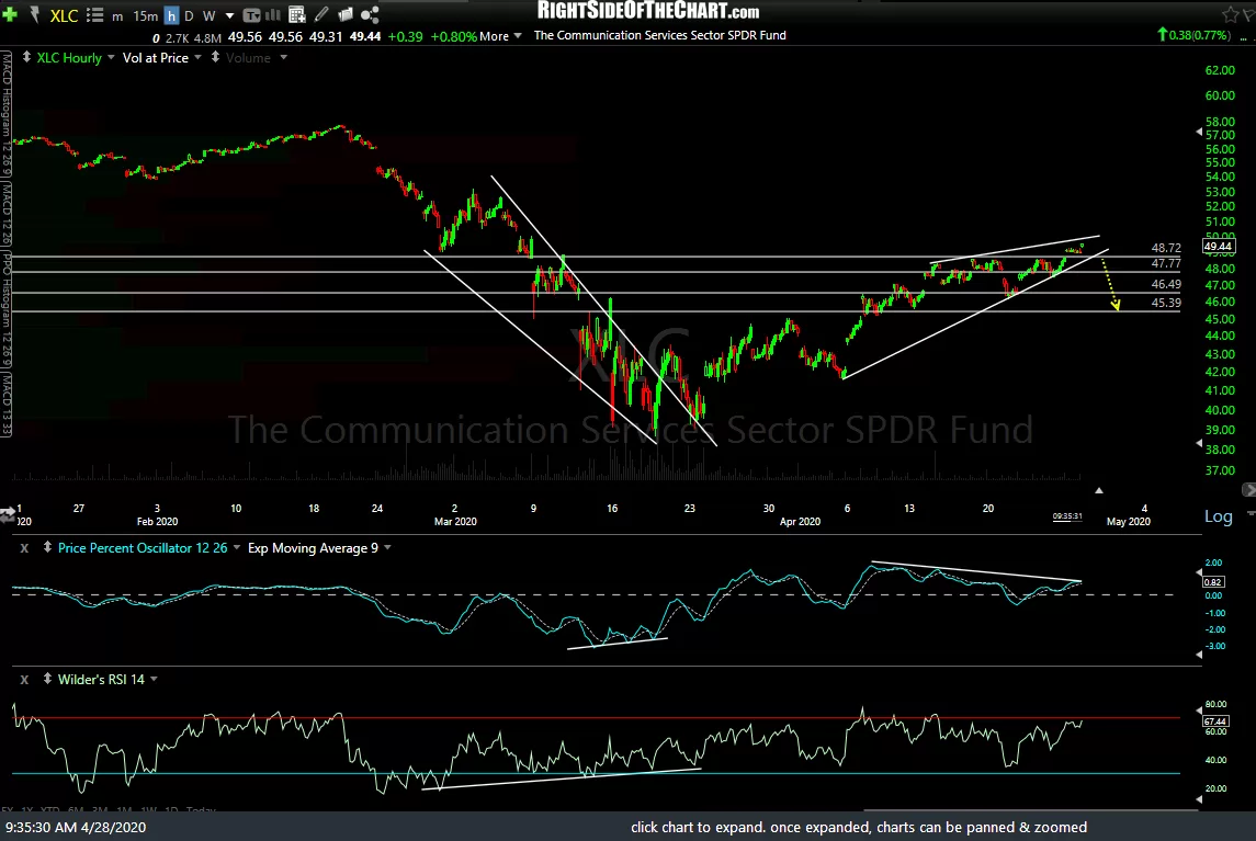
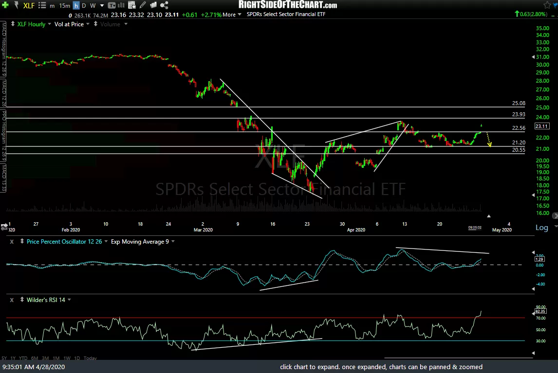
The common theme here is that nearly all 11 sectors either have negative divergences in place at this time & those that don’t, will likely if/when they put in a marginal new high soon. Most sectors also have fairly well-defined uptrend lines and/or horizontal price support levels just below so what I’ll be looking for is not just one or two sectors breaking below their respective trendlines or price support levels, but rather the majority breaking down in relatively close proximity.
Another big consideration is which sectors trigger sell signals. Just as the largest companies within the S&P 500 have a larger weighting within the index than the smaller companies (aS the $SPX is a market-capitalization-weighted index), certain sectors have a much larger impact on the performance of the index than others. For example, the largest weighted sector is technology at a more than a 25% weighting, accounting for roughly the same impact on the index as the 7 smallest weighted sectors combined.
-
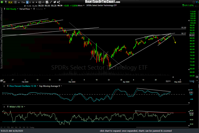
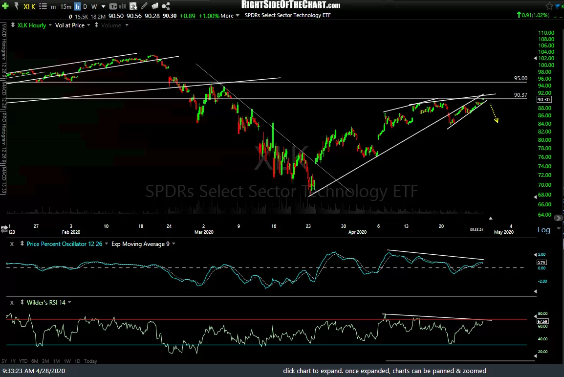
- XLK 60m April 28th
-
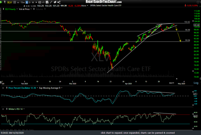
- XLV 60m April 28th
-

- XLC 60m April 28th
As such, I’ve posted the 60-minute charts of the 3 largest sectors above & the remaining 8 sectors below in descending order or market-capitalization, starting with XLK (technology sector ETF). Click on the first chart to expand, then click the arrow to the right to advance to the next expanded chart. My suggestion would be to replicate some of the trendlines & price support levels just below each & set price alerts on those levels although a solid breakdown in just XLK alone is likely to do the trick.
-

- XLF 60m April 28th
-
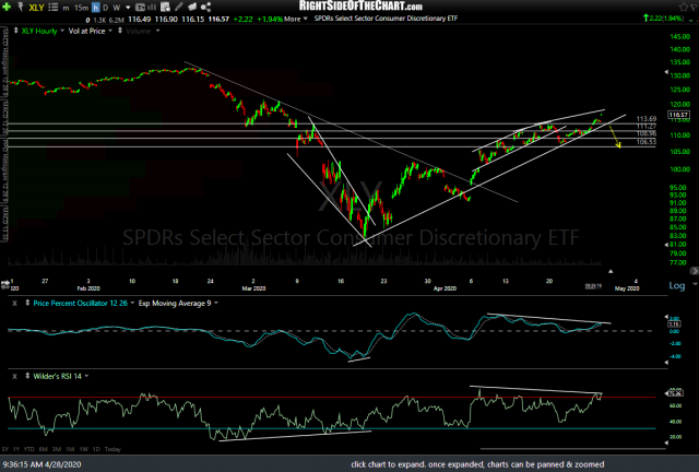
- XLY 60m April 28th

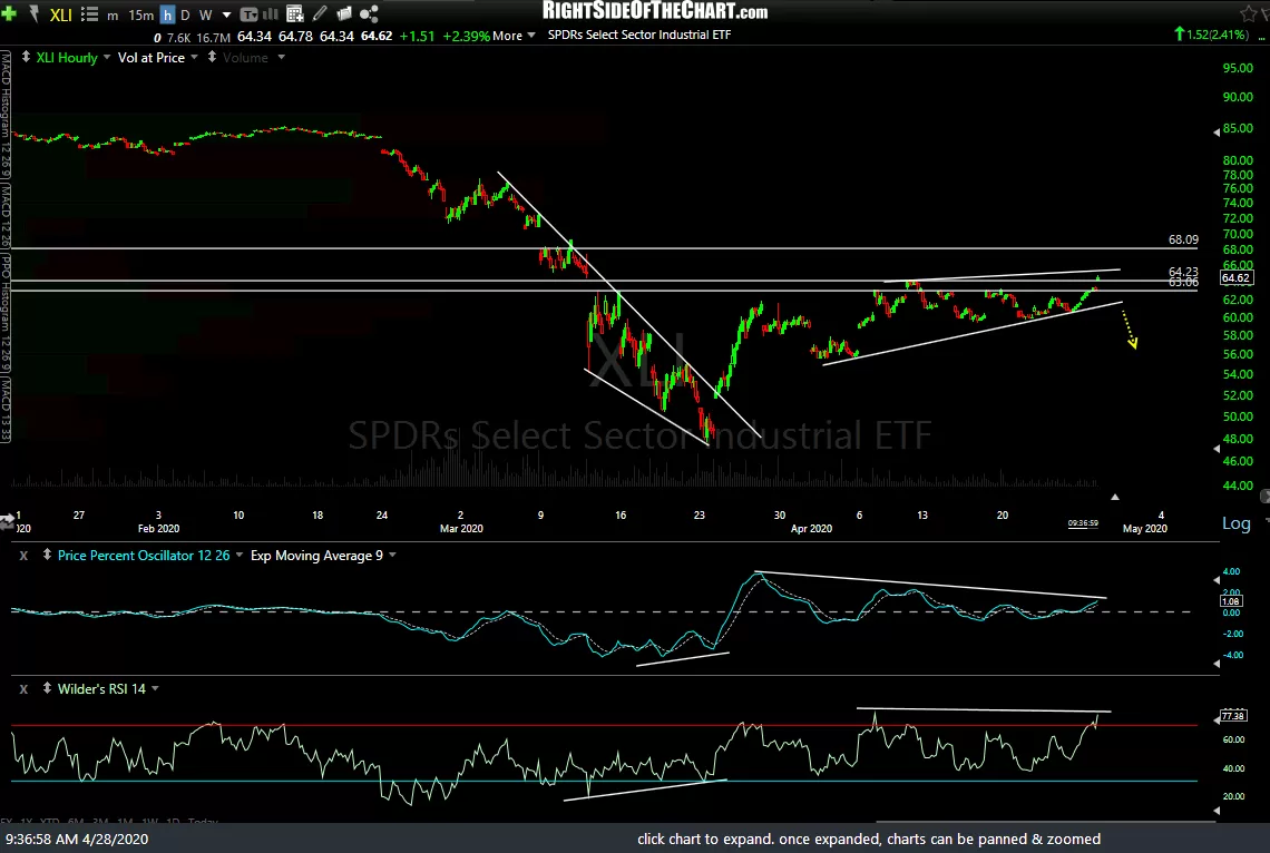
-
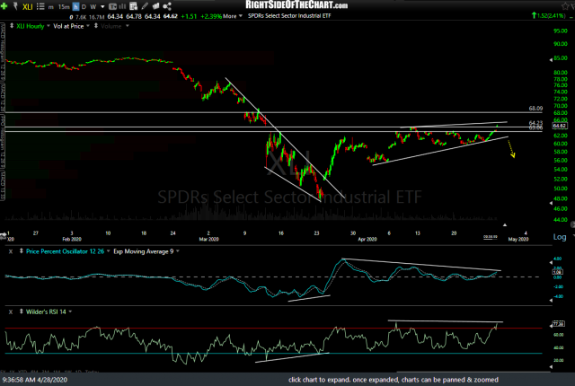
- XLI 60m April 28th
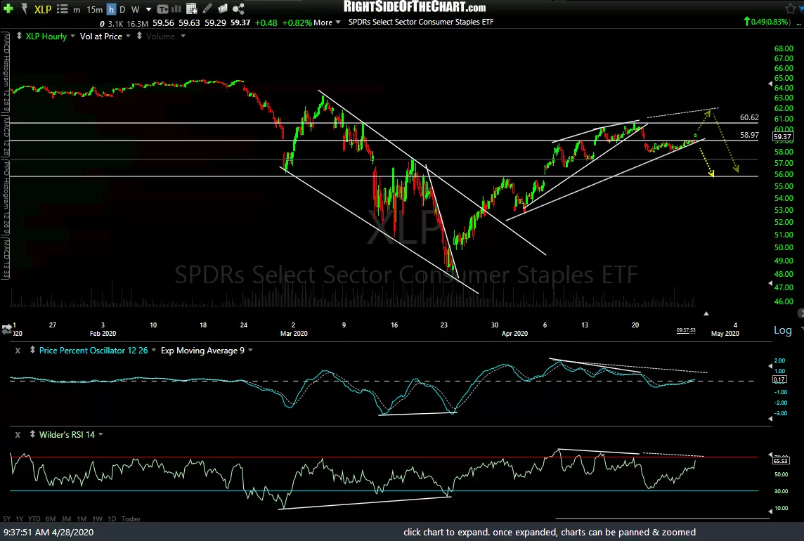
-

- XLP 60m April 28th
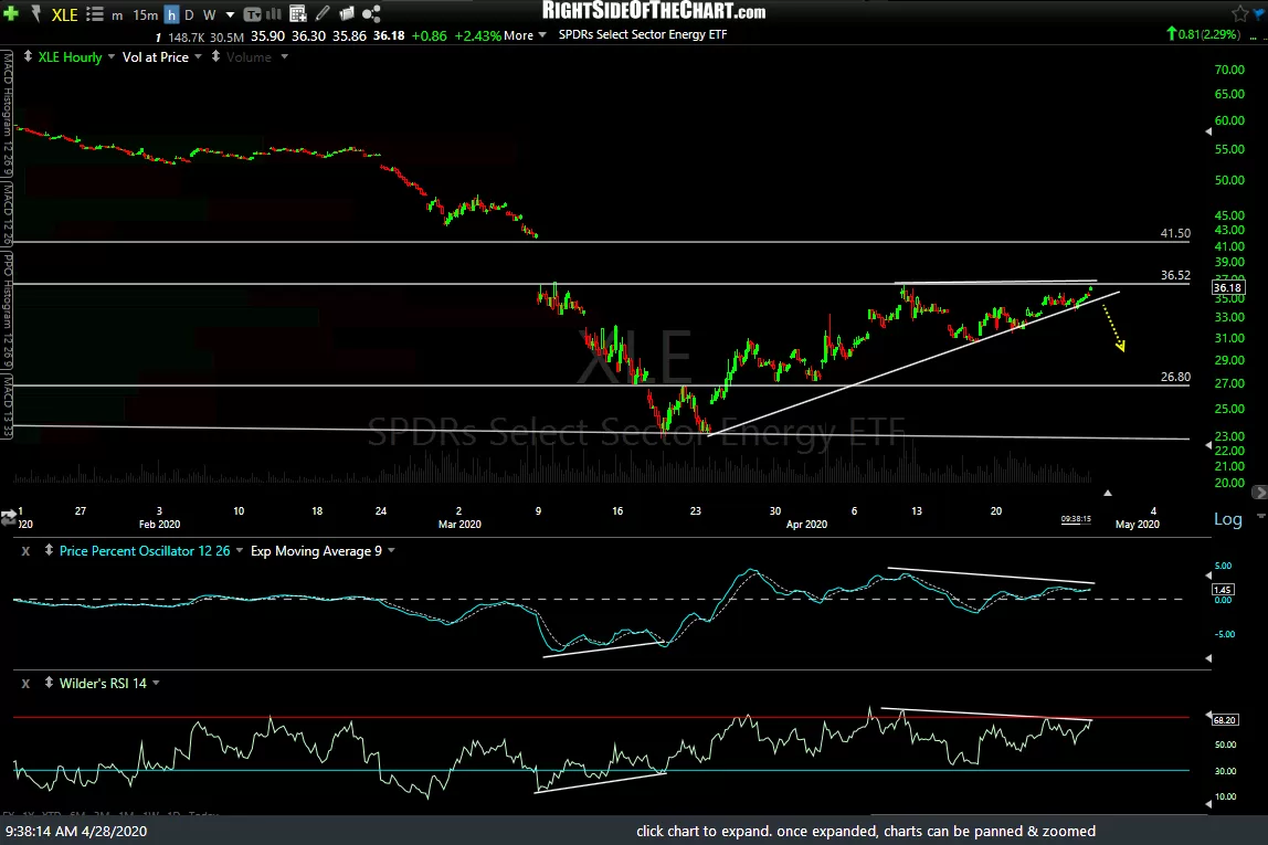
-

- XLE 60m April 28th
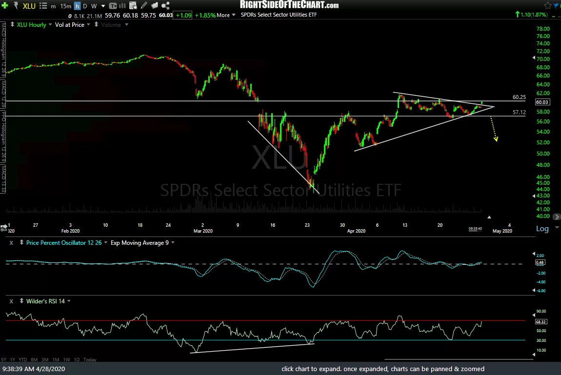
-
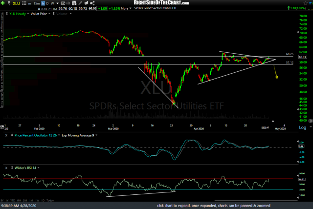
- XLU 60m April 28th
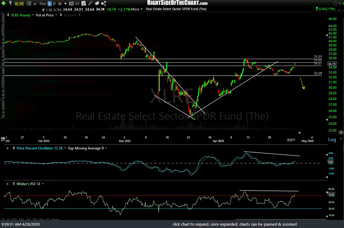
-
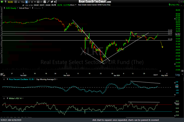
- XLRE 60m April 28th
-
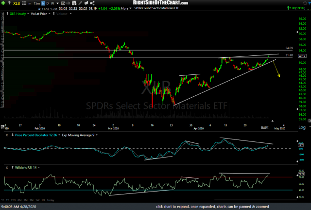
- XLB 60m April 28th