
Charts speak louder than words so without further ado:
Long-term view of the bull market leading up to the March 2000 “Dot.com” blow-off top followed by the subsequent 78% bear market over the following 2½ years:
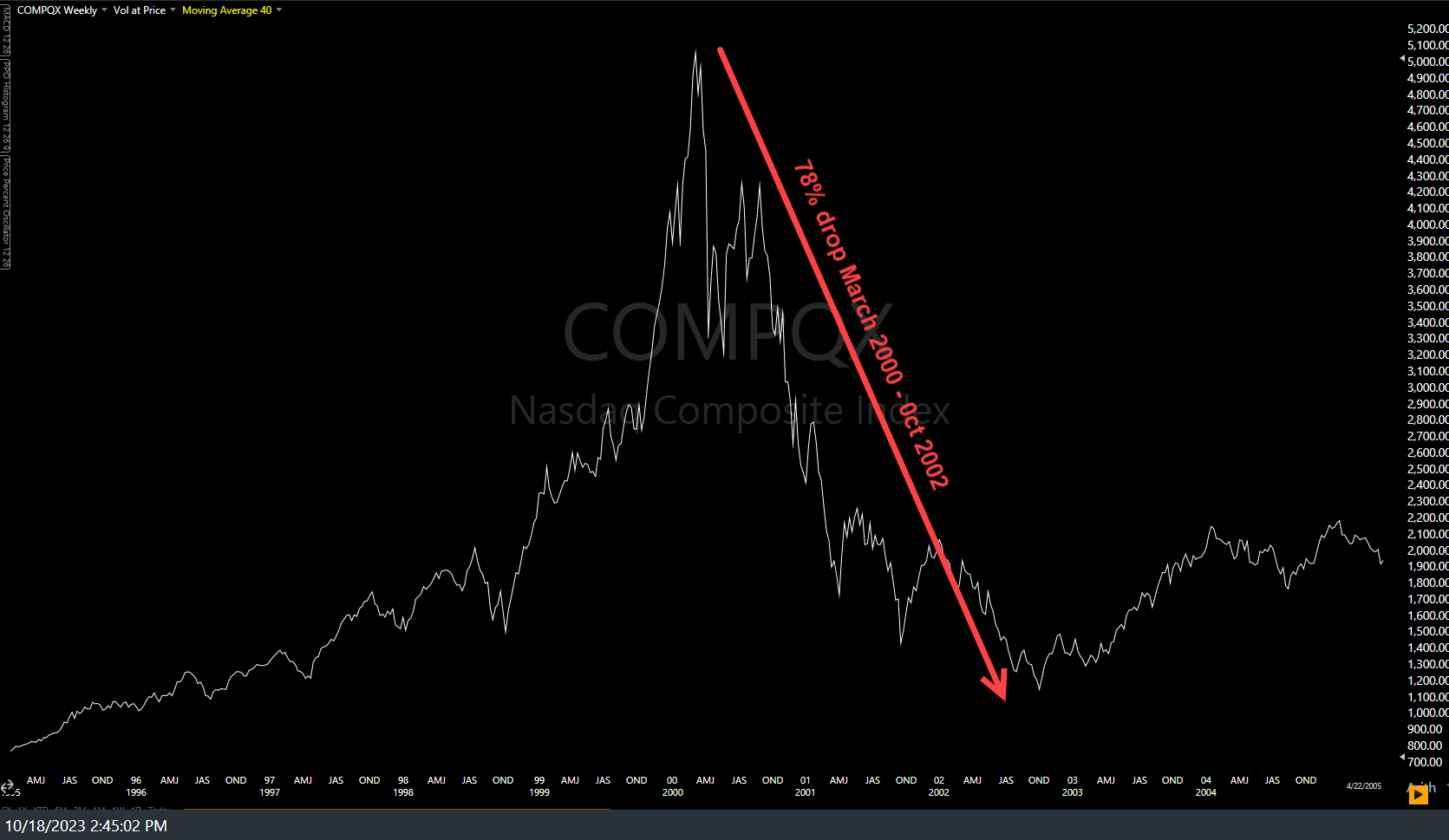
Nasdaq Dot Com Bull & Bear Oct 18th
Same chart but truncated at the end of the initial 41% bear market rally that followed the first leg down off the March 2000 top:
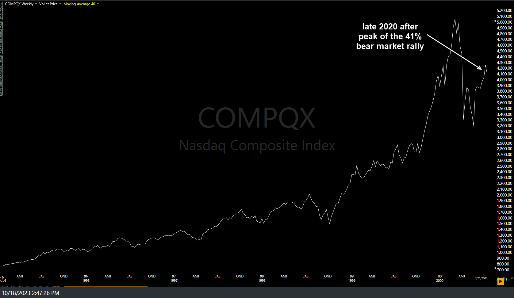
Nasdaq Comp late 2000 Oct 18th
..and the current chart of the Nasdaq Composite through today, showing the preceding bull market, initial leg down & the 43% “that’s just too big to be a bear market rally, Randy!” into the July highs. Look similar?
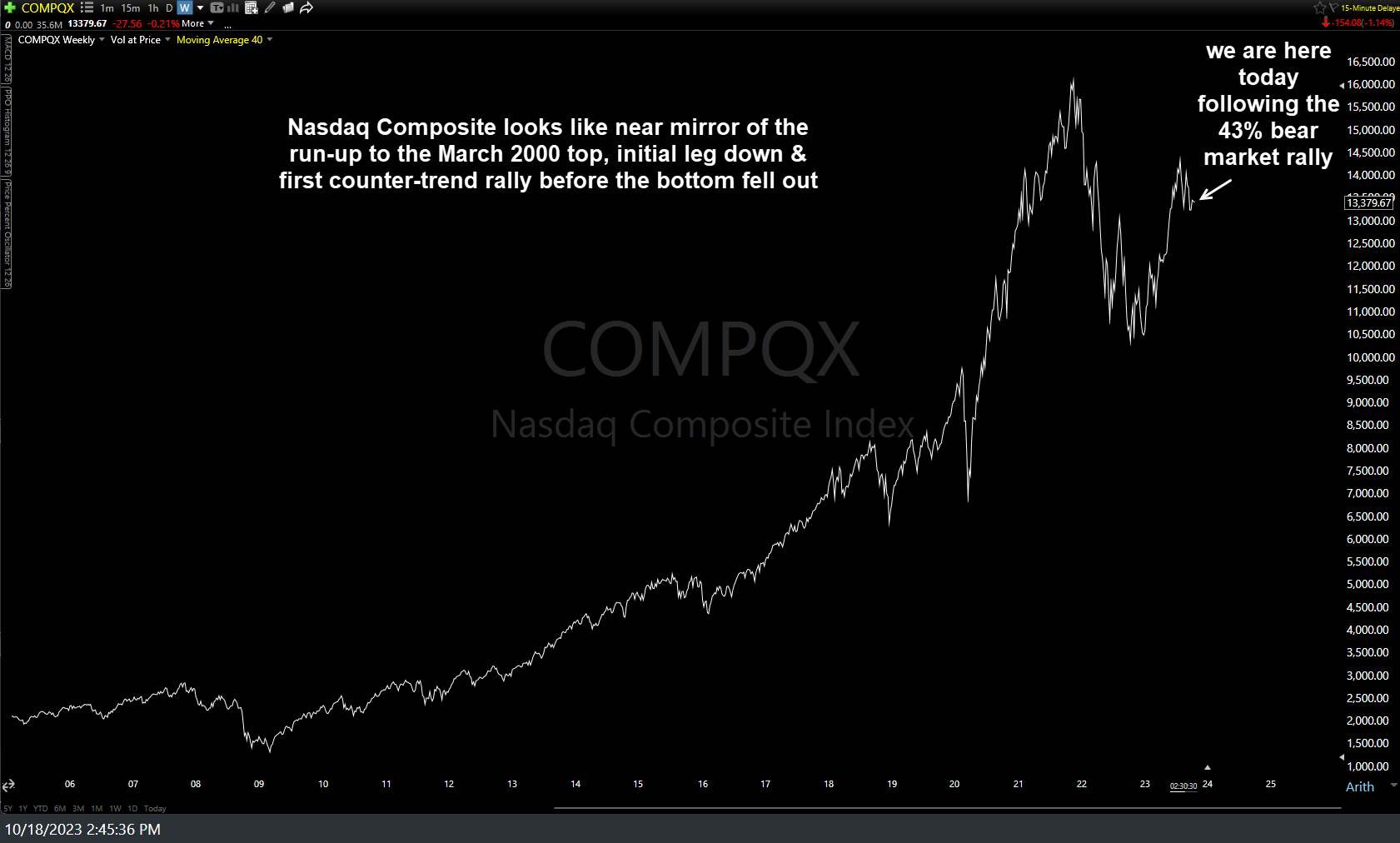
Nasdaq Comp Today Oct 18th
Note: I normally use log scaling on my long-term charts but selected linear (aka- arithmetic) scaling in this case. As I said last week, I suspect Halloween might come early this year for the stock market as I continue to see more & more yellow flags across various key stocks, sectors, & asset classes.