
Member @nadeemenglish inquired about my use of the PPO (Percentage Price Oscillator) in the trading room today and as I field a lot of questions on that indicator, I figured that I would share my response here on the front page.
PPO (Percentage Price Oscillator) is a momentum oscillator that is a very close cousin to the more commonly used MACD (Moving Average Convergence/Divergence Oscillator). While these two oscillators will provide a near-mirror image of each other on many charts, the PPO often does a much better job than the MACD on charts with large price differentials (from high to low).
Some charting platforms offer the PPO while many don’t. That is unfortunate as I find myself using the PPO in lieu of my former favorite (and still one of the best indicators IMO), the MACD with increasing regularity in recent years where in the past, I would only use it when the MACD wasn’t rendering any clear signals. I also find the PPO much more useful than the MACD on longer-term time frames, such as weekly & monthly charts, as most securities have wide variances in price when viewing many years of price history.
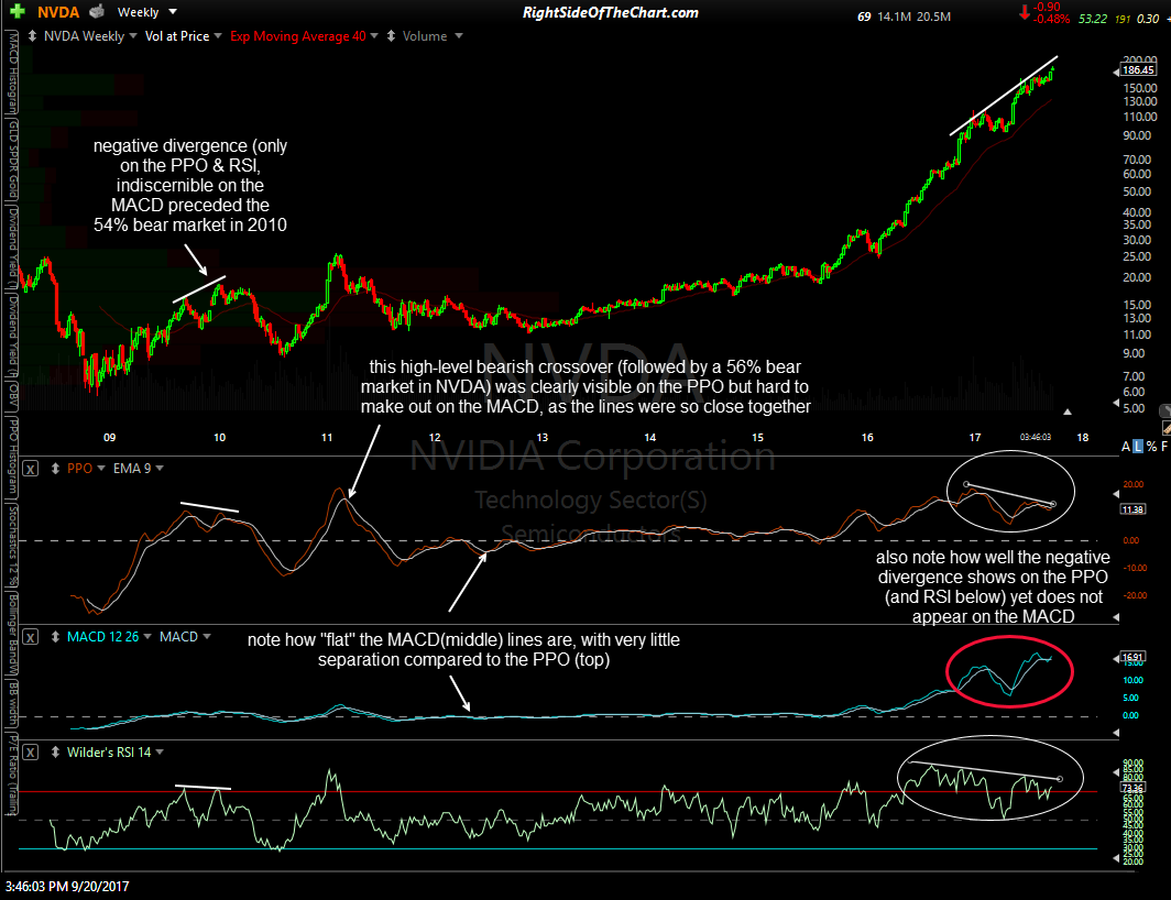
NVDA 10-yr weekly Sept 20th
The chart above is a 10-year weekly chart of NVDA. I chose that stock to illustrate the difference between the two as the price differential between the low & high on the stock is 3,100%. Again, the larger the price differential on the chart you are viewing, the more useful the PPO will be vs. using the MACD.
Going from left to right on that chart, one can see the clean separation between the two reaction highs in the PPO, with the second high lower than the first, back in late 2009 & early 2010. That lower high in the PPO (which was also clearly seen on the RSI) while NVDA put in a higher high in price (vs. the same previous reaction high) was negative divergence. Immediately following that divergent high in the stock, NVIDIA plunged by 54% over the next 7½ months. In early 2011, NVDA put in a significant top which was followed by a 56% bear market. Once can clearly see a high-level bearish crossover on the PPO while the comparable bearish crossover on the MACD was much harder to make out.
Also note how flat the MACD appears throughout most of the 10-year history on this chart, with the separation between the lines barely discernible, unlike the PPO which shows clean separation between the PPO line & signal line (9-ema) during all of the periods when the stock was trending (the two lines on just about any momentum indicator will compress during extended periods of sideways trading with periods of very low volatility, such as NVDA experienced from 2012 to mid-2015).
After that multi-year, low volatility sideways-to-slightly upward trend from 2012-2015, NVDA embarked on the 830% mega-rally off the mid-2015 lows. Note how both the PPO as well as the RSI currently show clear negative divergence with clean separation between both reaction highs while the MACD doesn’t show any divergence at all. While I used a stock on a long-term chart with a very large price differential, the same benefits, albeit typically to a lesser extent, can be found using the PPO in lieu of, or even in conjunction with, the MACD on daily time frames & even intraday time frames at times, with many securities.
-
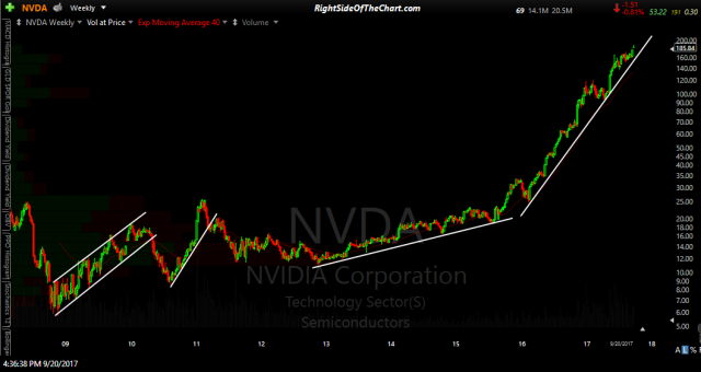
- NVDA 10-yr weekly log scaling
-
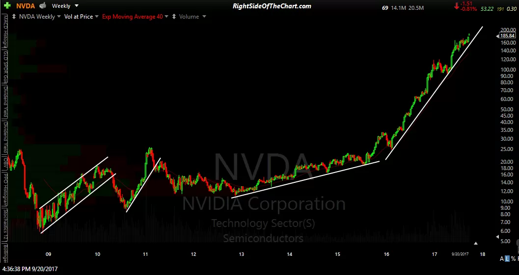
- NVDA 10-yr weekly linear scaling
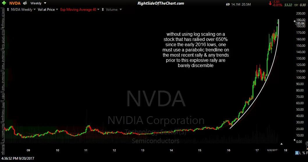
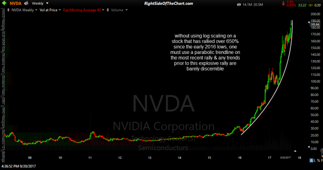
On a somewhat related note, when viewing a security with a large price differential from low to high, I find it an absolute must to use log (aka- semi-log) scaling vs. using a linear (aka-arithmetic) scaling as the latter will render a distorted technical picture of the price history of the security, making trendlines nearly impossible to draw. The two charts below show the same 10-year weekly price history of NVDA, the first using log scaling, as with the previous chart near the top of the page, the second using linear scaling. Unlike the second chart using linear scaling, the log chart allows for well defined trendlines both on the current uptrend as well as other trends in the past.