
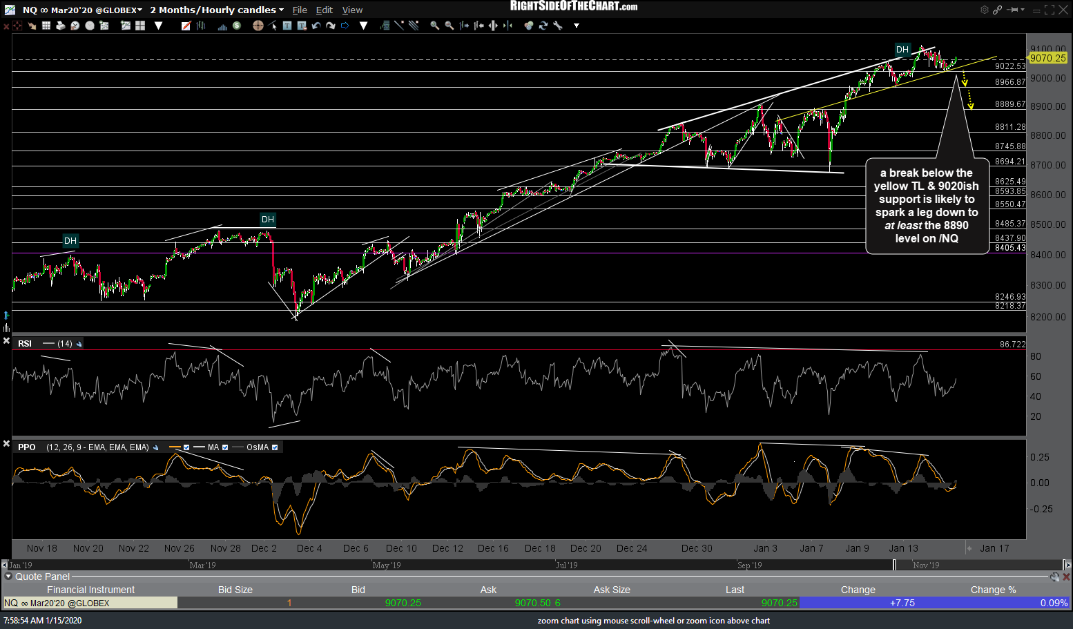
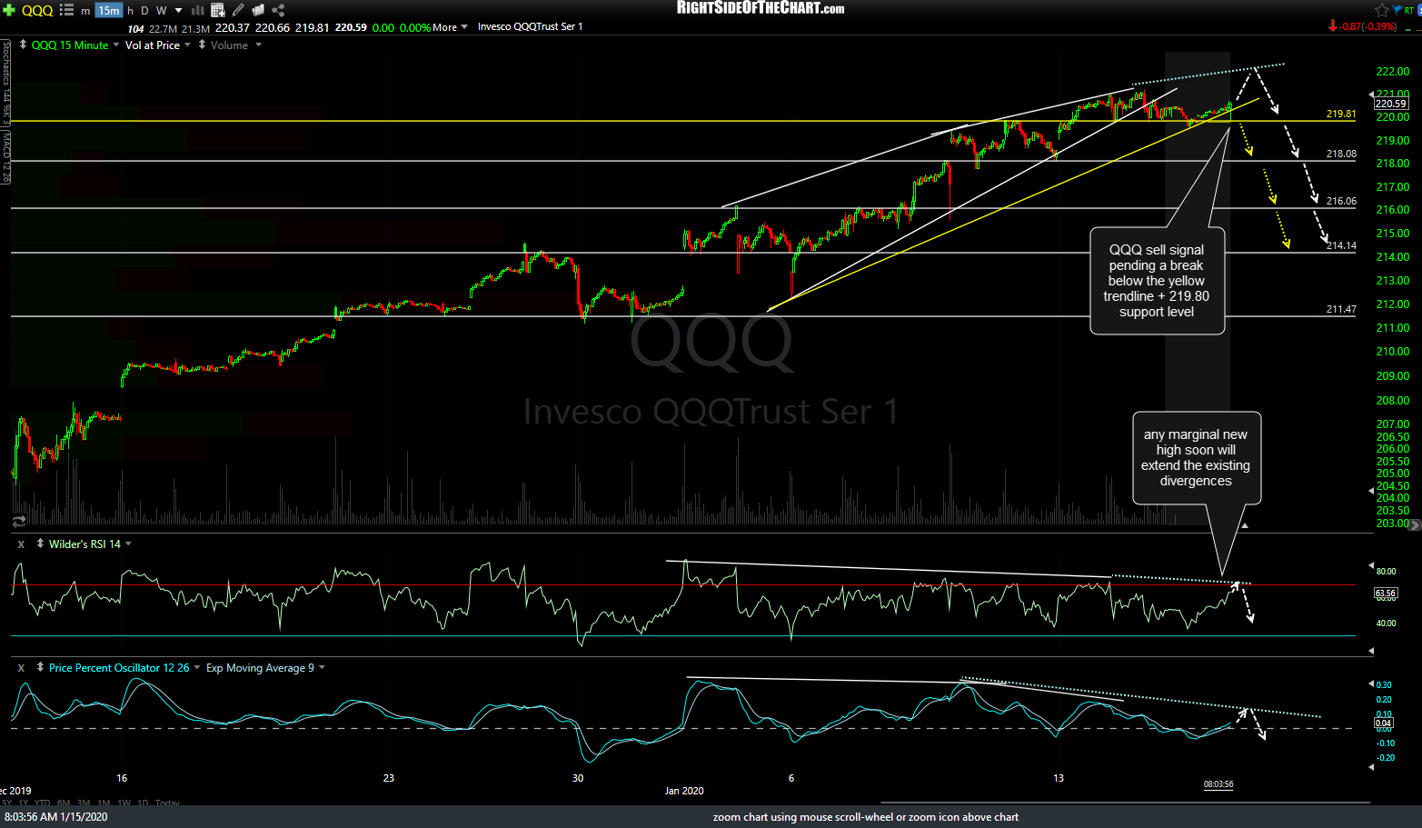
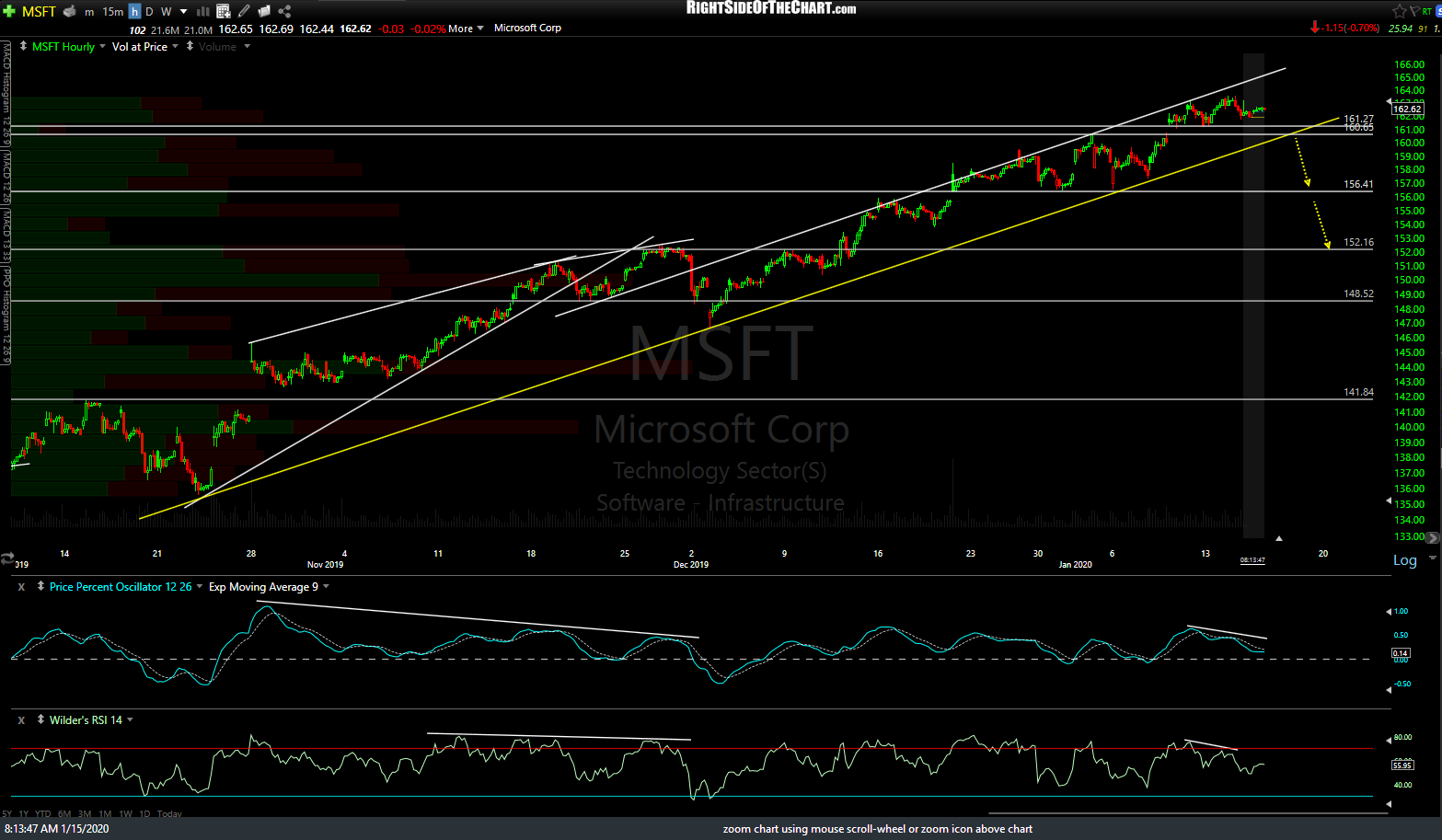
The yellow lines on the charts of the major stock index-tracking ETFs & futures along with some of the market-leading FAAMG+I stocks are key levels that would likely spark a tradable pullback if taken out. The more of these support levels that are broken, as well as how impulsively the breakdowns are, will help to confirm a sell signal on the major stock indices. The scenarios with the white arrows show a little more upside in the indexes & market-leading stocks which will extend the existing divergences before the next leg down begins.
-

- NQ 60m Jan 15th
-

- ES 60m Jan 15th

-

- QQQ 15m Jan 15th
-

- AAPL 60m Jan 15th

-
- MSFT 60m Jan 15th
-

- GOOGL 60m Jan 15th

-
- AMZN 60m Jan 15th

-

- FB 60m Jan 15th

-
- INTC 60m Jan 15th
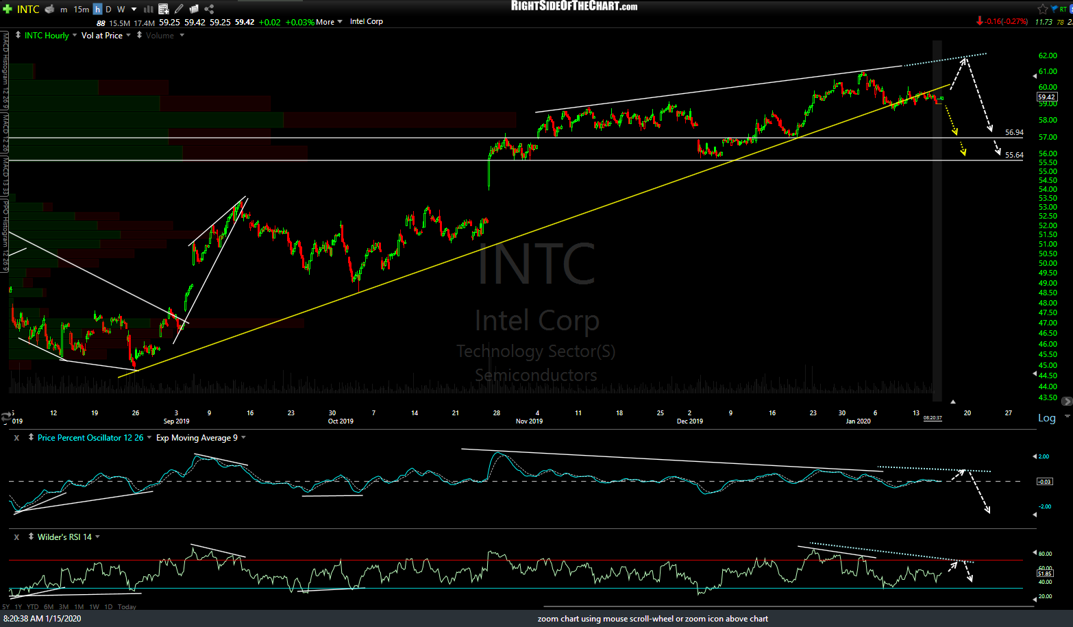
While I’m not targeting all of the horizontal support levels on each of these charts, for the most part, the first several support levels could be used as near-term pullback targets, should we get a decent sell signal(s) soon. Until then, the trend remains bullish. The charts above are 60-minute time frames on /NQ, /ES, QQQ (15-minute), AAPL, MSFT, GOOGL, FB & INTC. Click the first chart to expand & then click the arrow to the right to advance to the next chart.