
Member @natdicarlo posted this inquiry within the trading room:
Randy, seeing NYMO at very oversold levels and yet no significant pullback in markets. Big caps masking the carnage. Your thoughts would be appreciated on if this might postpone the bear case for now?
That clearly seems to be the case (mega caps doing most of the heavy lifting right now), although I don’t see that as postponing a pullback rather more so an indication that one is most likely coming very soon. As the Nasdaq 100 has been the leading index throughout this entire bull market, gaining approximately 430% since it bottomed in November 2008 vs. gains of roughly 365%, 253% & 224% in the Nasdaq Composite, S&P 500 & Dow Jones Industrials, respectively, since their lows that followed a few months later in March 2009, I focus most of my analysis on the Nasdaq 100.
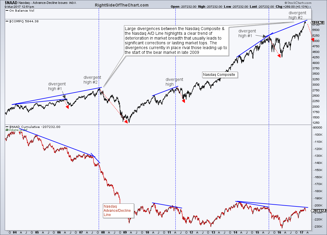
One indicator that I’ve shared on RSOTC for many years now are identifying periods of divergence between the Nasdaq Composite and the $NAAD (Nasdaq Advancing vs. Declining Issues Index). During period of healthy market internals, meaning the markets are moving higher with the majority of stocks contribution to the advance, the $NAAD will move & fall in tandem with the Nasdaq 100 ($NDX) and the Nasdaq Composite ($COMPQ). However, there are periods when the stock market continues to climb yet the $NAAD, the ratio of advancing vs. declining issues, fails to move higher or even begins to move lower. Simply put, that is negative divergence.
$NAAD vs. $COMPQ March 9th
The first chart above shows a nearly 14 year history of the more significant divergences between the $COMPQ & $NAAD. While such large divergences are not useful as an exact timing indicator, since as with all divergences, they can continue to build or even become ‘negated’ or taken out, they are most certainly a warning sign of a likely correction or primary trend reversal due to a extended & persistent deterioration in market internals (i.e.- fewer & fewer stocks, namely the widely-held, over-loved mega-caps like APPL, GOOG, MSFT, etc…) are doing more & more of the heavy lifting.
While that long-term chart can only provide an indication that all isn’t well under the hood but isn’t very useful for timing exits out of long positions & short entries on the broad indices, the charts below might help to provide a little more insight as to when the next correction is about to set in. The first chart is a zoomed-in version of that longer-term $NAAD vs. $COMPQ chart which highlights the two most recent smaller divergent highs in the $COMPQ with the previous (Oct ’15) divergences followed by a roughly 6% correction & the more recent divergent high, which so far has resulted in the $COMPQ falling relatively steadily since the March 1st divergent high.
-
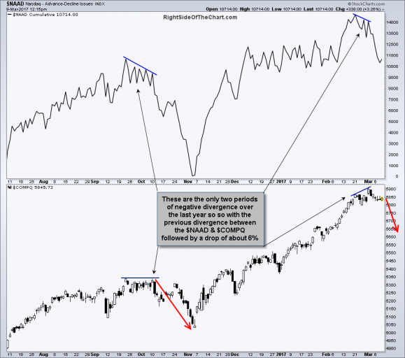
- $NAAD vs. $COMPQ short-term divergences 3-9-17
-
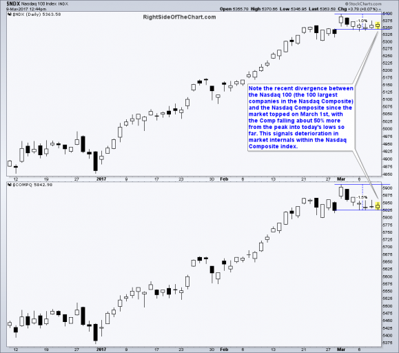
- $NDX vs. $COMPQ March 9th
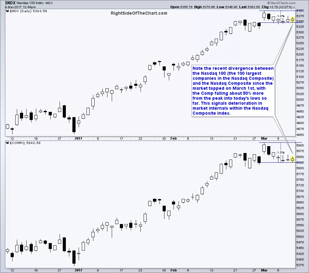
Further highlighting the recent deterioration in the internals of the Nasdaq Composite can be seen by comparing the recent performance between the Nasdaq Composite Index, a universe of about 3000 stocks which trade on the Nasdaq Stock Exchange, and the Nasdaq 100, which is simply the 100 largest stocks within the Nasdaq Composite. Since the March 1st market top, the Nasdaq Composite has fallen (from peak through today’s low so far) about 1½% vs. a drop of only about 1% in the Nasdaq 100. That’s a 50% larger drop in the $COMPQ which indicates that the handful of very top heavy components of the $NDX (the top 10 largest components alone account for over 50% of the returns of the $NDX), have been helping to buoy the market leading index while the vast majority of stocks have been moving lower at a more rapid pace. It should also be noted that the Russell 2000 Small Cap index has now fallen about 3.6% from its March 1st highs, additional confirmation that the majority of stocks in the US stock market have been steadily falling so far this month although the top-heavy mega-cap indexes appears to be holding up relatively well.
The bottom line is that deterioration in market breadth, even when zoomed into the shorter time frames as the two previous chart have, are still not sell signals or any type of timing indicators, simply a warning sign that the chances of a correction & possible even a major trend reversal are elevated at this time. The timing for exiting long positions or establishing short positions are more specific, quantifiable sell signals such a breaks below trendlines & major support levels, bearish candlestick reversal patterns, trend indicators flipping from bullish to bearish, prices crossing down below key moving averages that have acted as support in the recent past, etc… Some of those sell signal have either recently triggered on the intraday time frames with sell signals on the more significant daily time frames very close but still pending.