
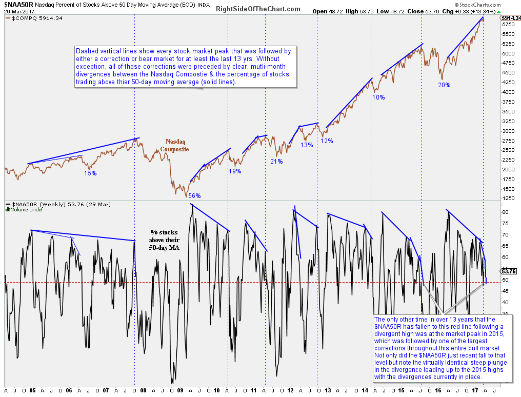
The chart below shows the Nasdaq Composite plotted above the percent of stocks within the Nasdaq Comp trading above their 50-day moving average. The dashed vertical lines show every stock market peak for at least the last 13-years. Without a single exception, all of those corrections (a drop of 10% or more) and bear markets (20%+ drops) were preceded by clear, multi-month divergences between the Nasdaq Comp & the percentage of stocks trading above their 50-day moving average. Of particular note is the recent plunge in the $NAA50R which virtually mirrors the plunge that preceded the market top in 2015 which was followed by one of the largest corrections throughout current 8+ year bull market.
$NAA50R daily March 30th
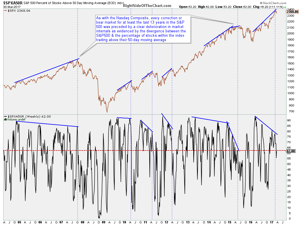
As with the Nasdaq Composite, every correction or bear market for at least the last 13 years in the S&P 500 was preceded by a clear deterioration in market internals as evidenced by the divergence between the S&P500 & the percentage of stocks within the index trading above their 50-day moving average.
$SPXA50R daily March 30th
The video below provides some additional commentary & observations on these divergences & how they are likely to affect stock prices going forward.