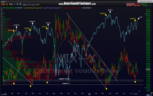
 i often mention the lag in time that needs to be considered when effectively analyzing or interpreting extreme readings of sentiment indicators such as the P/C ratio, bull/bear ratios, the VIX, etc… on this daily chart of the VIX, the yellow arrows mark significant reaction lows (troughs) on the VIX and the corresponding level on the S&P 500 above while the white arrows mark reaction highs (peaks) on the S&P 500. you’ll notice that every low in the VIX came before the peak in the SPX. in fact, the average lag time from the low in the VIX to the peak in the SPX was 11.5 days. the last reaction low in the VIX was on july 19th, 12 days ago. of course the only time will tell if the 7/19 low on the VIX was the low for a while but just by eyeballing this chart, the spacing between lows and the past price patterns of the VIX seem to indicate that it likely was a multi-month reaction low like the previous four shown on this chart.

