
With the markets still slogging around in a sideways-to-downward trend and with all major indices other than the Nasdaq 100 still well off their March 1st highs & most likely in the early stages of a much deeper correction, I just wanted to reiterate that the divergences in market internals will most likely manifest in the form of a significant correction in equity prices.
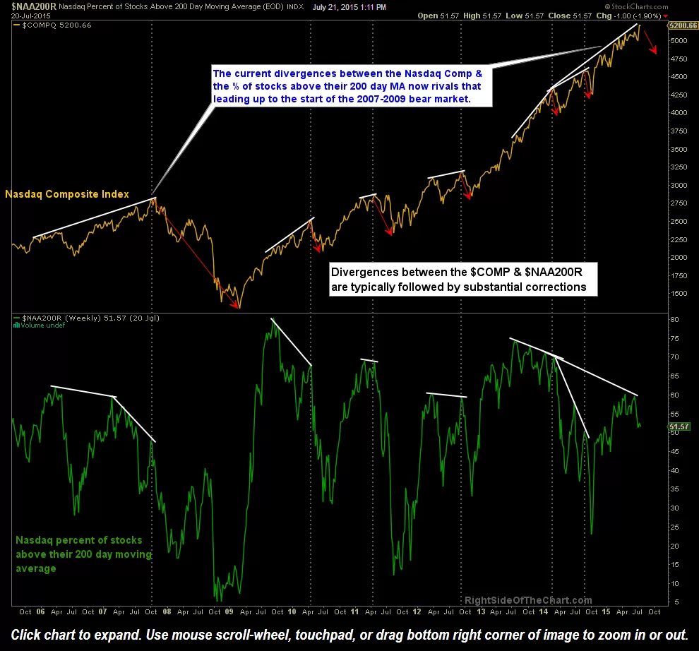
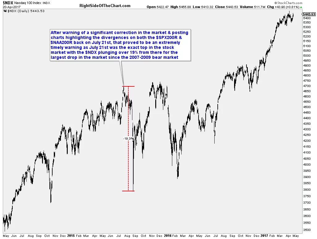
While divergences are far from an exact timing indicator, more so merely a “heads up” that a trend change is coming soon, these first two charts (the weekly charts of both the S&P 500 as well as the Nasdaq 100/Nasdaq Percentage Of Stocks Trading Above Their 200-day Moving Averages) did prove to be very timely when posted nearly two years ago. After warning of a significant correction in the market & posting charts highlighting the divergences on between both the S&P 500 & Nasdaq 100 & their percentage of stocks trading above their 200-day moving averages back on July 21st, 2015, that proved to be an extremely timely warning as July 21st was the exact day that the stock market peaked with the $NDX plunging over 19% from there for the largest drop in the market since the 2007-2009 bear market.
-
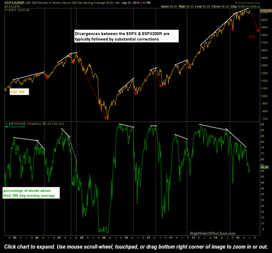
- $SPXA200R July 21, 2015

-
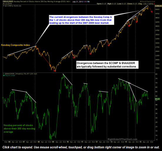
- $NAA200R July 21, 2015
-
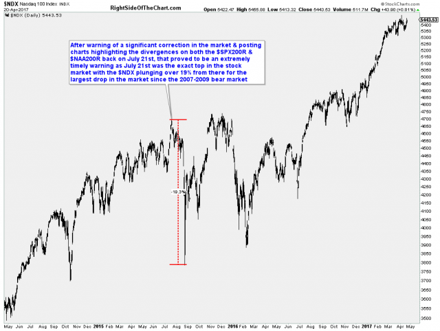
- March 21, 2015 Market Top
With that, I’ll leave you with the current divergences shown between the percentage of stock trading above their 50 & 200-day moving averages along with their respective indices (Nasdaq & Nasdaq 100, S&P 500 & the NYSE). As history clearly shows, it’s not so much a matter of “will these divergences play out for a correction?” but more so “when will these divergences play out for a correction?”. That’s where the key trendline & price support levels that I’ve been highlighting recently come in as well as the key uptrend lines on the market leading FAAMG stocks posted earlier today.
-
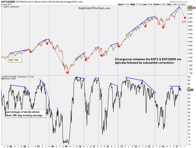
- $SPXA200R weekly April 20th

-
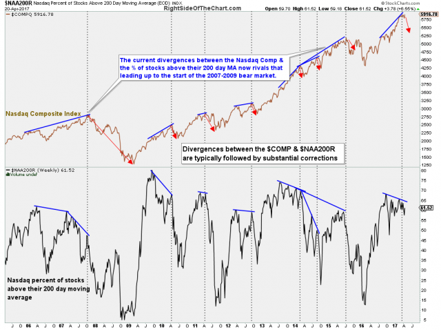
- $NAA200R weekly April 20th

-
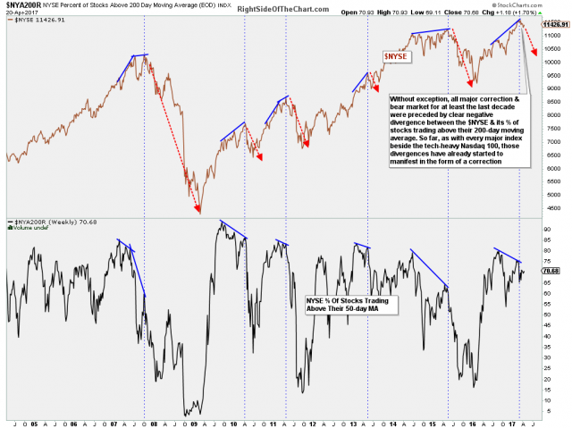
- $NYA200R weekly April 20th

-
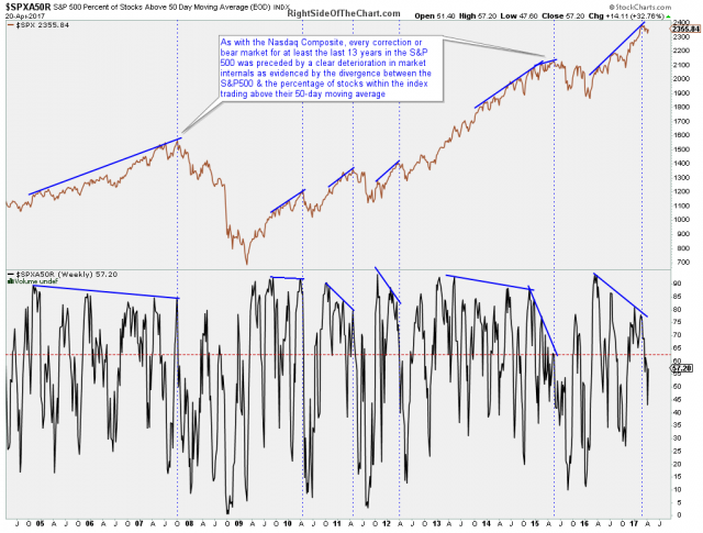
- $SPXA50R daily April 20th

-
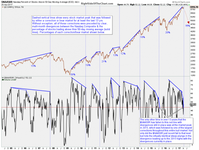
- $NAA50R daily April 20th
