 I often liken stock market predictions to weather forecasting. A meteorologist can tell you what the weather will be like tomorrow with a very high degree of certainty. However, as the forecast is extended in time, the accuracy diminishes. Trying to forecast what the weather will be like anything more than a few weeks out, other than incorporating the typical seasonal patterns is basically a crap-shoot. The same holds true when using technical and even fundamental analysis to forecast future prices in individual stocks or the stock market although I do believe that the charts, combined with the study of the business cycle and other macro-economics, do allow us to make potentially accurate longer-term predictions.
When trading or investing, we can use all the resources at our disposal to formulate scenarios that are likely to play out for months and even years in the future with the goal of successfully aligning our trades or investment portfolio according to that scenario. The key is to be flexible and to continually analyze the data, both fundamental (e,g.-economic data, earnings trends) and technical (charts) in order to make any necessary adjustments to your plan as needed.
For months now, I have been making the case that the US equity markets were setting up for a substantial decline and quite likely a new bear market. I continually look for evidence that reaffirms or refutes that scenario. Yes, there will always be enough evidence present to formulate a pretty decent bullish case or bearish case at just about any point in time but what ultimately determines who will be right and who will be wrong is how one interprets the same data that is easily accessible to all.
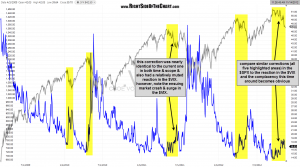
With that being said, the chart below is something that I actually covered at the end of the recent $SPX top holdings video. What this chart illustrates, at least by my interpretation, is a blatant lack of fear amongst market participants since the current market correction began in mid September. There is an old adage that says stocks climb a wall of worry and for the most part, that holds true. Major market bottoms are almost always formed when fear is rampant and it looks like the bottom will never come. However, the same typically holds true for market tops where instead of fear, complacency rules. This chart highlights all similar market corrections over the last several years since the bull market began back in March 2009. By similar, I am referring to corrections similar in scope that followed substantial prices advances AND began with the $VIX towards the bottom of it’s range.
As the chart shows, this has been by far the most muted response from the $VIX on such a correction in the $SPX. In fact, the second most muted reaction occurred on a nearly identical market correction that occurred from 4/26/11 to 6/21/11. From there, prices rebounded sharply for just over 1 week before plunging and sparking the most powerful sell-off since the bull market began, the end result of complacency combined with bearish technicals, exactly the conditions facing the market today.

