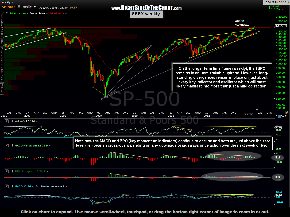
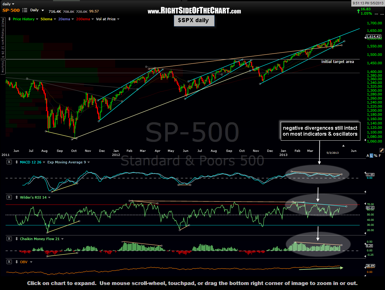
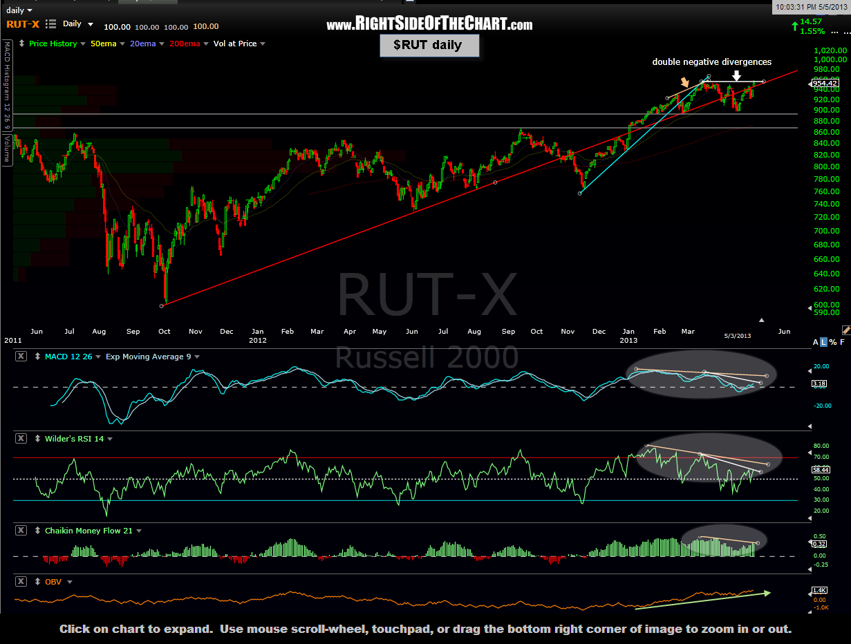
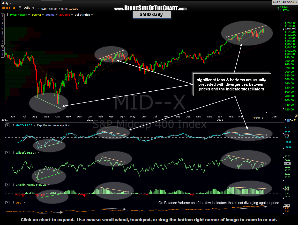
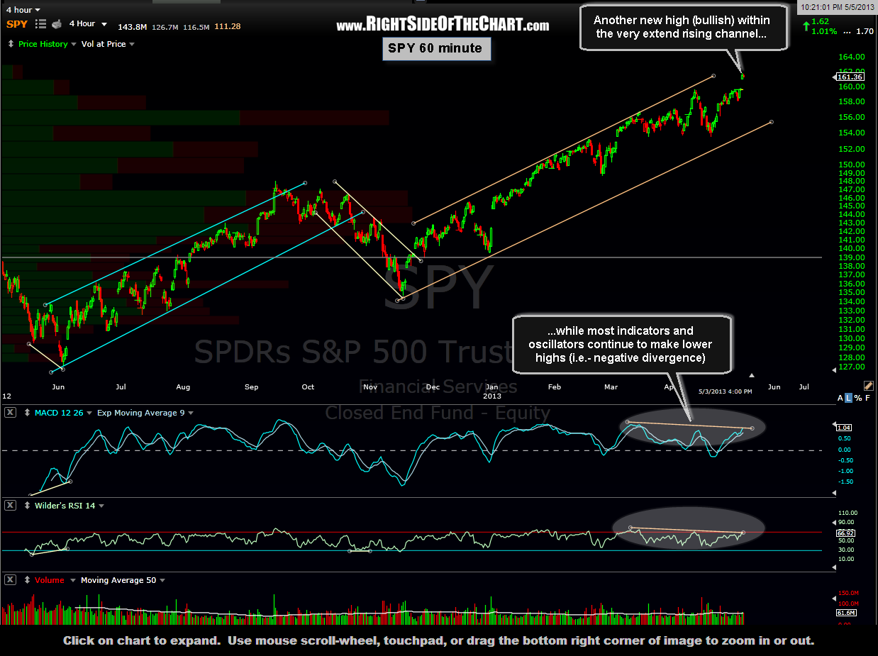
As I look through the charts of the major US indices, I see a mixed bag of both bullish and bearish technicals. From a longer-term perspective, the markets remain in an unmistakable uptrend with prices continuing to make higher highs (bullish) yet most significant indicators and oscillators making lower highs, i.e.- negative divergence (bearish). For the most part, the same can be said about the daily charts.
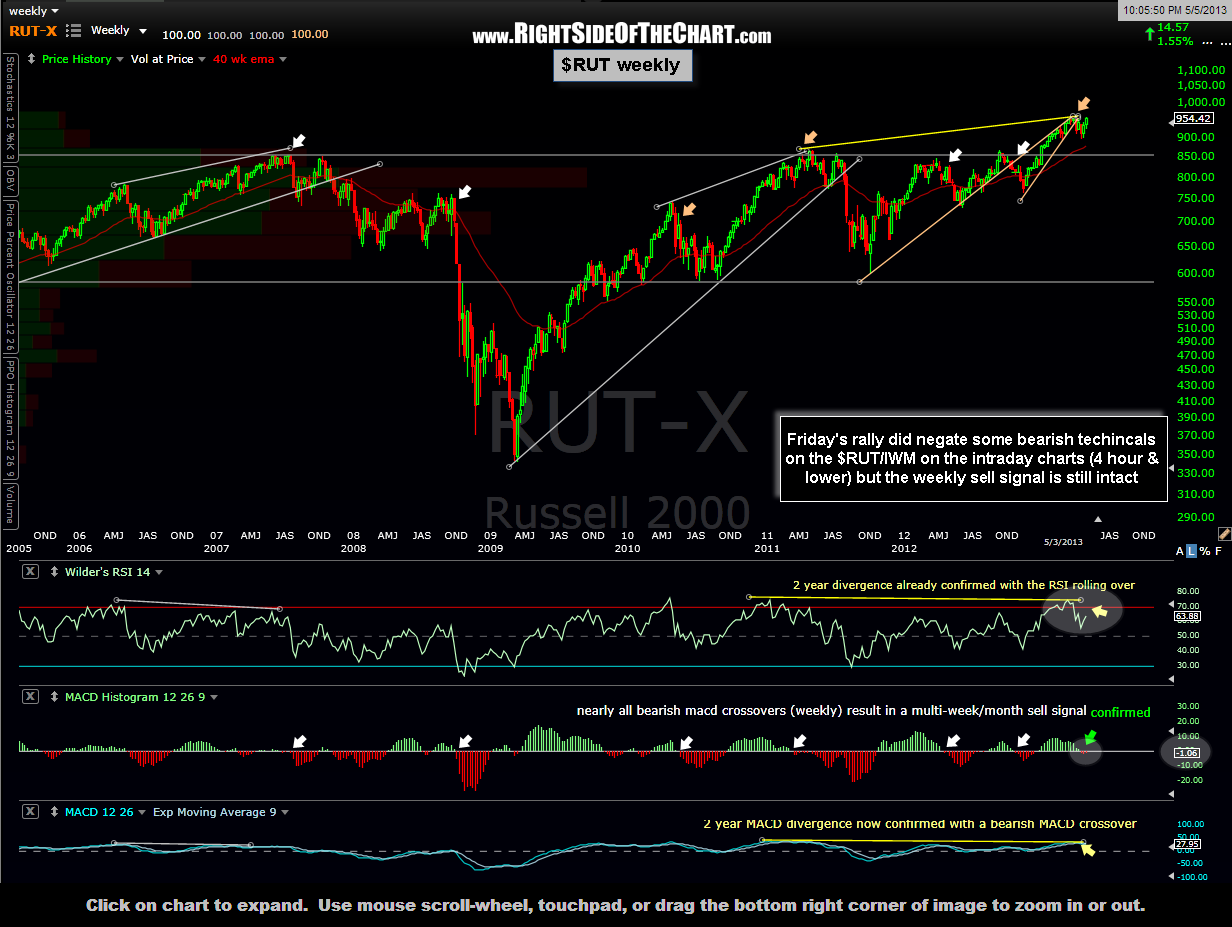
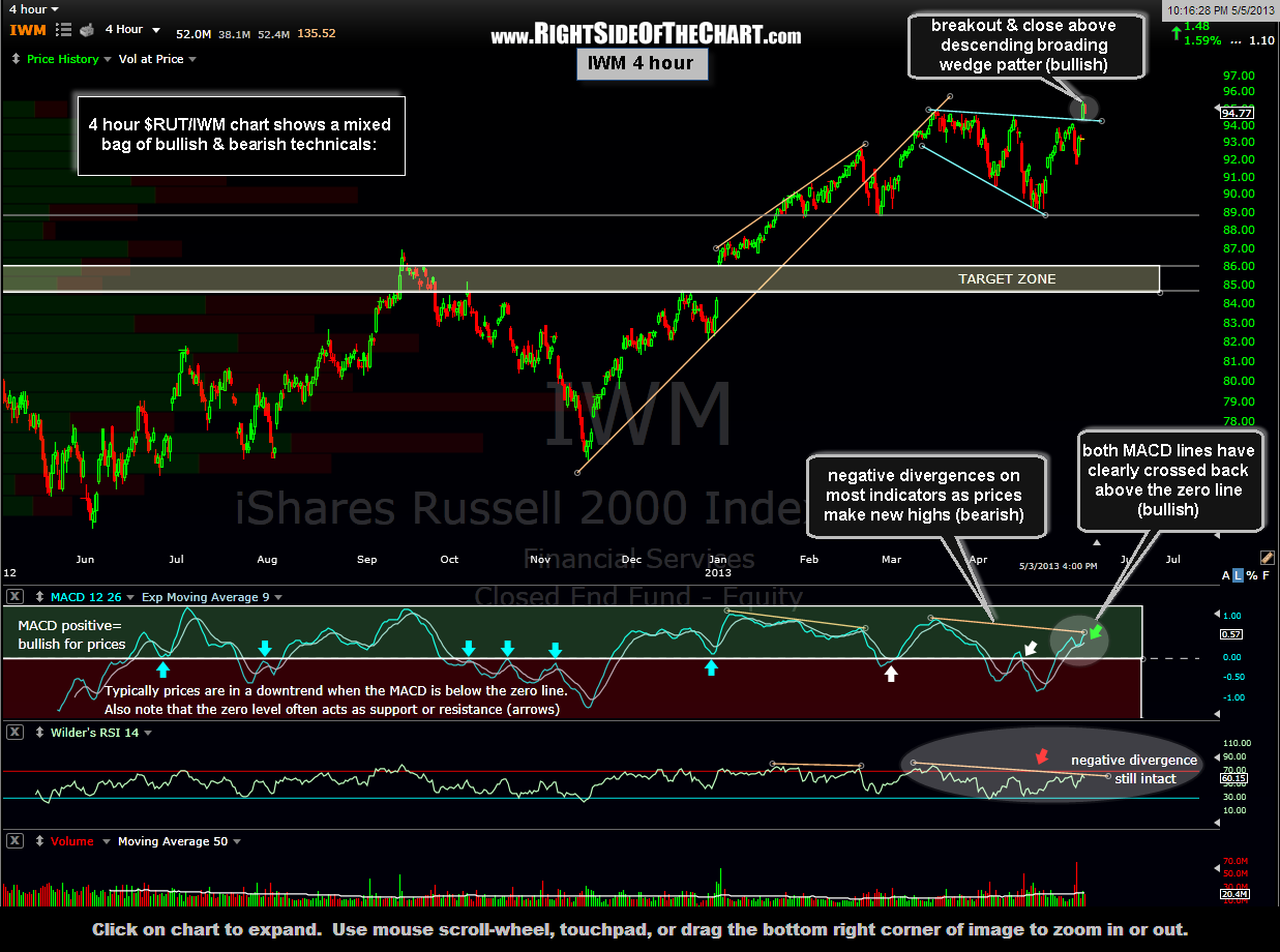
Zooming down to the intraday day charts (4 hour – 60 minute time frames), we did see some bullish technical events on Friday with many key indices making new highs including the $RUT/IWM, which clearly took out the well-defined downtrend line that has been in place since the small cap index peaked back on March 15th. In summary, one has to give a check to the “bullish” box from the price action in just about every major index on Friday. By most metrics however, this market has become very extended both from a technical perspective but just as importantly, the divergence between stock prices and deteriorating macro fundamentals tells us that at the very least, a half-decent correction is likely to begin soon.
I was a bit surprised to see that the recent $RUT weekly sell signal remained intact despite the 1.55% gain in the index on Friday. I’m also watching the more important $SPX weekly charts for a similar sell signal, namely bearish crossovers on the MACD & PPO momentum indicators (on a weekly closing basis). All in all, despite some of the shorter-term bullish technical events last week, I continue to believe that the R/R for entering new long positions is very poor at this time. On the flip side, the momentum makes trading the short side very difficult so the best strategy at this time (other than keeping it light) might be to tighten up stops on any long-side trades and/or continue to use a scale-in strategy for any new positions, longs or shorts. Below are the charts of some of the key US indices in order of weekly, daily, 4 hour & 60 minute time frames.