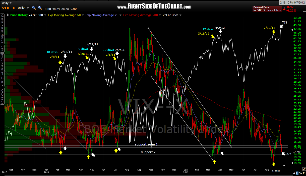
the first chart below is an update to the patterns that i recently highlighted on the $VIX (click here to view those posts if not familiar with it). the last update to this chart was on aug 6th, when i said “a new low in the $VIX would either break this pattern or mean that the $SPX will likely continue to climb until the $VIX bounces again and makes and higher low (keeping the pattern intact but playing out in the future)”. only time will tell but “the future” may have arrived. again, just something to monitor for now as we would need the market to turn down soon with the $VIX putting in a higher low vs. the 7/19 low.
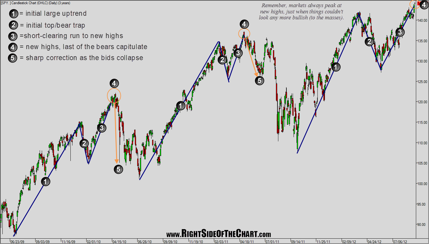
this next chart is mainly a reminder that significant market tops always come when least expect it and just after the market makes bullish new highs (obviously, as per the definition of a top). however, i wanted to highlight a pattern that has been pretty clear since the bull market began back in march ’09. the symmetry of these patterns is what jumps out at me when eyeballing the market over that time period and i figured this was worth sharing. from a technical perspective, any move below yesterday’s lows (the large green candlestick) would greatly increase the odds of this pattern repeating once again.


