
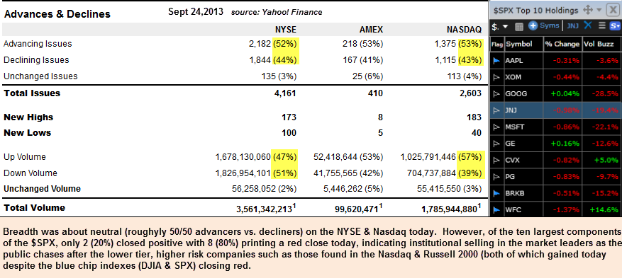
Looks like it just might be time to start dumping the trash… low quality stocks that is (or stocks of just about any quality for that matter). At a glance, the commonly followed overall breadth measures such as the $NYAD & $NAAD (NYSE & Nasdaq Advancing vs. Declining issues ratios) have indicated that the recent highs on many of the major US indices were broad based, accompanied by relatively healthy internals. Even today, for example, I noticed that the both the ratio of advancing to declining issues as well as the up vs. down volume on both the Nasdaq and the NYSE were roughly equal. However, I also noticed quite the discrepancy on my watchlist of the 10 largest components of the S&P 500 (which combined, make up nearly a 1/5th weighting of the entire 500 stock index). Out of those 10 top SPX holdings, decliners outpaced advancers by a margin of 5:1 today. In other words, 8 out out the 10 largest components in the SPX closed down today with only 2 managing to close (marginally) higher.
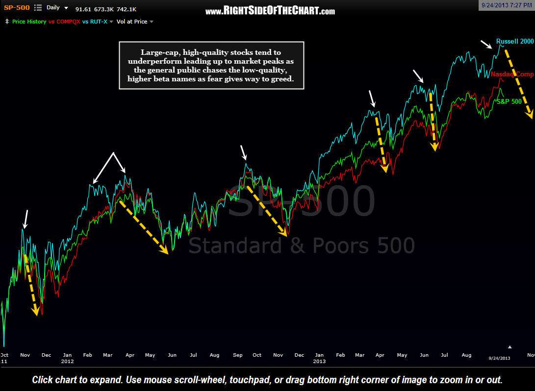
Getting back to the “junk stock” theme, the chart below highlights how the lower quality stocks (small caps, i.e.- the Russell 2000 Index), tend to start outperforming the higher-quality, well-establish large caps stocks heading into market tops. This is typically the result of investors losing fear and chasing stocks with the highest return (and risk) potential.
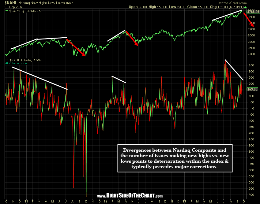
As you’ll also notice on the first chart above (today’s market breadth), the number issues making new highs outpaced the number of new lows by a fair margin… bullish, right? Not if one focuses on the trend over the last few months. This next chart shows the Nasdaq Composite Index plotted over the $NAHL, or Nasdaq New Highs-New Lows Index. Divergences between the H/L ratio and the index are marked along with the ensuing corrections. Note how sharp/steep the current divergences are compared against the divergence that led to the previous correction. Typically, the longer and/or more pronounced the divergences are, the larger the ensuing correction.
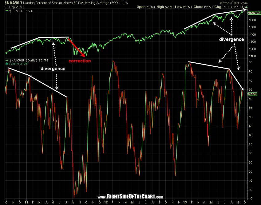
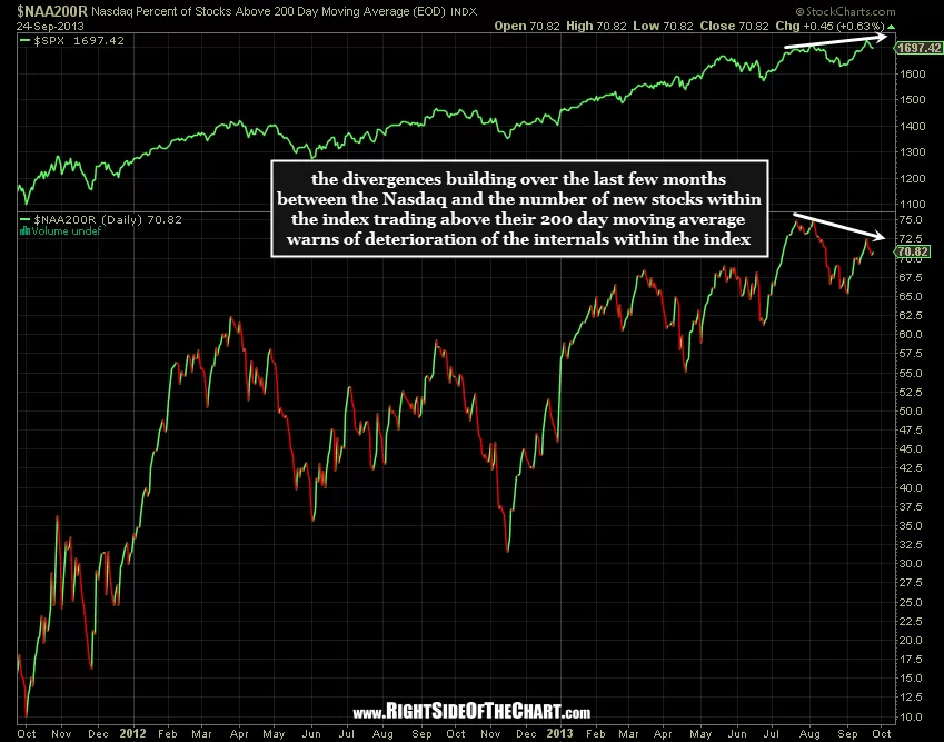
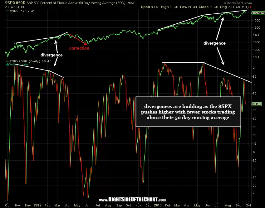
Moving along, let’s take a look at another measure of the internal health of the market leading up to last week’s Fed-induced thrust to new mulit-year highs on all the major US indices. These charts show the percentage of stocks trading above their 50 & 200 day moving averages in both the Nasdaq Composite as well as the S&P 500. Take the first chart, for example, the $NAA50R. As with the May-October 2011 correction (which missed the 20% definition of a bear market by mere basis points on the Nasdaq), we currently have some very solid divergences in place that have been building since the beginning of the year or about 9 months (as back then). As the 50 day moving averages change much faster than the 200 day averages, it only stands to reason that divergences are more commonly found when the index values are plotted against the shorter Percent-of-Stocks-Sbove-the-XX-Moving-Average indexes. However, rarely do you see the market powering to new highs with negative divergences, especially of the magnitudes that are current in place on both the $SPXA200R & $NAA200R charts below.
-
- Nasdaq Percent of Stocks Above 50 Day Moving Average
-

- Nasdaq Percent of Stocks Above the 200 day Moving Average
-
- S&P500 Percent of Stocks Above the 50 day Moving Average
-
- S&P500 Percent of Stocks Above the 200 day Moving Average
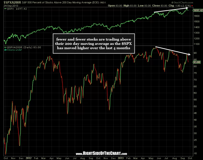
The bottom line is that significant red flags that continue to build as the US broad indices hover around multi-year and/or all-time highs. In addition, I studied the top 10 components of both the $SPX & the $NDX tonight and found quite a few stocks sitting precariously close to the bottom end of bearish technical patterns or developments. I hope to be able to put together a couple of brief video overviews of each index tomorrow as well as post some additional trade setups that I am following. Currently the banking sector and social media stocks are among the most attractive looking shorts candidates on my radar, with some charts/new setups to follow asap.