weekly charts move slow but are critical when trying to get a bearing of where the markets are in the bigger picture. it’s easy to get lost in all the noise of the intraday and daily charts if you let it but i find trading similar to navigating (pre-GPS days) whereby you use the weekly charts to like a map to get a broad overview of where you are and where you are going while then relying on on the daily and intraday charts like your visual/line-of-sight aids; turn left at that thicket, walk around that muddy rut, cross the stream over there where that tree has fallen across, etc..
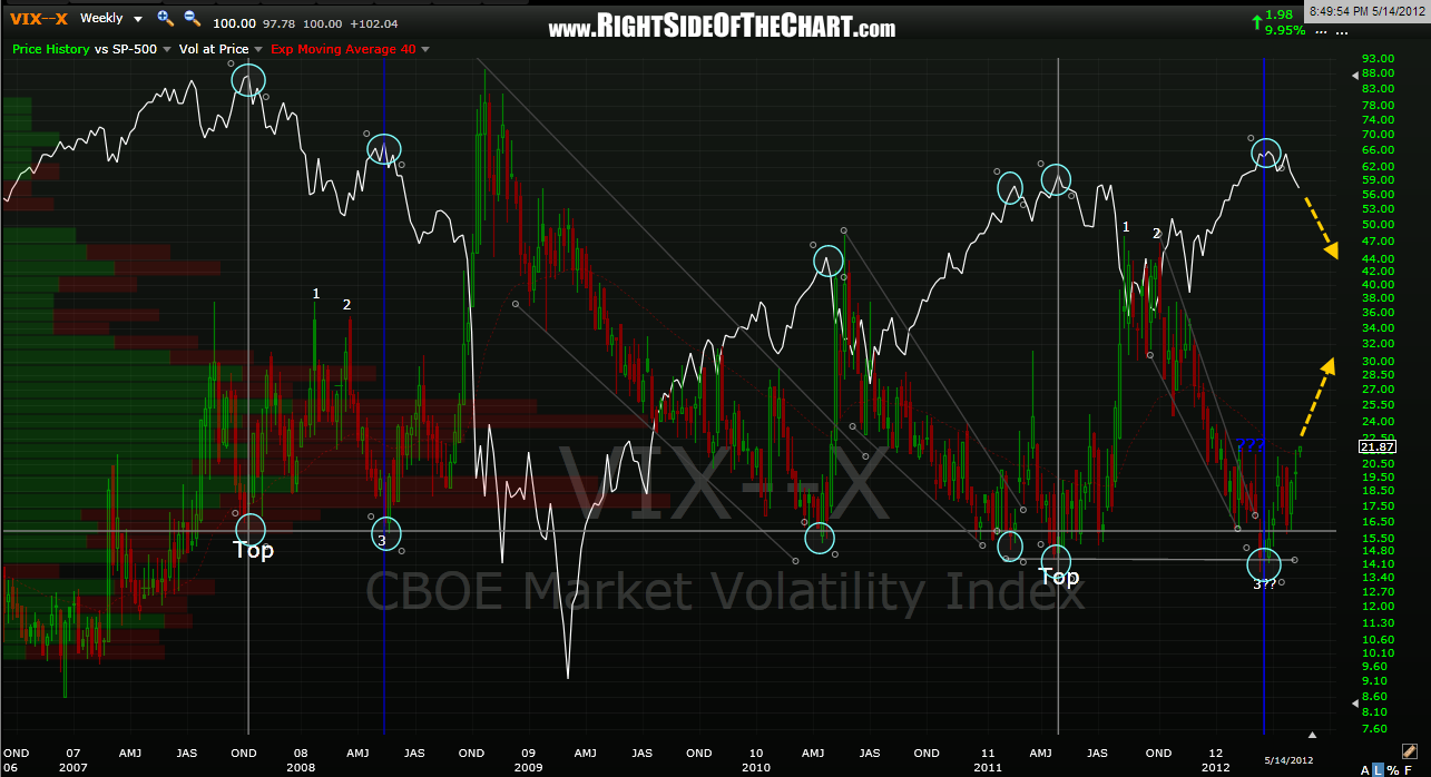
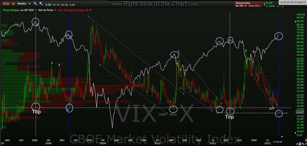
here’s the updated VIX weekly that continues to show where we are most likely headed from here along with the last VIX weekly i posted back on march 19th, literally about 1/2 of 1% off the $SPX’s peak. again, this is one of many technical signs that an impending correction, if not a more lasting top, was highly likely back then but more importantly than the 6% or so that the market has dropped since then is the fact that this chart, along with all of the other evidence presented here in the last few months points to the fact that this is most likely only the beginning of, and not the latter stages of a market drop.
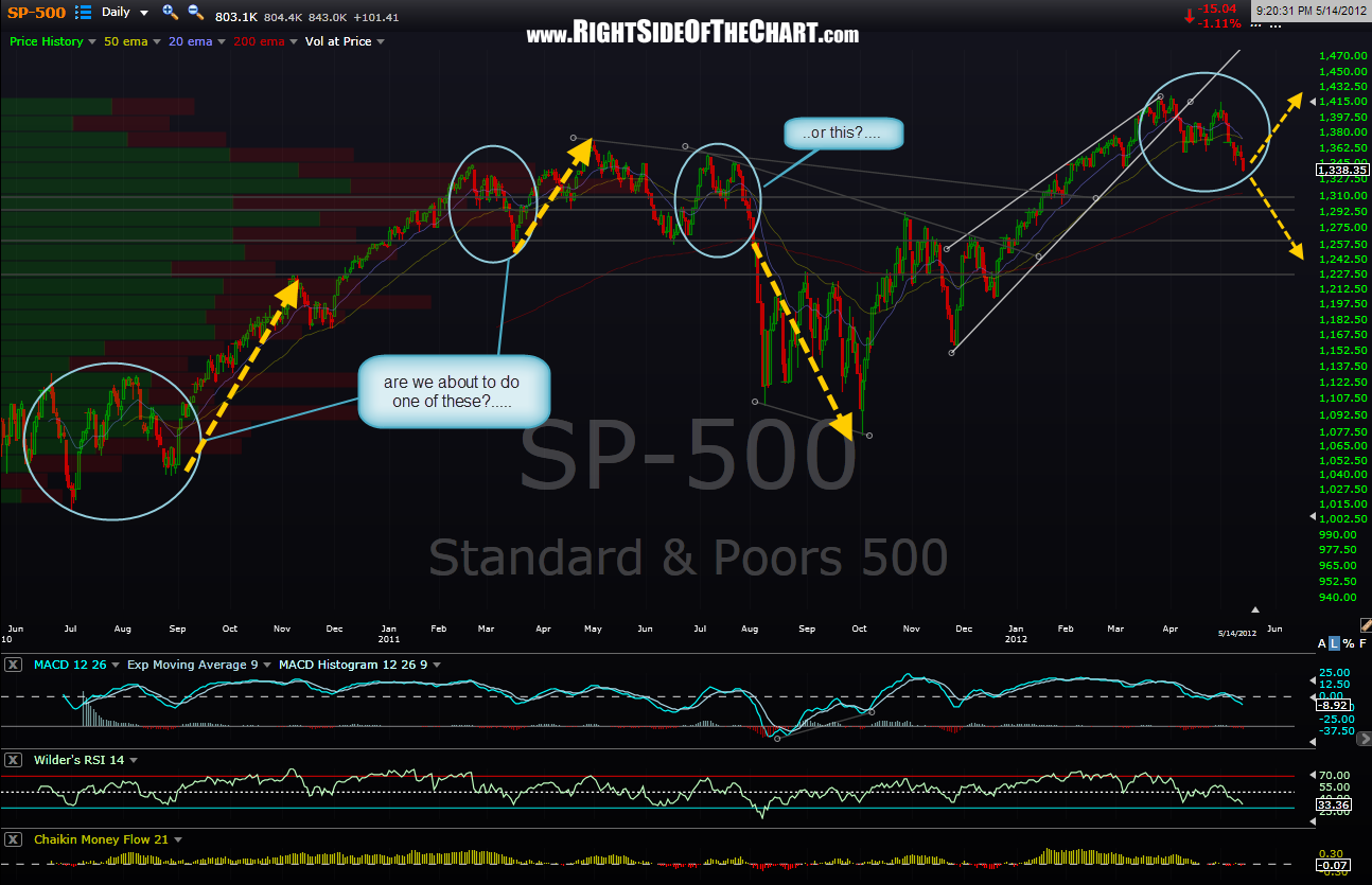
maybe things will be different this time but if they are not, and this chart along with all the other long-term sell signals do play out then whether you are an active trader or a long-term “buy and hold” investor you need to have a plan… and a plan B and maybe even a plan C. the flip-side also holds true for those with a with a bearish outlook. sometimes just when everything seems to line up for a big move in the market one way, it moves hard and sharp in the opposite direction. the SPX daily chart below highlights some similar looking junctures in the market over the last couple of years but again, the difference between those similar junctures where the market exploded higher and now lies in the weekly charts. i think that i have done a pretty solid job making the bearish case for months now and i still feel that the technical picture strongly suggests additional downside in the markets but i will continue to search for evidence that either refutes my current bias or confirms it. until or unless i find evidence to the contrary, i will continue to engage this market very aggressively on the short-side, treating any bounces for the time being as shorting opps to establish new positions or add on to existing positions while continuing to tactically cover existing positions as their predetermined targets are hit. trading the short-side does require a more nimble, hand-ons approach than the usual buy & hold investing or swing/trend trading on the long-side during an uptrend but what has always drawn me into trading the short-side is the phenomenal gains that can be made in such short order. as has always been the case throughout the history of the stock market, stocks tend to fall much faster than they go up. it is more than common to see a stock wipe out in a matter of days, weeks or months the all the gains that took weeks, months or years to accumulate as a quick glance at just about any long-term (weekly) chart of just about any stock will show.
as today was a very exhausting day for me with a lot of personal/family issues to contend with, this will probably be my only post for the evening. there are still more than enough active trades and set-ups listed on the site offering objective entries and throughout this week i will continue to remove the completed trades (target hit or stopped out) and replace those with new set-ups as well as try to highlight any attractive entries or exit points on the active trade ideas.