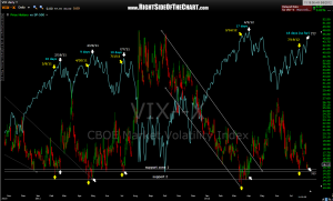
 here’s the updated chart of the $VIX lows vs. $SPX highs. the original post with notes can be viewed by clicking here. basically, this chart highlights all the reaction lows on the $VIX off it’s key support area and illustrates how every top in the market came days to weeks after those lows. although that NDX 60 minute symmetry pattern that i was tracking has now been busted up, this is a much longer-term pattern that has preceded basically all significant corrections over the last couple of years.
the question marks on the most recent white arrows mean that it is too early to say whether or not this patten will play out again or not. basically, the pattern is still potentially in play as the $VIX has failed to make a lower low while the $SPX has made new highs since that last reaction low on the $VIX 18 days ago. just something to monitor for now as a new low in the $VIX would either break this pattern or mean that the $SPX will likely continue to climb until the $VIX bounces again and makes and higher low (keeping the pattern intact but playing out in the future).

