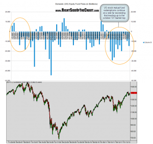
 although the SPX chart is shifted slightly to the left, i aligned it so that prices correspond with the dates of the month-end fund flow data above. i guess one could interpret this chart in one of two ways:
the bullish/glass-half-full view would say “yeah, unrelenting, unprecedented massive redemptions over the last year yet the market is still slightly above where it was when this current streak of fund outflows began in may ’11. just wait until all that money comes back into the market!”
while the bearish/glass-half-empty view would be: “that’s what unprecedented, nearly unfathomable amounts of liquidity injections (money printing) by the fed can do to counter the tremendous imbalance of natural supply and demand (as unarguably evidenced by the chart below). they can only print for so long before the unintended consequences begin to take effect. just wait until they pull the punchbowl away… there’s going to be a huge price to pay”.

