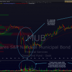
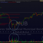
this is MUB, the iShares muni bond etf. this first chart i posted back on jan 30th, highlighting that the volume patterns indicated a high probability of a buying climax (a top). so far, the impulsive selling seems to be confirming that. keep in mind that when i add these wide arrows forecasting the next price move, those do not include all the minor zig-zags along the way, just where i think prices are likely to go from current levels before any meaningful, lasting bounce. also note that these buying and selling climaxes are not exact timing indicators but do often accurately predict primary trend reversals.


