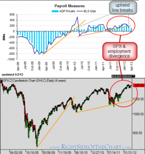
 although we’re just wrapping up a successful earnings season, where the majority of companies beat the consensus expectations, i have been noticing an concerning downward trend on many of the economic data reports. this morning’s ADP payroll report came in below expectations so i decided to take a glance at the chart and here’s what i see, fwiw:
first off, let me say that although many traders think of trendlines as something used only for stocks and equity indexes, trendlines are every bit as useful when used with bonds prices, interest rates, commodities, real-estate trends, etc… even economic data trends. here’s the ADP & BLS Payroll data charted against the $SPX over the last 4 years. hard to argue that one doesn’t effect the other but conventional wisdom would say that employment, or lack thereof, leads the market, not the other way around. also keep in mind that data such as the ADP report has a very short lag-time vs. corporate earnings releases, which usually reflects data up to 4 months old, as one quarter is 3 months and the results are usually released a month or so after the quarter ends.
the two points to make on this chart is 1) the recent uptrend line break on the BLS totals (solid blue line) and 2) the recent divergence between the SPX and the BLS totals, both of which peaked back around may ’11 yet the SPX has recently made new highs while the BLS totals are well below it’s prior peak from a year ago. therefore, if employment does lead the market, the recent up trend break and divergence does not bode well for equity prices.

