
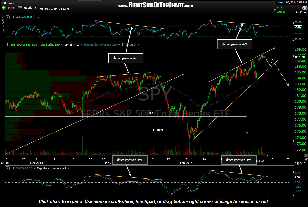
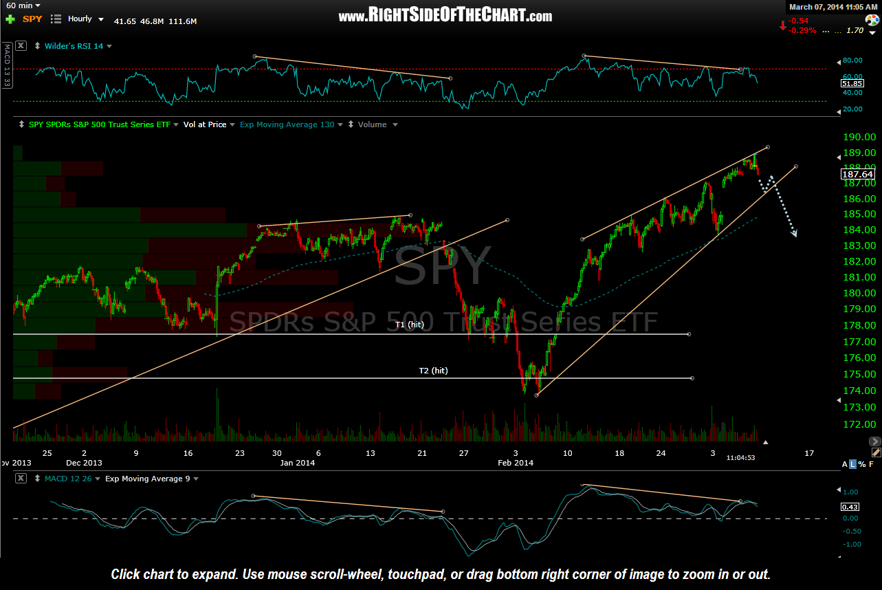
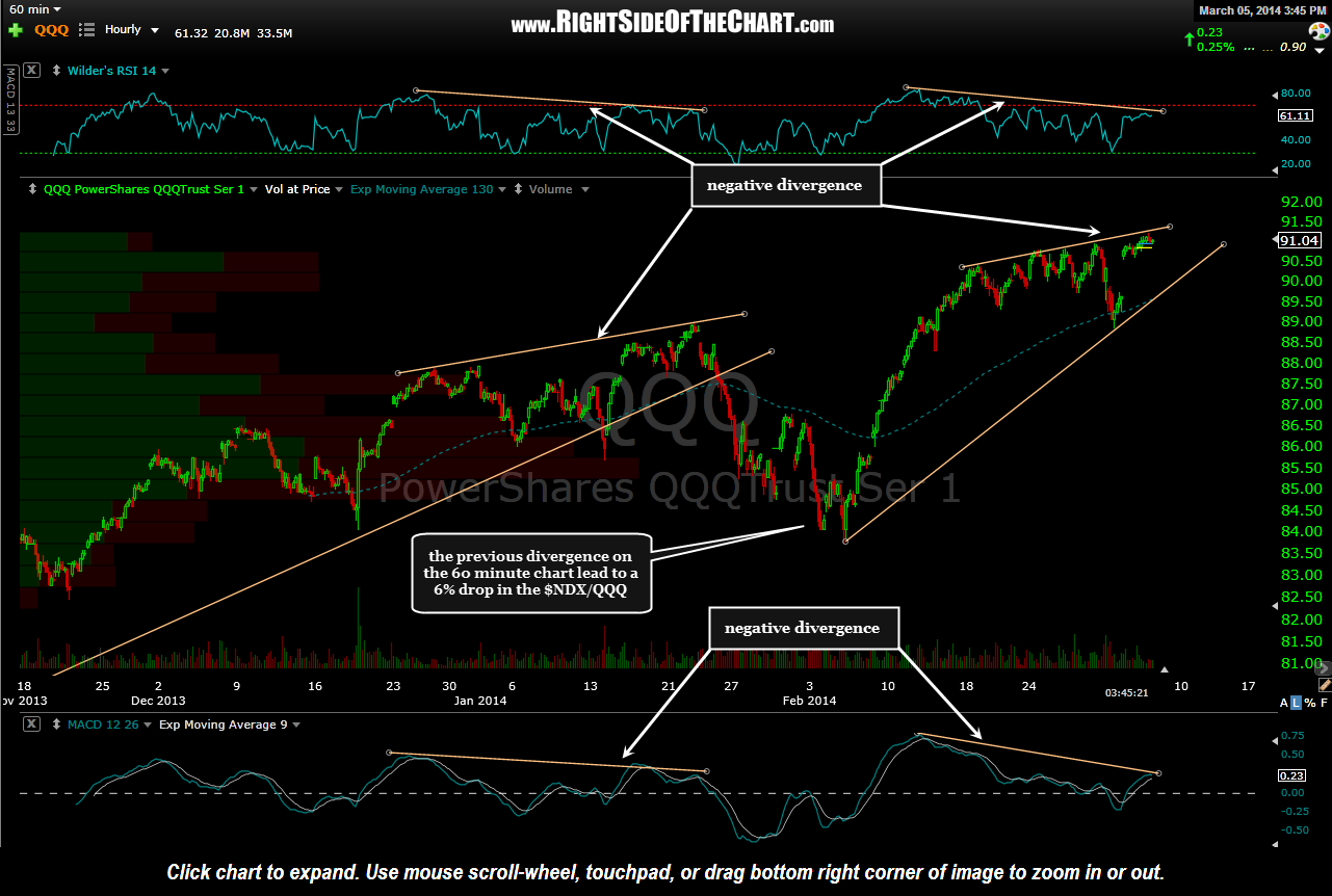
So far the 60 minute charts are playing out as expected. The $NDX/QQQ has already fallen from the top to the bottom of the potential rising wedge pattern while the $SPX/SPY has a bit more downside to go. I refer to these as potential bearish rising wedge patterns because the lower uptrend lines (bottom of the wedge) only have two reaction points so far. Any two random points can be connected by a line but it is the third reaction which validates a trendline, at least in my book. Therefore, I will be curious to see how the SPY & QQQ act off these levels. Regardless of this potential lower uptrend line, the more significant feature on these 60 minute index charts is the upper most trendline (top of the wedge) which shows the markets making higher highs while both the MACD & RSI have made lower highs, i.e.- negative divergence.
-

- SPY 60 minute March 5th
-
- SPY 60 min March 7th
-
- QQQ 60 min March 5th
-
- QQQ 60 min March 7th

While the 60 minute charts help paint the near-term picture, it is the weekly, multi-year charts that help formulate the bigger picture as to what might be in store for the US markets in the upcoming months. The weekly charts below plot the S&P 500 and the Nasdaq Composite Indexes against the percentage of stocks above their 200-day moving average. While a large percentage of stocks trading above their 200-day moving average is associated with a rising market, once prices continue to rise while the percent of stocks trading above their 200-day averages begin to fall (i.e.- negative divergence), those divergences will more often than not manifest in the form of a correction, as the charts below illustrate.
-
- $SPXA200R March 7th

-
- $NAA200R March 7th
