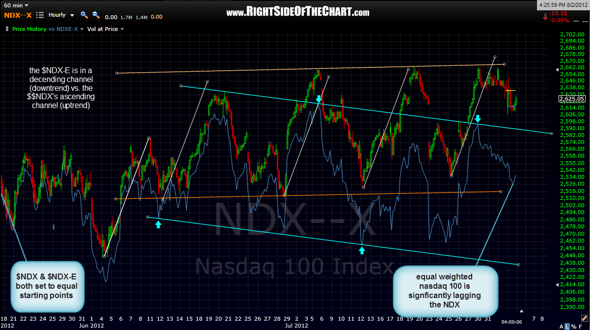
one of the indicators that i like to use to determine if an uptrend has staying power or might be in jeopardy is a comparison of the $NDX (nasdaq 100 index) vs. the $NDX-E (equal weighted nasdaq 100). as most are aware, the performance of the $NDX, although one of the most widely followed indices, is heavily skewed toward just a handful of it’s tops holdings, such as MSFT, GOOG, ORCL, INTC, CSCO and especially AAPL, which as of yesterday, made up a whopping 18.93% of the QQQ (tracking etf for the NDX). we all know that AAPL is an earnings juggernaut but when fund managers all start to cram into the same few select names that have held up, while selling the rest of the pack, that is often the sign of an impending top as fewer and fewer names carry the market higher.
comparing the NDX to the NDX-E is just one of many ways to highlight the deteriorating market breadth since the june 4th lows but for now, i’ll use this 60 minute NDX price symmetry chart that i’ve been highlighting lately. on this chart, i’ve recently pointed out how prices have been sharply moving up and down within a larger uptrend pattern, or this ascending price channel. notice how the NDX-E has not only significantly lagged behind the NDX but has also formed a downtrend channel over the last couple of months. that clearly illustrates that the market is being lifted by fewer and fewer big stocks while the majority of stocks are in a downtrend.
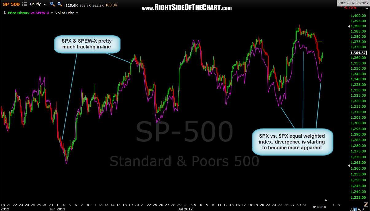
this is not an isolated example either. the recent underperformance of the small cap sector has been pretty apparent to most and i’ve also included a 60 minute chart of the S&P500 (SPX) plotted against the S&P500 equal weighted index to help illustrate the declining breadth. the SPX and it’s equal weighted counterpart had been tracking pretty tightly but we began to see the equal weighted index start to underperform towards the latter-end of the early july sell-off.