
Most who follow Right Side of the Chart will have noticed that my general market analysis as well as new trade ideas have been on the light side lately. The primary reason for that is due to the fact that although I’ve been stating this for a while now, I continue to believe that the risk/reward in the market has been very poor lately. This has also been reflected in my recent preference to avoid trading/holding broad market tracking ETFs, such as the SPY, QQQ, etc.., instead focusing on specific individual trades with the most bearish (for shorts) and bullish (for longs) chart patterns. I also continue to believe that the odds remain high that a substantial correction, quite likely a bear market (as commonly defined as a drop of 20% or greater) will begin by the end of the year, which is now less than 7 weeks away.
As I’ve stated in the past, 2013 has been the most difficult year of trading that I have experienced in years as so many sell signals & bearish technical developments that worked so well in the past failed to play out for anything more than a few relatively shallow corrections as the market just continued to grind higher, despite numerous warning signs. My currnet thoughts on the market can be summarized up from the post that I made back at the end of August in 2012 titled Predictions vs. Warnings (which I would encourage you to read by clicking this link). As the title of that post implied, I was warning that the odds of a sharp correction were high but acknowledging that at times, such as we have seen throughout the last several months, the right conditions for a correction don’t always manifest into sell-off in the same way that a tornado warning in an area does not always result in a tornado actually occurring. That has essentially been the case for the last several quarters where many of the market conditions that have historically preceded significant corrections were in place yet the market just continued to move higher with only relatively minor corrections along the way.
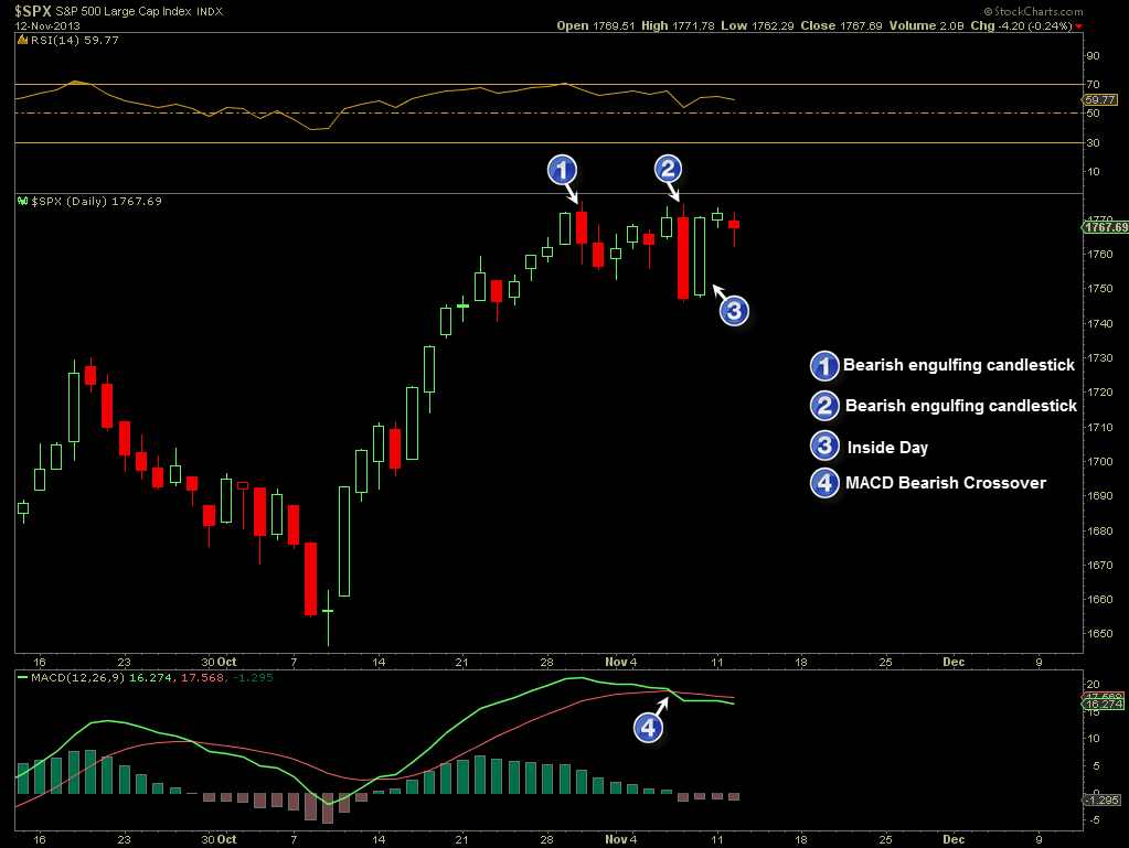
Up to now, my bearishness has been based largely on bearish developments such as bearish divergences that have been building over several months (and continue to persist) as well as extreme sentiment measures, such as put/call ratios, bull/bear spreads, record high margin interest, multi-year low short interest, etc, etc, etc… However, until recently we haven’t had many solid sell signals, i.e.- ‘events’, only bearish developments (divergences, extreme bullish sentiment, etc..) which can always continue to build. In a way, the aforementioned bearish developments could be viewed as qualitative whereas sell signals, such as a 50/200 day moving average death-cross (still pending) or this more recent string of bearish candlestick formations on the S&P 500 (chart below) are more quantitative or definitive in nature. Again, bearish divergences can theoretically continue to built indefinitely or may be ‘unwound’ in the future, should prices move high enough to negate the divergences. However, other technical events such bearish candlestick formations, bearish moving average pair crossovers, and breaks below key uptrend lines, wedges, or other support levels are quantifiable, one-time “all-or-none” technical events such as the recent price action as we’ve had on the S&P 500 as well as many other key indices and leading stocks such as AAPL. Whether or not these recent “hard” sell signals on the market play out or not is yet to be determined but at the very least, traders should be watching for any additional downside or sell signals in the coming days/weeks which would help confirm this recent series of potential topping candlestick patterns (as well as a move to new highs, which would likely negate or undo these sell signals).
Even with these recent “quantitative” sell signals on the broad market, there’s still quite a bit of work to be done from a technical perspective before we can make a solid case for aggressively shorting or removing a good deal of long exposure. Prices on all the major US indices remain above their primary uptrend lines and all intermediate and long-term trend indicators remain on buy signals/bullish at this time. However, as with the Predictions vs. Warnings post from just over a year ago (which turned out to be very timely as the markets peaked just two weeks later, followed by a roughly 10% drop in the S&P 500and a ~13% drop in the Nasdaq Composite and Russell 2000), I want to reiterate that I believe all the ingredients are currently in place for a 10%+ drop in the markets. As such, I will continue to avoid posting any long setups on momentum stocks at or near new highs while focusing primary on stocks with low valuations that appear to be bottoming and likely have less downside risk, should the markets experience a sudden and sharp decline. This includes the gold and silver stocks, steel & coal stocks, as well as select high-yielding dividend stocks. On the short side, it is still a stock picker’s market, meaning that there are plenty of attractive short patterns with specific individual stocks but shorting the broad market (via SPY, ES mini-futures, QQQ, etc…) remains difficult and I would like to see some more solid evidence of a trend reversal before adding any broad market shorts.
On a final note, I wanted to share a few excerpts from John Hussman’s most recent market commentary that was forwarded to me by a follower of the site (thanks S.C.). Although I do incorporate fundamental analysis into my longer-term market analysis as well as many of the Long-Term Trade/Investment ideas on the site, the bulk of the market analysis that I publish is based on technical analysis (charting). Hussman incorporates more fundamental analysis in managing his funds (HussmanFunds.com) and the following statements of his echo my thoughts on the what has transpired in recent years and where things are likely headed:
-
Investors who believe that history has lessons to teach should take our present concerns with significant weight, but should also recognize that tendencies that repeatedly prove reliable over complete market cycles are sometimes defied over portions of those cycles. Meanwhile, investors who are convinced that this time is different can ignore what follows. The primary reason not to listen to a word of it is that similar concerns, particularly since late-2011, have been followed by yet further market gains. If one places full weight on this recent period, and no weight on history, it follows that stocks can only advance forever.
What seems different this time, enough to revive the conclusion that “this time is different,” is faith in the Federal Reserve’s policy of quantitative easing. Though quantitative easing has no mechanistic relationship to stock prices except to make low-risk assets psychologically uncomfortable to hold, investors place far more certainty in the effectiveness of QE than can be demonstrated by either theory or evidence. The argument essentially reduces to a claim that QE makes stocks go up because “it just does.” We doubt that the perception that an easy Fed can hold stock prices up will be any more durable in the next couple of years than it was in the 2000-2002 decline or the 2007-2009 decline – both periods of persistent and aggressive Fed easing. But QE is novel, and like the internet bubble, novelty feeds imagination. Most of what investors believe about QE is imaginative.
As Ray Dalio of Bridgwater recently observed, “The dilemma the Fed faces now is that the tools currently at its disposal are pretty much used up. We think the question around the effectiveness of QE (and not the tapering, which gets all the headlines) is the big deal. In other words, we’re not worried about whether the Fed is going to hit or release the gas pedal, we’re worried about whether there’s much gas left in the tank and what will happen if there isn’t.”
While we can make our case on the basis of fact, theory, data, history, and sometimes just basic arithmetic, what we can’t do – and haven’t done well – is to disabuse perceptions. Beliefs are what they are, and are only as malleable as the minds that hold them. Like the nearly religious belief in the technology bubble, the dot-com boom, the housing bubble, and countless other bubbles across history, people are going to believe what they believe here until reality catches up in the most unpleasant way. The resilience of the market late in a bubble is part of the reason investors keep holding and hoping all the way down. In this market cycle, as in all market cycles, few investors will be able to unload their holdings to the last of the greater fools just after the market’s peak. Instead, most investors will hold all the way down, because even the initial decline will provoke the question “how much lower could it go?” It has always been that way.
The problem with bubbles is that they force one to decide whether to look like an idiot before the peak, or an idiot after the peak. There’s no calling the top, and most of the signals that have been most historically useful for that purpose have been blaring red since late-2011.
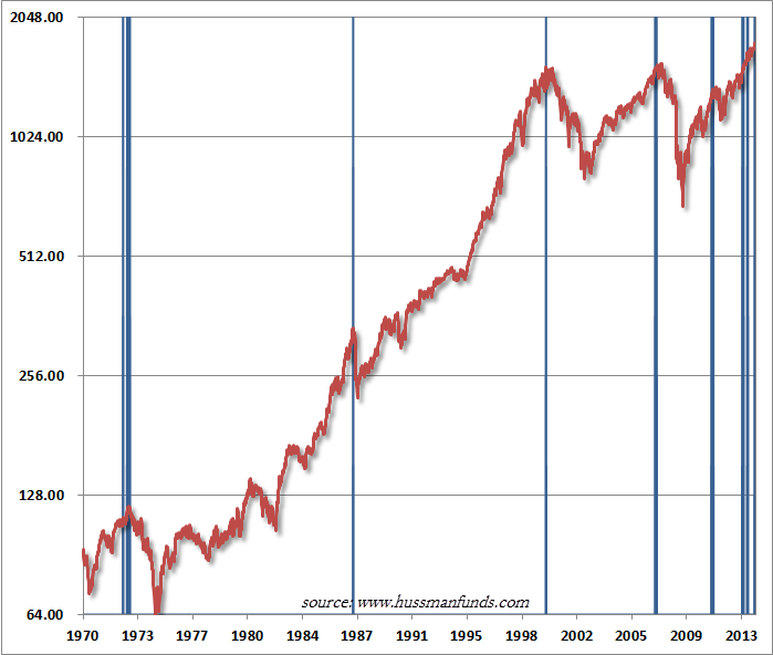 Hussman then goes on to discuss the following conditions in which the blue bars in this chart depict the complete set of instances since 1970 when these conditions have been observed:
1. S&P 500 Index overvalued, with the Shiller P/E (S&P 500 divided by the 10-year average of inflation-adjusted earnings) greater than 18. The present multiple is actually 25.
2. S&P 500 Index overbought, with the index more than 7% above its 52-week smoothing, at least 50% above its 4-year low, and within 3% of its upper Bollinger bands (2 standard deviations above the 20-period moving average) at daily, weekly, and monthly resolutions. Presently, the S&P 500 is either at or slightly through each of those bands.
3. Investor sentiment overbullish (Investors Intelligence), with the 2-week average of advisory bulls greater than 52% and bearishness below 28%. The most recent weekly figures were 55.2% vs. 15.6%. The sentiment figures we use for 1929 are imputed using the extent and volatility of prior market movements, which explains a significant amount of variation in investor sentiment over time.
4. Yields rising, with the 10-year Treasury yield higher than 6 months earlier.
Hussman’s entire weekly commentary, which I would suggest viewing, can be viewed by clicking here. In the commentary, Hussman also discussed a chart of the S&P 500 overlaid with a log periodic bubble with finite-time singularity, which presents and interesting & compelling visual, also making the case for the potential occurrence of a blow-off top in the market in the very near future.