
Since the May 30th post titled Junk Bond Spreads Flashing a Warning Sign for Equities, the divergences between the normal (inverse) correlation between equities and junk bond credit spreads has continued to build. This first chart plots the BofA Merrill Lynch US High Yield CCC or below (aka- junk bonds) Option-Adjust Spread vs. the S&P 500. The nearly lock-step inverse correlation between the two began disconnecting shortly before that previous post about 7 weeks ago with the SPX continuing to move higher along with a sharp rise in junk bond OAS’s (as well as a sharp drop in junk bond prices).
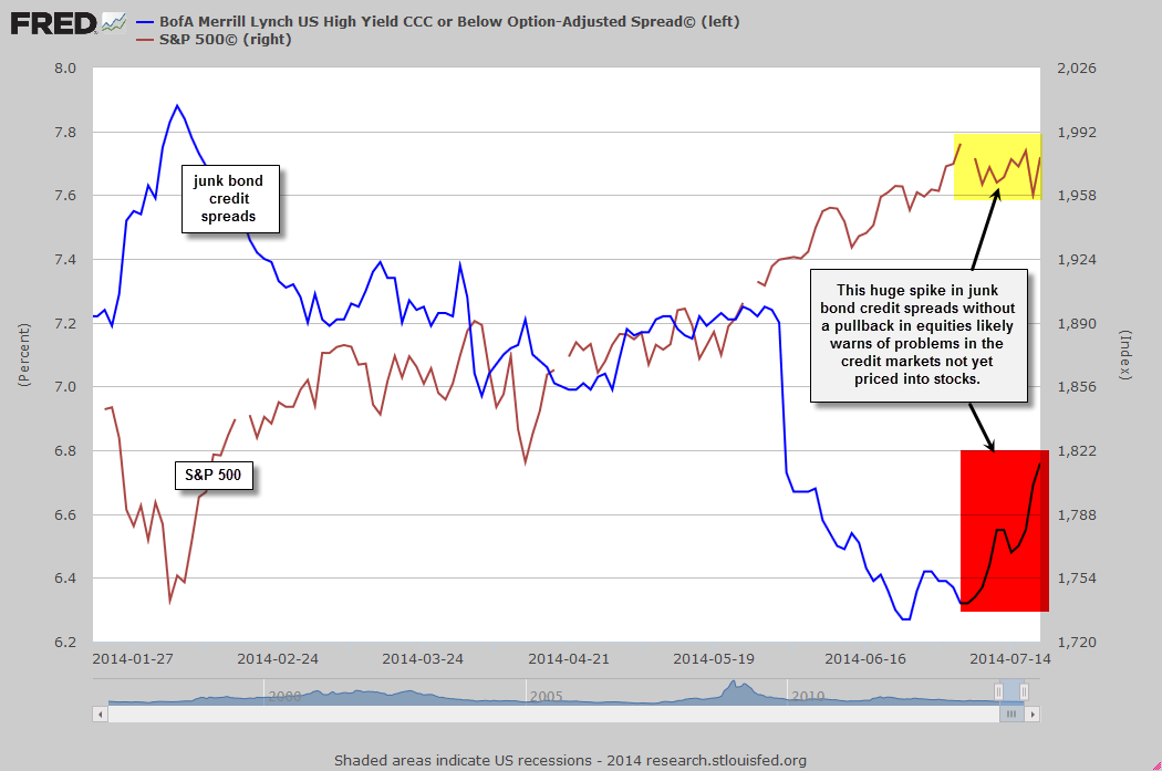
Junk Bond OAS vs $SPX July 21st
Obviously, as the perceived credit risk of high-yield bond issues increases, so do the yields on the underlying bonds. High-yield (aka “junk bonds”) bond prices have typically had a very strong correlation with stock prices as the credit quality, or ability to make interest & principal payments on those bonds, is largely dependent on the business cycle. Default rates on junk bonds typically spike during recessions or contractions & subside during economic expansions. In the chart below, I plotted the S&P 500 ($SPX) above the ratio of the $SPX to JNK, an ETF which tracks the Barclays High Yield Bond Market (i.e.- junk bond prices).
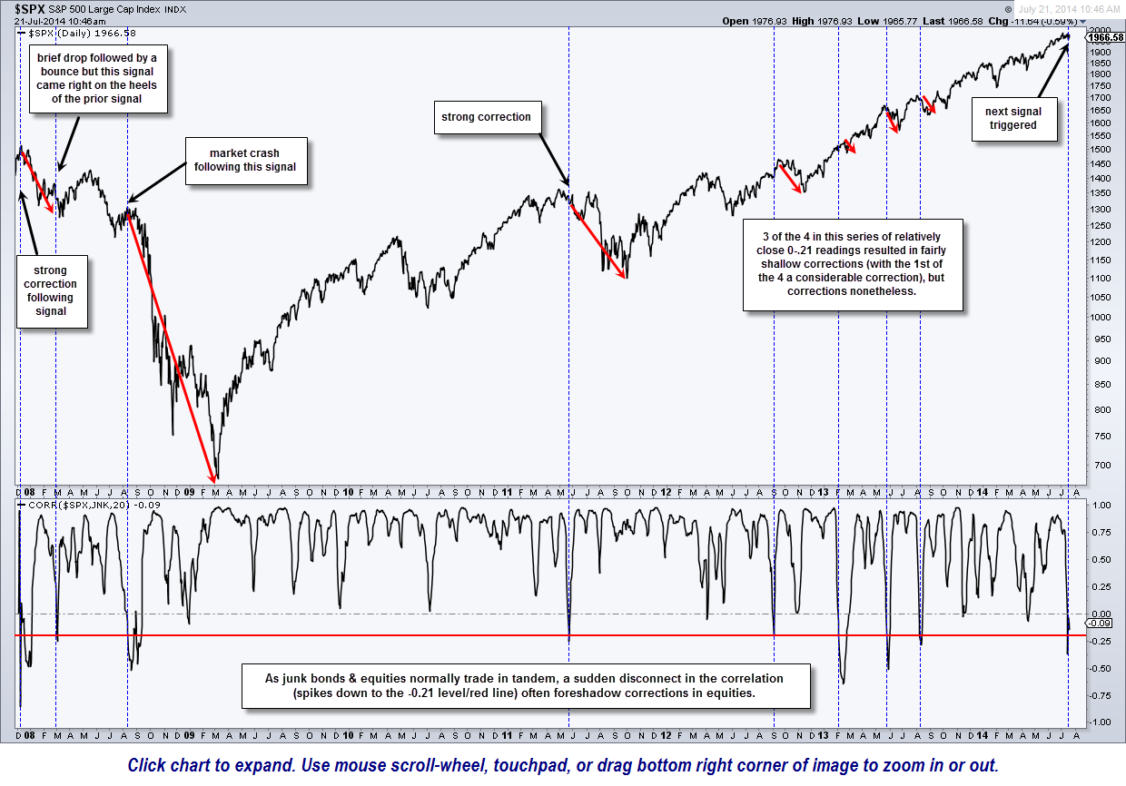
$SPX vs. JNK ratio sell signals
The horizontal red line on the ratio below was placed at the -0.21 level. The vertical dashed blue lines show each time the typically very tight correlation below the $SPX & JNK fell to the -0.21 level (a fairly strong negative correlation). I could only go back as far as the trading history on JNK, which was, leave it to the suits on Wall Street, just as the great bear market of 2007-2009 was kicking off. JNK, as well as the other popular junk bond ETF HYG, which was also rolled out at the very end of the last bull market, fell by about 50% from where the first began trading…. basically in lock-step with the stock market.
As this chart below highlights, every time the $SPX/JNK ratio fell to the -0.21 level, a correction in equities followed with very little, if any, lag time. The one “almost” exception would be the second signal on this chart which came in the beginning of March 2008. That signal was indeed immediately followed by a sharp but relatively quick drop in the $SPX, then quickly followed by a considerable rally. However, that signal also came very close on the heels of a previous sell signal triggered in early Dec 2007 which has resulted in a very strong correction, hence, the early March signal was more of a follow-up signal that came while a correction was already well in progress & with equities already quite oversold.
Admittedly, this is a relatively small sampling pool of sell signals on this nearly 7 year chart. We also had a cluster of 3 sell signals in 2013 that only played out for relatively shallow corrections although those three signals came on the heels of the Sept 2012 signal , which was immediately followed by a 9% correction in the S&P 500 and a nearly 12% drop in the Nasdaq Composite. The signal prior to that came just days after the May 2011 market peak, which kicked off drops of over 20% (the technical definition of a bear market) in both the S&P 500 & Nasdaq Composite.
Only time will tell whether or not this current drop in the $SPX/JNK ratio to the -0.21 level foreshadows another correction in the the market or not. However, the recent disconnect between stock prices & credit spreads, taken together with the recent trend of deteriorating macro-economic data (GDP, housing starts, etc…) as well as numerous extremes in complacency measures (put/call ratios, short interest, bullish vs. bearish sentiment, etc…), and overbought conditions all continue to damper the near-term outlook for equities despite the powerful uptrend that has been in place for a long while now.