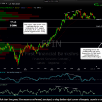
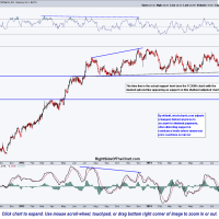
FFIN (First Financial Bankshares) is just one more in a long list of attractive short candidates in the regional banking sector. In fact, the chart pattern on FFIN looks very similar to the HIBB Active Short Trade with a similar topping pattern above a well-defined support shelf with a substantial thin zone below which is likely to be filled quickly once/if prices break support (as they did on HIBB). FFIN will trigger a short entry below the 28.25 horizontal support level with a suggested stop above 29.10. The sole profit target at this time is 24.84, which would provide a 12% gain if hit, although this trade has the potential to morph into a much longer-term swing short trade with an ultimate downside target around the 18.70 level, depending on how both FFIN & the broad markets trade going forward.
- FFIN daily Aug 14th
- FFIN 2-day Aug 14th
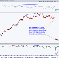
- FFIN daily sc.com adjusted
- FFIN daily sc.com unadjusted
I’ve included a 2-year, daily chart as well as a 4-year, 2-day period chart from TC2000 along with both the normal (adjusted) and unadjusted 2-year daily charts from stockcharts.com to help illustrate the shortcomings of the stockcharts.com charting platform. Stockcharts.com uses a default of plotting all historical stock prices adjusted for dividend payments instead of using the actual levels where trades took place in the past. The result is an inaccurate representation of historical prices when viewing the charts of dividend paying stocks. These distortions become more pronounced the longer the time period viewed and/or the higher the yield (past dividend payments) on the stock or ETF that you are viewing. The go-around solution for this issue is to add an underscore (“_”) before the ticker symbol which will render a chart showing the “unadjusted” price history of the security. This works fine unless the stock has split during the time period you are viewing as stockcharts does not “unadjust” for the change in price following the stock split.
TC2000, along with the free version, freestockcharts.com, by default will show stock price history that is unadjusted for dividend payments but adjusted for stock splits, which results in a true picture of the past trading history of the security… which is the basis for technical analysis & essential when trading IMO. FFIV is a good example of that difference as the TC2000 chart shows an extremely well-defined horizontal support level with numerous reactions while the default stockcharts.com chart shows a slightly up-sloping (dashed) support line over the same period of time. There are several reasons that I subscribe to both charting services with one of those reasons is the ability to provide users of Right Side of the Chart links to the live, annotated charts, a feature that stockcharts.com provides while TC2000 does not. Each of these charting platforms has their own pros and cons but when trading and especially setting trendline alerts, I will use TC2000 along with several other streaming real-time platforms from some of the various brokers that I use.


