remember, the NDX has clearly been the leading index throughout this entire bull market off the 2009 lows and AAPL, being the largest component of the NDX, has been the lead sled dog for that index. therefore, if you are trying to navigate and trade your way through this current chop-n-slop (more power to you), you would be remiss not to keep AAPL on your radar at all times.
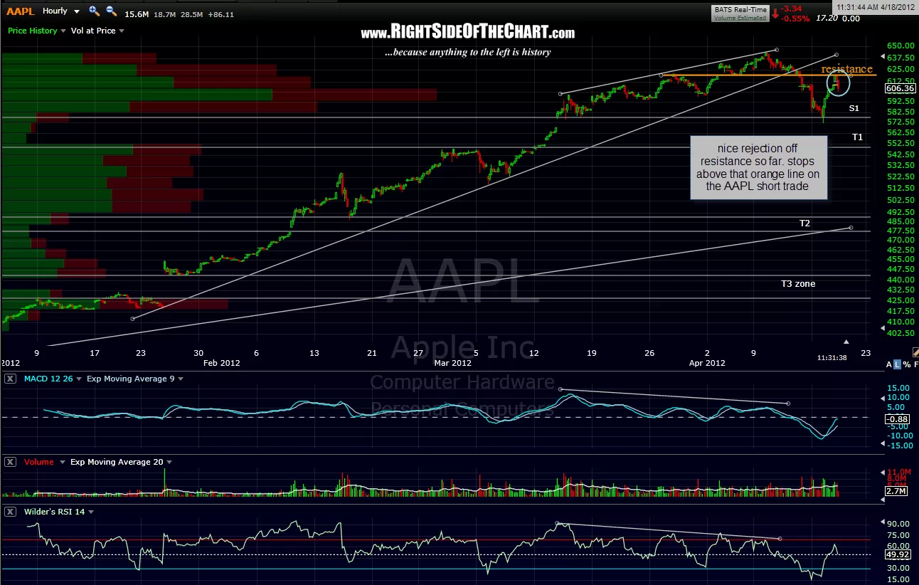
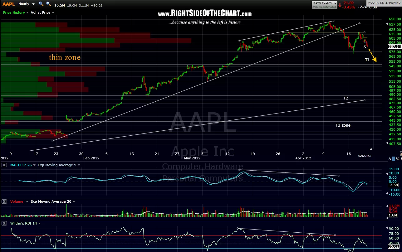
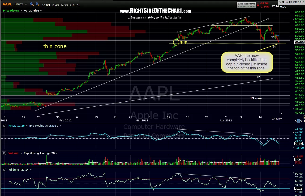
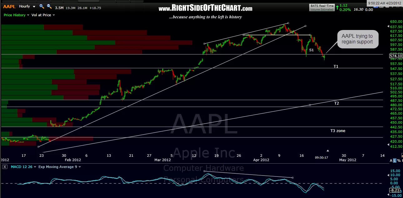
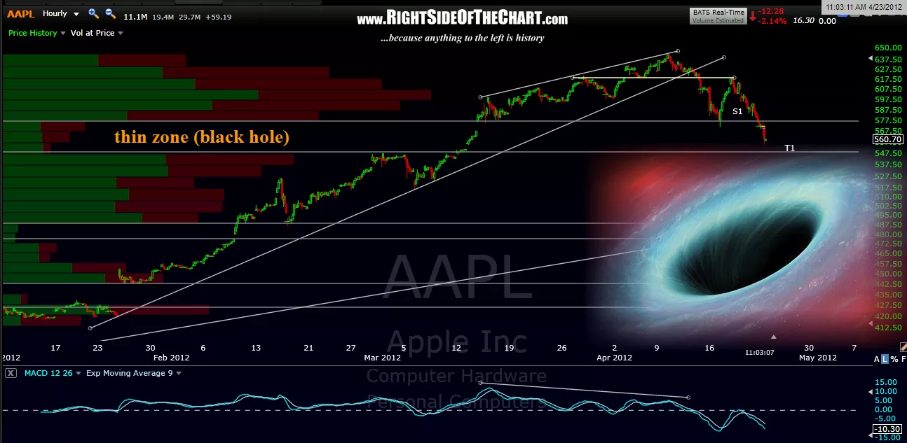
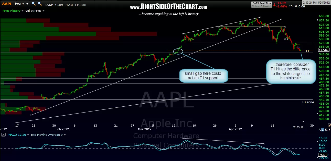
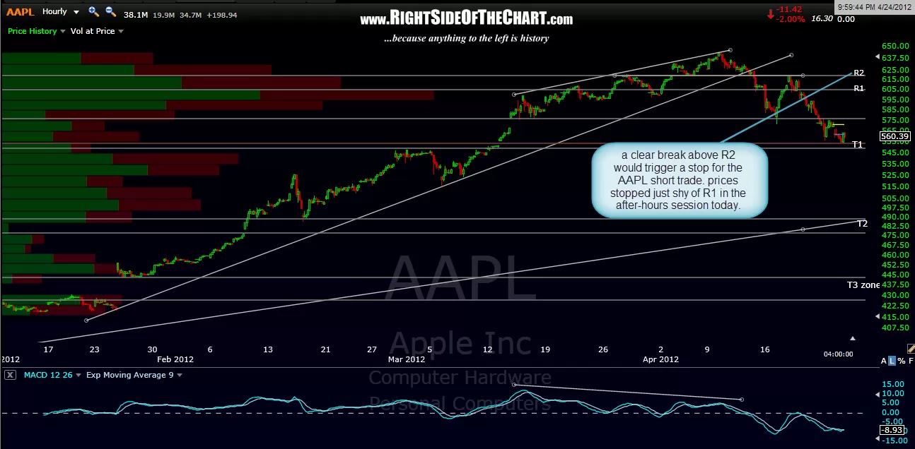
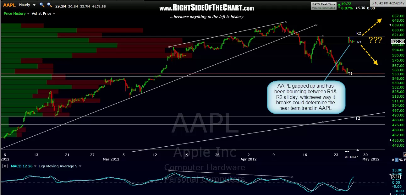
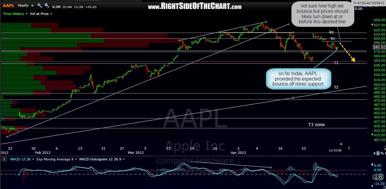
here’s the string of the current series of AAPL 60 minute charts posted here in order from the first to the most recent. i added some notes to the most recent chart including the fact that the bounce in the market from the lows today was most likely a result of AAPL finding support on the previously posted resistance area from the most recent 60 minute charts. although there are time where i will actively day-trade, aiming to profit both long and short off the intraday turns in the market, i’m tuning out the short-term noise right now but figured that i point out those levels in AAPL for those that are actively trading right now. most recent chart also shows my current preferred scenario for AAPL, which should impact the markets if it does play out. keep in mind that these are only the recent string of 60 minute charts for AAPL. the initial short entry and plunge following the break of that rising wedge was posted before the breakdown on the 120 minute and 4-hour charts.
note: when viewing a string of charts on this site, you can click anywhere on the chart just off center to move forward to the next chart or backwards to the previous. when you move your cursor off center to one side or the other, you will see a small arrow pop up on the outside edge of the chart. clicking on the chart while that arrow appears will advance forward or bring you back to the previous chart.