It is commonly known that the Nasdaq 100 has, by a wide margin, been the leading major US index during the current bull market. Not only has the Nasdaq 100 surpassed the S&P 500 in gains but it is also over three months older than the bull market in the S&P 500. The $NDX bottomed in November 2008 and has returned a whopping 267% through the most recent peak back on March 6th. That compares to a 185% return for the $SPX which bottomed in March 2009 and (so far) peaked on April 4th.
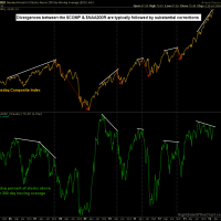
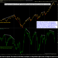
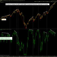
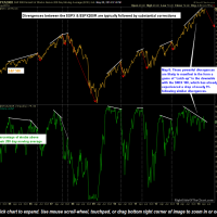
A technical case was made earlier today as to why my expectation is for the $SPX to begin moving lower soon, following the recent sell-offs in the $NDX, $COMPQ, & $RUT vs. those indices moving sharply higher to close the gap and catch up with the $SPX. The charts below help to formulate my reasoning that an imminent correction in the $SPX is likely to begin in the coming days/weeks. Highlighted are the divergences between the Nasdaq Composite Index and the Percentage of Stocks Above Their 200-day Moving Average ($NAA200R) as well as the S&P500 vs. the $SPXA200R. The first chart of each index comparison are the original charts posted on March 7th, literally just one day after the $NDX & $COMPQ topped (click here to view the March 7th, Divergences Abound post), followed by today’s updated charts.
- $NAA200R March 7th
- $NAA200R May 8th
- $SPXA200R March 7th
- $SPXA200R May 8th
These charts show how those divergences have indeed played out (or only just begun to play out) on the Nasdaq yet the divergences on the $SPX have only grown larger, an even more bearish technical development. Remember that the expected scope of a move is typically commensurate with the scope of the technical pattern or divergences in place. For example, a bullish falling wedge pattern formed over a few weeks might only project for an 8% move in the stock, should the pattern breakout while a falling wedge formed over many months and a much larger price drop in the stock might have a technical projection for a price target well into the double digits. Although the current bearish divergences on the $SPX are inline with a couple of the previous divergences shown on that chart, it is the very steep angle of the rise in price that is concerning. Just as the duration of divergences help indicate the strength of the ensuing trend reversal, so does the differential between the slope of the trendlines, i.e.- the steeper the divergence, the more powerful the expectation for a reversal.


