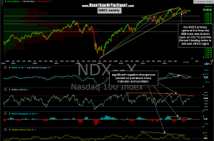
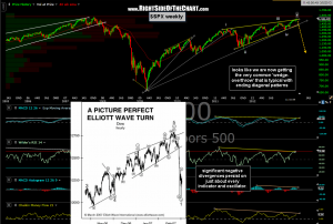
As of today, the 60 min SPY & QQQ primary scenario has been eliminated and the alternative scenario is now in play. The new alternative scenario would be that my broad market analysis is just plain wrong and we will continue to go much higher (another 10%+ of gains) before much lower ( a drop of 10%+). However, I continue to feel very strong that the next 10%++ from current levels will be to the downside. That view is largely (although not entirely) based on the longer-term technical structure of the major indices. In fact, today we have what could quite possibly turn out to be the initial stages of a brief over-throw of the large bearish rising wedge pattern (ending diagonal) on the $SPX. In fact, wedge over-throws, although not absolutely required, are very common events during the final thrust on the final wave in the ending diagonal pattern. As discussed repeatedly, this pattern is very large and has been forming over the last two years and as such, is not something that can be timed down to the day or minute using the intraday or even daily charts.
 Now that prices are starting to break above the top of the wedge, the next confirmation signal would be prices moving back inside the wedge. Keep in mind that the over-throw itself could last for days or even weeks or we could reverse at anytime. Until we get some solid signs of a reversal or some technical evidence that these bearish patterns have been negated (i.e.-prices continue to move much higher with the indicators and oscillators below making new higher highs, thereby taking out the negative divergences), I would suggest continuing to trade the best looking patterns, long or short, versus trying to “game” the broad market. Despite all the “NEW HIGHS!!” cheerleading on bubble-TV recently, this market has gone basically nowhere in the last 5 months (the S&P 500 is up roughly 4 1/2% since mid Sept while the Nasdaq 100 is down nearly 3% since then).
 As you can see, the $NDX weekly chart (above) is still below it’s Sept ’12 highs and if prices were to turn down before making a new high and then go on to take out their Nov 16th lows (a confirmed series of lower highs and lower lows), that would sharply increase the odds that the “former” leading index is in the early stages of a new cyclical bear market that began on Sept 21, 2012. As far as the $SPX, this weekly chart (right) speaks volumes to me, even without the “Picture Perfect Elliot Wave Turn” example from Elliot Wave International (DOW hourly chart from 2007). I didn’t bother to overlay all the a-b-c three sub-wave patterns but did label the 5 waves (i-v) within the pattern. Note the wedge overthrown on the final wave V up back in 2007 .

