
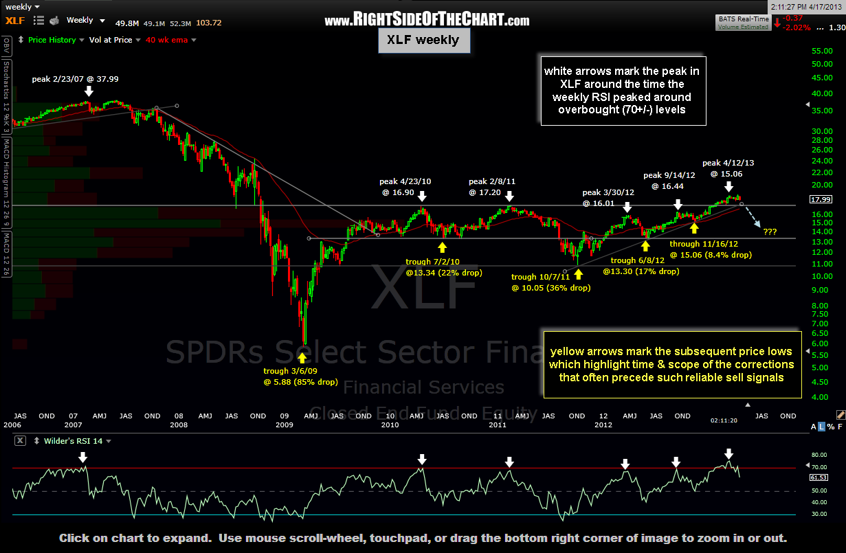
 I’ve shared this XLF chart recently, highlighting how the overbought readings on the weekly RSI have historically preceded major corrections in the financial sector. However, I took the time to annotate this updated chart with the price peaks that surrounded those signals as well as the subsequent trough (lows) that ensued, included the total percent drop in XLF each time. I do this primarily to impress upon the importance of longer-term sell signals.
There is often a propensity for novice traders or investors to get lost in the shorter-term charts, typically the daily time frame while missing out on the “bigger picture”. This often leads to booking relatively shallow gains and leaving a lot of potential profits on the table. As often discussed here, I will typically employ a top-down approach when charting, starting out on the weekly or even monthly time frames in order to help formula a bigger-picture bias of where prices are likely headed and then progressively stepping or zooming down to the daily and even intraday charts in order to hone down my entry and exits points.
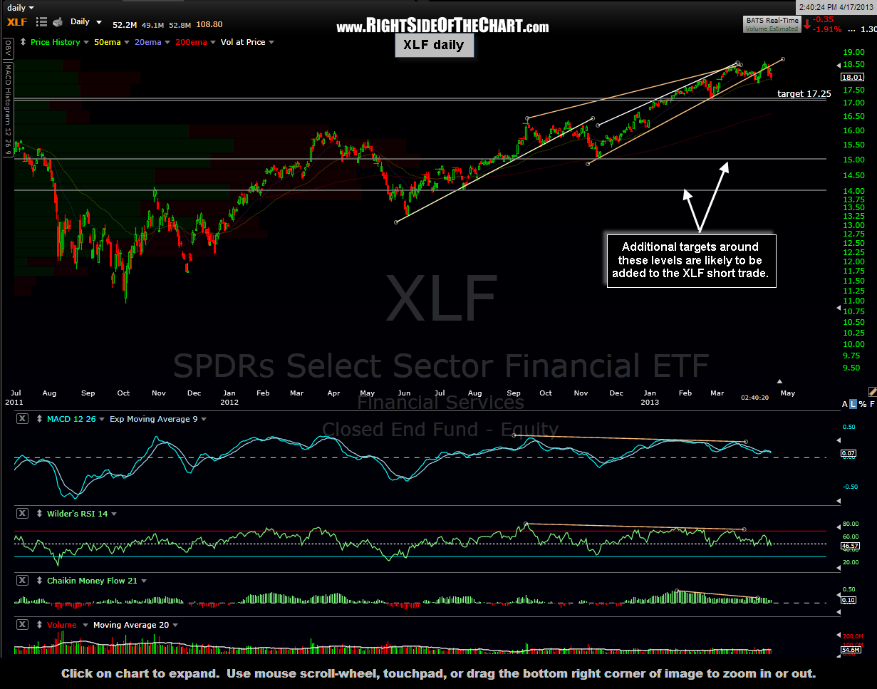 I wanted to share this as I update the XLF short trade because it sheds light on my tthough process regarding this trade. The current XLF short is based off the daily charts and at this time, only has one target (17.25) listed, which would only be a 5.5% gain if hit (or 2x to 3x that if using SKF or FAZ). Based on my longer-term views on the market and the scope and duration of the previous RSI sell signals on this weekly XLF chart below, I will most likely add additional downside targets to this trade soon (note: I always extend/add targets to a trade in advance of the final target being hit). The updated daily & weekly charts for XLF are shown above. I also plan to update the charts for BAC, JPM, C, & WFC later this afternoon.