For those who already viewed the previous post & chart on the YZC Long Trade Idea, which triggered an entry today, please note that the previous chart has been replaced. By default, StockCharts.com modifies stock charts to adjust for dividend payments. For non-dividend paying stocks and stocks with very small dividends this is normally not an issue. However, when viewing charts of stocks that pay a substantial dividend, such as YZC, adjusting the price history of the stock to account for dividend payments gives a distorted historical picture (chart) of the stock, especially when viewed over a long period of time. Most charting platforms, at least those that I use, do not make this adjustment and hence, tell a difference story when drawing trendlines, price patterns or horizontal support & resistance lines. My preference is to use the unadjusted price when charting as it shows the “pure” or actual historical price levels where the transactions took place as that is the essence of using technical analysis to help predict future price movements.
On the previously posted charts of YZC I had neglected to use the unadjusted stock price. To do so with StockCharts.com, you must add an underscore “_” before the ticker symbol when viewing a chart. I just noticed the relatively large disparity between the first target (downtrend line) on the adjusted vs. unadjusted chart while viewing YZC on a different charting program. Both the static chart as well as the live chart link have been corrected in the previous post below. Remember, when an uptrend or downtrend line is used a price target, as in the case of YZC, I can not provide a suggested sell (or cover) level as the price levels on trendlines are dynamic (changing every day) vs. horizontal support & resistance levels, which are static.
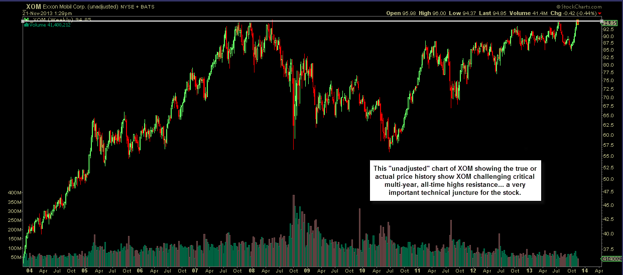
These two charts of XOM (Exxon Mobil Corp) are a good example of how these alternative pricing methods can tell two completely different stories from the perspective of using technical analysis. The first chart is the default (prices adjusted for dividends) that one gets when typing in XOM at stockcharts.com. This chart tells about as bullish a story as one could look for on a stock with XOM making a solid breakout above key resistance while going on to successfully backtest that level (now support) since the breakout in mid-2012 and recently powering onto new all-time highs:
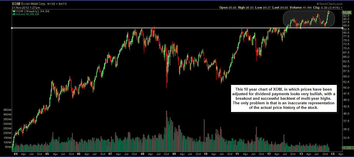
This next chart is also a 10 year weekly chart of XOM from StockCharts.com except using the “_” before the symbol to show the real or actual price history of where the stock has traded in the past. As you can see, this chart tells a completely different story, one of a stock that is recently up against significant price resistance of the all-time highs that the stock failed to surmount on multiple attempts back in 2007-2008 and again more recently in mid to late July.