Here’s an overview of the US Dollar Index, $DXY, starting with the big picture (monthly chart), then zooming down to the weekly and daily time frames. Looking at the monthly chart below, we can see that prices are sitting right on top of the uptrend line that began back in May 2011. Obviously, a solid monthly close below that trendline would be bearish but if that level holds and prices move higher, the next targets (on this time frame) would be the July ’12 highs, then the orange downtrend line. Also note the precarious position of the MACD, which is sitting just above the zero line and threatening a bearish cross-over to boot. The ROC 12 is also close to a potential longer-term sell signal as it has been declining and sits just barely in positive territory (negative readings have historically accompanied significant downtrends). While neither of these indicators have triggered sell signals yet, they are something to watch for, especially if prices were to break below the uptrend line.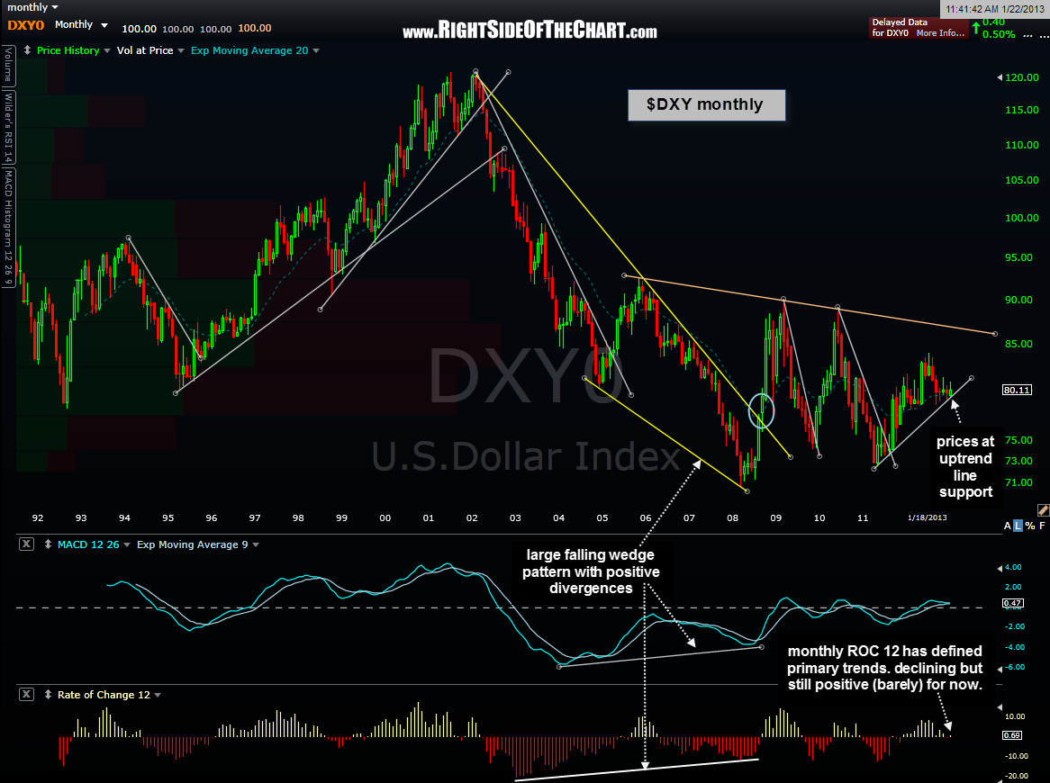
Moving down to the weekly time frame, we can see that prices are sitting just above the orange trendline that the index has found support on throughout 2012. This support line also ended the impulsive selling following the rising wedge pattern (blue lines) breakdown which occurred in late August. A break below the orange uptrend line would be bearish but until/unless that happens, the dollar remains in an uptrend that began with the lows put in back in May 2011.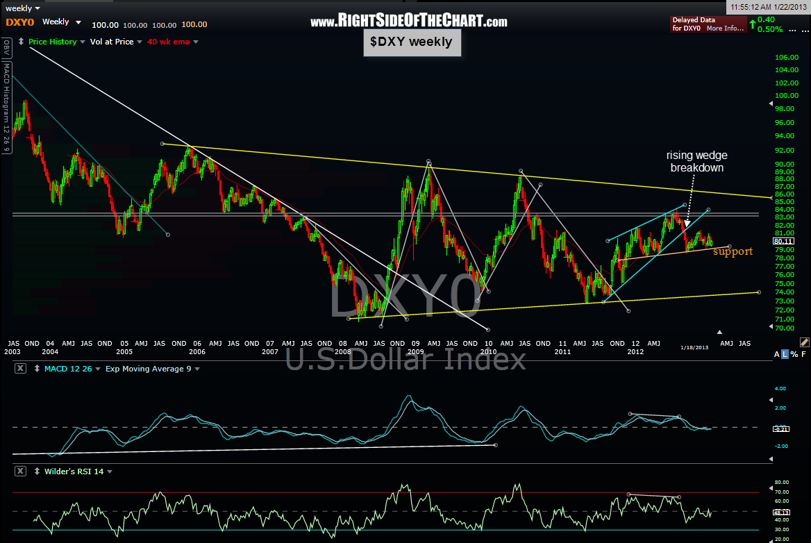
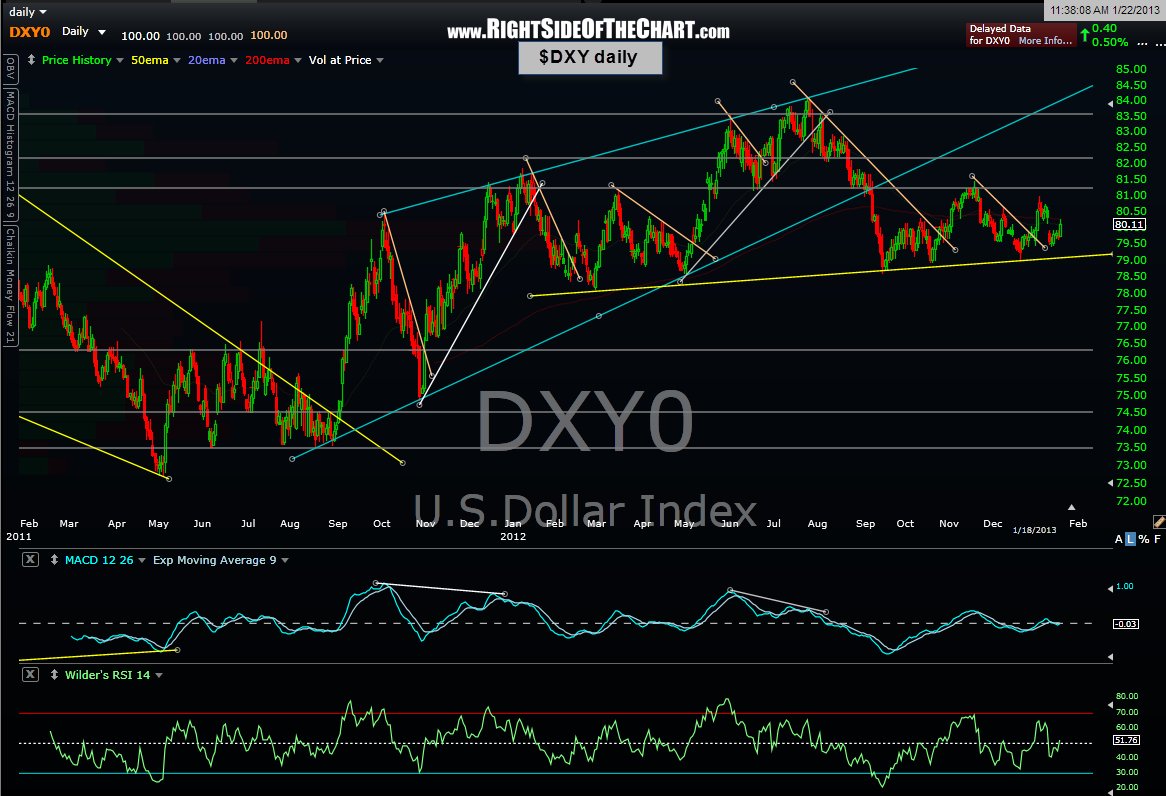
Finally, zooming down to the daily chart we pretty much see the same key levels as the weekly chart (recently broken blue bearish rising wedge pattern; key yellow support line) along with a few more overhead resistance levels that the index must contend with, assuming that it continues to move higher.