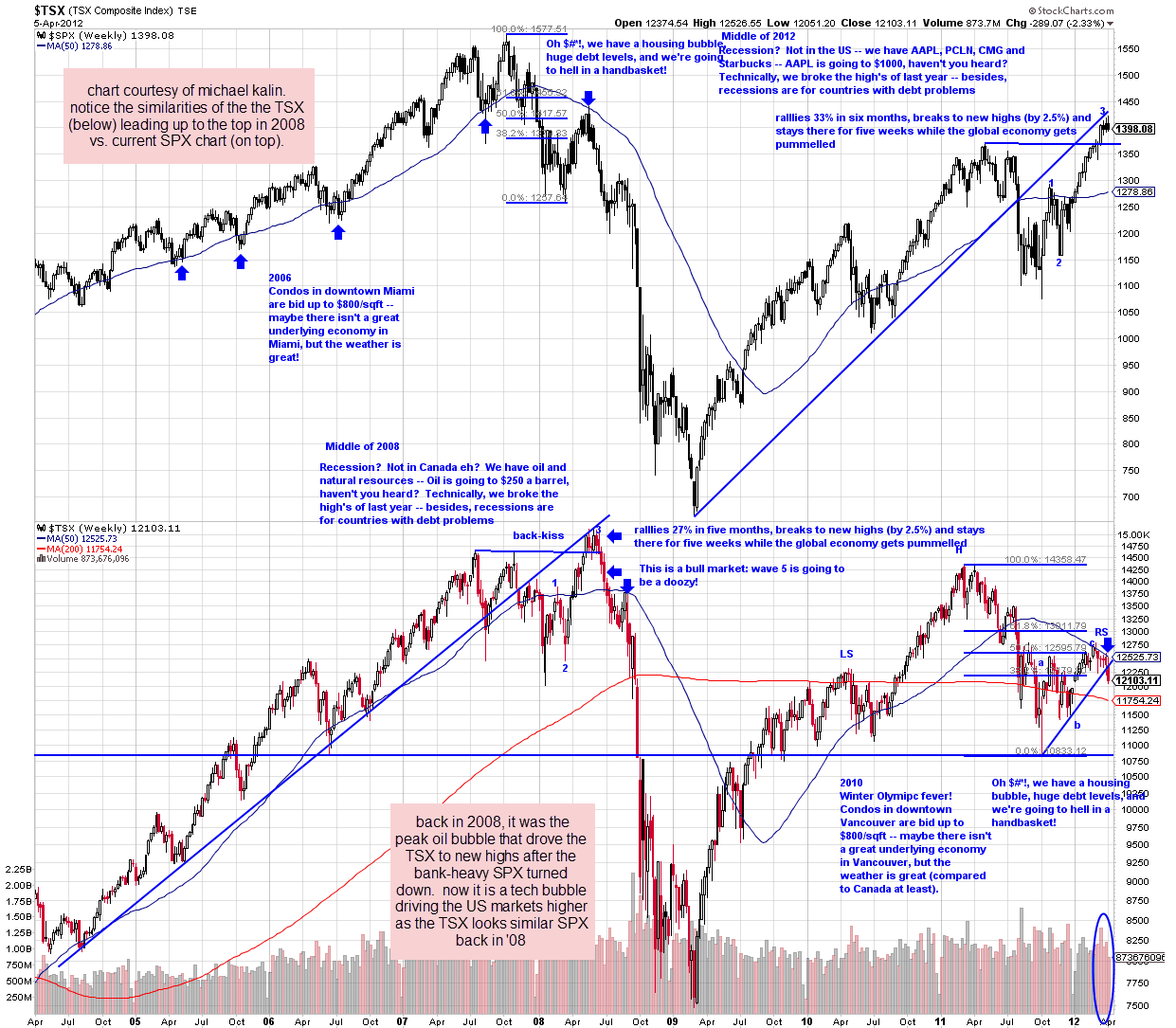
i just arrived back in town and as it’s getting pretty late, i’ll start posting more actively tomorrow morning. until then, here’s a chart that was sent to me by a fellow trader, michael kalin, just before i left town for the weekend highlighting some very similar patterns between the SPX leading up to current levels with the move in the TSX leading up to it’s peak in 2008. peak oil was the bubble-de-jour back then while technology has recently powered the US markets to new highs throughout most of the recent bull market.
Results for {phrase} ({results_count} of {results_count_total})
Displaying {results_count} results of {results_count_total}


