Of the two main methodologies used to predict the future direction on the price of a security, an index or even the economy, which is better- Technical Analysis or Fundamental Analysis? If I were forced to only use one in my market analysis and security selection, technical analysis would win hands down. Fortunately, I’m free to use (and do use) both TA & FA as both methodologies definitely have their pros and cons. Typically, fundamental analysis (FA) is used by those with longer-term time frames such as investors or economists whereas TA has useful applications in predicting both short-term price movements in securities and markets as well as long-term trends.
When it comes to security selection (aka- “stock picking”), I give a much higher weighting to TA over FA. A recent example of this would be AAPL, which was added as a short trade here on Aug 27th at 679.99, a mere 3 1/2% & 3 1/2 weeks before the stock hit it’s all-time high. Keep in mind at the time that the fundamentals, both current & forward looking (according to the vast majority of analysts, pundits and other misc. experts, most of whom use FA in formulating their opinion) could not have been more bullish. Of course, as the basis for the short entry, the charts (TA) were clearly telling another, completely different story on where the stock was likely headed.
Now let’s turn our attention to the macro-economic picture of the US economy. As I mentioned recently, there is most certainly a bullish case to be made right now (or really just about at any time) with the US stock market and although I could spend a little extra time in making a case for both sides (longer-term bullish and the longer-term bearish outlook for 2013), my preference for now remains to support the longer-term bearish case. Therefore, let’s take a quick look at some of the fundamentals of the US economy while applying simple TA to those charts.
As I look at the economic calendar (link located under “Tools of the Trade” on the right-hand sidebar of RSOTC.com), I can see that we have several key economic reports scheduled to be released this week. Let’s take a quick look at those charts and the simple annotations that I made to each one (trendlines, notes, etc..). Several of these reports are not accompanied by charts so will not be discussed and I’m only going to show the charts that directly show economic activity. This would exclude charts such as consumer confidence (which is a coincident indicator at best, and therefore useless IMO); housing (while home values have an effect on consumer confidence and the ‘wealth effect’, this is not a direct measure of the growth or contraction in the economy such as GDP or the various manufacturing indexes); jobless claims (which is widely acknowledged that when you hit such a high unemployment level as we have, there is pretty much but nowhere but down for the NEW claims number to trend plus, not a measure of expansion or contraction in the economy per se).
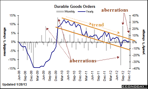
That brings us to those key reports due out this week, starting with the Durable Goods Orders that was released at 8:30am ET today (first chart below). By adding trendlines (TA) to these economic charts (FA) we can see that the rate of growth in the US economy has clearly been slowing (i.e.-trending lower) for at least the last two years and many of these key measures have now fallen to at or near levels not seen since the beginning of the Great Recession and start of the bear market in late 2007. Something that I point out on today’s Durable Goods Orders report are the aberrations, like today’s “bullish” reading of +4.6% vs. the consensus of on +1.6%. Bullish? Well certainly…. if that trend continues. However, the reason that this chart shows the yearly average (blue line) along with the month to month reading (grey bars) is to smooth out the aberrations. In effect, this is no different than using moving averages on a stock chart to help tune out the day to day, week to week, or month to month price swings and therefore help in identifying the overall trend of the stock. As you can see on this Durable Goods chart, that important measure of economic activity has been in a clear downtrend (channel) for over 2 1/2 years now and is flirting with contraction territory.
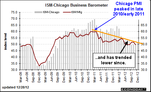
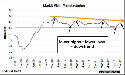
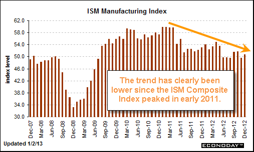
The remainder of the charts are self-explanatory and once again, are due to be updated later this week. Downtrends don’t remain in place indefinitely and therefore I will continue to monitor the trends in these important economic indicators for signs of reversal. Just like charting an individual security or index, once a multi-year downtrend line is broken to the upside the odds sharply increase that a new uptrend may have begun. I would image that if this were to happen on these economic indicators soon, the stock market will have likely put the current key overhead resistance levels and longer-term divergences comfortably in the rear-view mirror and as such, look more bullish from both a technical and fundamental perspective. Until then, a potentially dangerous disconnect between rising equity prices against a back-drop of deteriorating economic fundamentals continues to build.