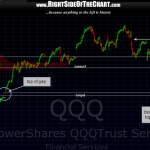
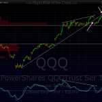
here’s the update to the last 15 minute chart i posted back on march 23rd showing the downside target for the Q’s. just the other day, i wrote about how prices in a downtrend will usually find support on the top or the bottom of a gap. this is that chart updated with a 30 min view and it shows how perfectly the Q’s hit the top of that gap and never looked back. another thing to note on this chart is how quickly prices fell once they entered that thin zone that was highlighted in that original chart. more often than not, we will see those thin zones back-filled if prices break into the zone. with AAPL yesterday, the drop into that thin zone lasted about 1 min at the opening bell but it quickly regained support and AAPL just barely managed falling into a pit of quicksand that would have likely pulled it to T1.
one thing that i will note on this 30 min QQQ chart is the fact that prices were able to blast right through the top of that thin zone is bullish. in fact, you can even see how prices fell back to successfully retest that level (marked support) at today’s lows, another check in the bullish column so far for the Q’s. a check the bear column includes the fact that the Q’s “ain’t goin’ nowhere” without the rest of the market meaning that the $SPX, $RUT and mid-caps are still below key resistance and therefore, the short-term downtrends for those indexes are still intact and not at risk at this point. either the $NDX starts dragging the rest of the market up with it, or those other indexes will pull it back down like a cinder block chained to it’s leg. updated 30 min first, previous 15 min chart second.


