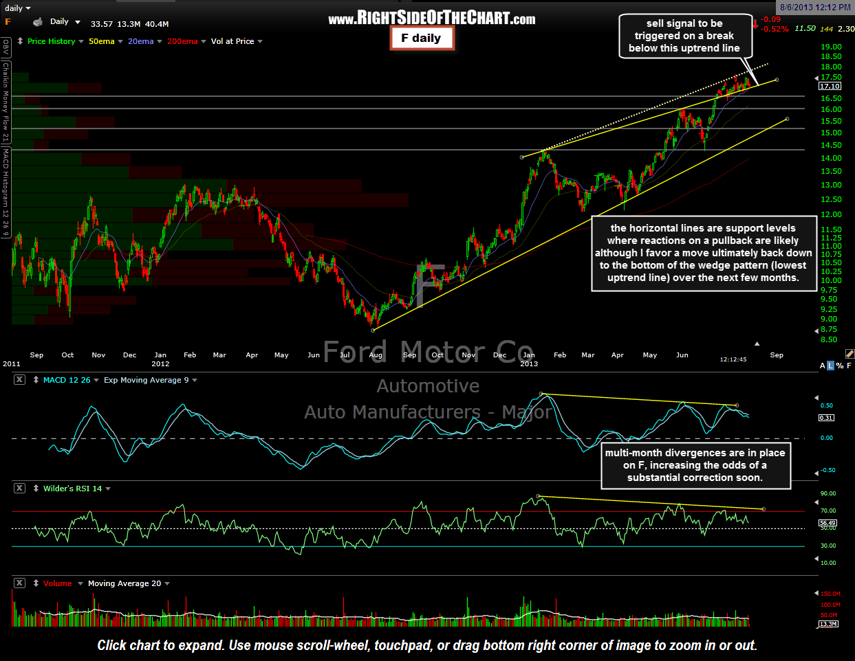
 I was asked my thoughts on F and as this is a widely held/followed stock, I figures that I’d share the chart for anyone interested. I show F in a large bearish rising wedge pattern with two possible upper trendlines. The solid line represents the top a more typical shaped wedge pattern whereby prices recently popped above the wedge on July 8th and have been skating along the top of the pattern since. A close back inside the wedge would likely bring prices ultimately back down to the bottom of the pattern (lowest uptrend line). I’ve also drawn an alternative uptrend line although my focus is on the solid line as there are numerous reactions from above and below which help to validate it. Regardless of which trendlines are used, the stock has been clearly building negative divergences since the beginning of the year as prices make higher highs while the MACD & RSI continue to print a series of lower highs, a warning sign that the bull run in F is likely running out of steam.
