
Despite a blow-out quarter, AAPL (Apple Inc.) managed to accomplish two technical feats today that significantly increase the odds that my initial downside target & possibly the second target (on the daily chart from the Live Charts page) will be hit in the coming weeks.
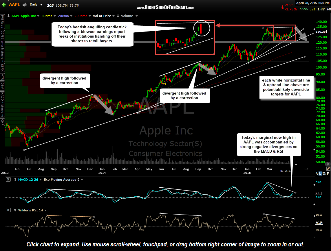
AAPL daily April 28th
The first important technical event that occurred today in the wake of AAPL’s rosy earnings report and guidance last night was the fact that it drove the stock gap up to a marginal new high today. What that new high did, *besides suck in retail buyers as institutions took advantage of the earnings release to unload their shares, (*that part just being speculation & my “read” or best guess as to what happened) was to put in place some potentially strong divergences on most of the price & momentum indicators & oscillators, such as the MACD, RSI & CMF… bearish event #1 (and a fact).
From there, AAPL was sold into immediately following that opening pop, failing to even retest those opening highs, while closing down just off today’s lows. That price action put in place a bearish engulfing candlestick which is an inherently bearish candlestick formed (bearish event #2, also a fact) after an extended uptrend, often signaling at least a short-term trend reversal. As with most two-day candlestick patterns (the first day being yesterday’s small doji candlestick that was engulfed today), I would like to see some follow-up bearish price action, such as a red close on AAPL tomorrow.
Bearish engulfing candlestick patterns, or just about any 2-day candlestick for that matter, are best ignored unless accompanied by other support technical evidence. For weeks & even months now I have pointed out the divergences that have been building on both the weekly & daily time frames on AAPL. The two charts below are the same charts available on the Live Charts page, located under Market Leading Stocks.
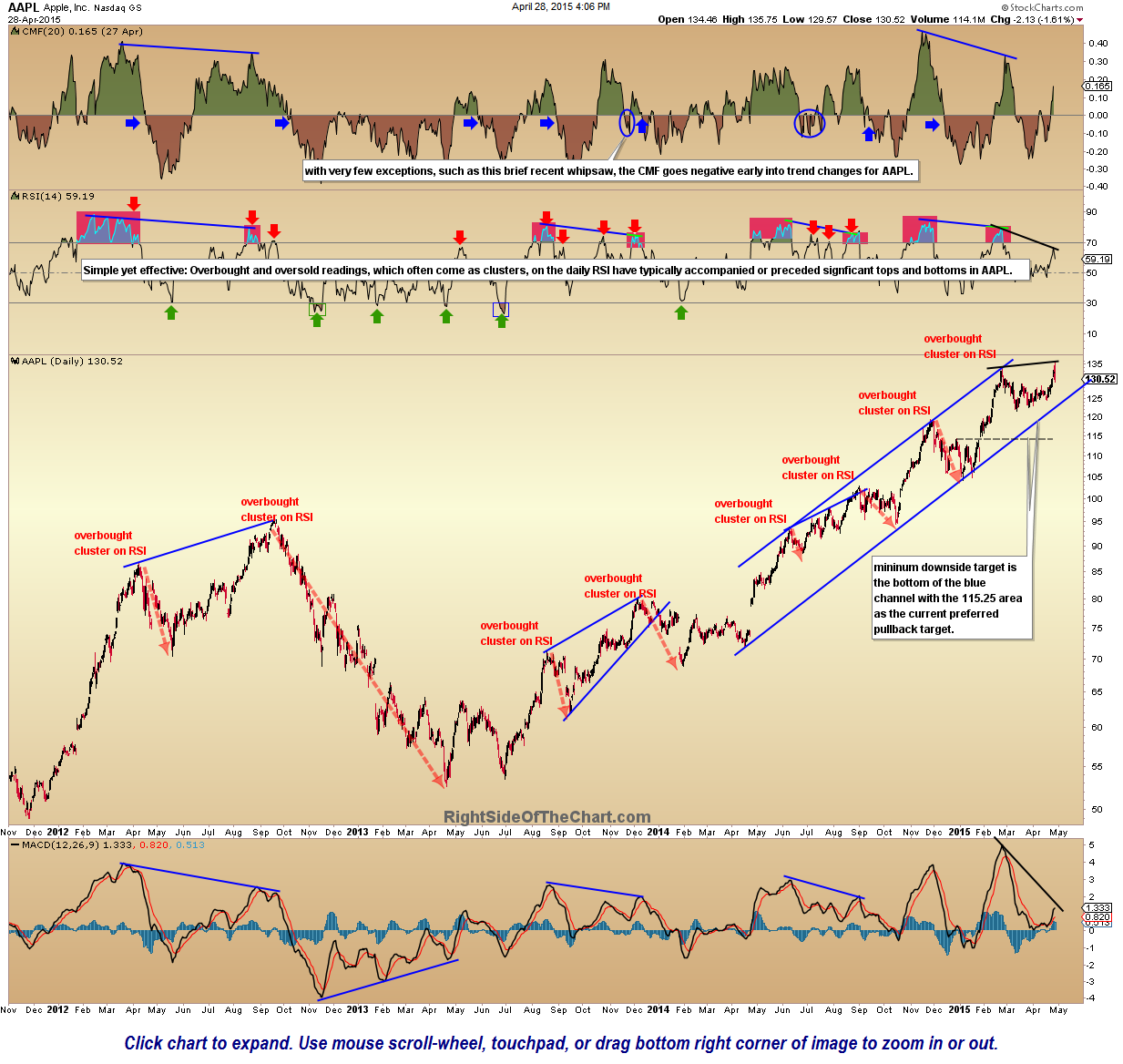
AAPL daily 2 April 28th
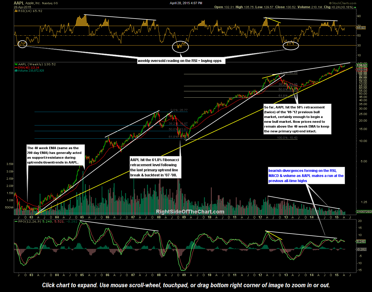
AAPL weekly April 28th
As was pointed out on the AAPL weekly chart nearly two years ago, as long as AAPL remains above the 40-week moving average (ema) and the yellow primary uptrend line, the current bull market in AAPL is intact, which is still clearly the case. With that being said, the divergences that have been highlighted have now rival those that preceded the previous bear market in AAPL following the stock’s peak at the end of 2008. Point being that it is still way to early to say that the current bull market in AAPL is over but clear bearish divergences are signaling that the odds for at least a substantial multi-month correction or bear market are elevated at this time.
Weekly charts help provide a long-term forecast of where prices are likely headed as well as identifying & confirming the current trend whereas the daily charts, although also useful for confirming intermediate-term trends, can be useful in giving us a heads-up, or early signal on trend changes on various time frames (short, intermediate & long-term). Should we get some solid follow-thru to the downside on AAPL in the coming days, my expectation would be for a move down to the 40-week EMA in the coming weeks to months (40wk-ema is the same as the 200-day EMA), which would correlated to about a ~13% drop, depending on if/when prices get there.