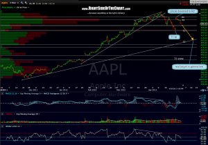
 updated AAPL 120 min chart. primary scenario continues to favor additional downside to at least T2 but we still have a couple of support levels not far below to contend with. you might also want to revisit this post i made back in january just before AAPL’s previous earnings release. that gap and crap pattern did not play out after the jan earnings release but as the chart in this link shows, that was more the exception than the rule. also keep in mind that is a log scale chart over a 3 year time frame and covers a very large move in AAPL. therefore, those post-earnings gap-n-crap drops were more substantial than they might appear at a glance. technical analysis in it’s purest essence is all about using similar historical price patterns to order to forecast future price moves. like weather forecasting, there are a nearly infinite number of variables and it is far from an exact science but more often than not, similar patterns will lead to similar results as they have in the past.

