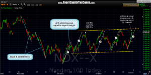
 i often find symmetry in price moves very intriguing and occasionally useful in predicting price trends or inflection points. symmetrical price patterns never repeat indefinitely but sometimes they can go for a while. here’s a 60 minute chart of the $NDX which shows some very similar price patterns on both the move down into the june 4th lows, as well as the 5 mini-uptrends (rips) that the market has experienced since those lows were put in. all of these lines are identical in length and slope. obviously, the distance of the line from top to bottom (measured vertically) gives you price move in the NDX while the horizontal distance (slope) gives you the time measurement.
it looks like we are currently in the 5th mini-uptrend since the june 4th lows and all but the first seem to form a slightly upward sloping price channel (dashed lines). coincidentally or not, the current rip, assuming it runs the length of the previous four, would terminate right around the top of that channel. recent history has also shown us that the subsequent sell-offs were also very similar in scope and duration, each wiping out nearly all (but slightly less) of the preceding move higher. will history repeat itself once again? tough to say. sooner or later that pattern will terminate and prices will either break above or below that rising channel but maybe something to keep an eye on early next week.

