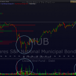
the previous chart was the 4 hour of MUB highlighting how prices followed that blow-off top, which was highlighted on the first chart below back on january 30th. the next few charts posted show the type of impulsive selling that usually follows parabolic blow-off tops. given that AAPL only looks parabolic on the 4 hr time frame that i posted, and not as much on the daily time frame, what i would expect to see on AAPL is a correction in the coming days/weeks that retraces a good part of that parabolic move that really launched around mid-december.
on MUB, i was pretty confident of the pullback target and as you can see from this string of previously posted charts, it bounced very sharply off that target after it stopped nearly cold in it’s tracks while still in free-fall mode. AAPL, however, is a little more difficult for me to call a target on but my current target is around the 500 area, which would be a 100 point drop. i know that’s heresy amongst the masses out there but only time will tell. i just call ’em like i see ’em, right or wrong. here’s the MUB string of charts with the AAPL daily.


