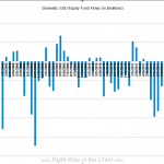
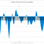
i just updated this chart through the latest weekly numbers reported yesterday (for the week ending march 14th). amazing how much liquidity the fed is pumping into the banks and investment firms to give the necessary fuel to move this market higher in the face of $148 billion dollars out unrelenting outflows out money by the general public since the middle of last year (not even a single month of inflows into US stock funds since april 2011). they better hope and pray that the public allows them to pass the torch soon as a ponzi scheme of such magnitude can only continue as long as new money continues to flow in to support it. i saved it as both a column graph an area graph which gives a better visual representation of imbalance of fund flows in and out of the market over the last several years.
Results for {phrase} ({results_count} of {results_count_total})
Displaying {results_count} results of {results_count_total}


