
The US equity markets were closed today (Monday December 26th) which leaves just four trading days left in 2016. While I’ll be away from my desk more often than not over the next few days as I typically refrain from trading during the final weeks of each year due to the decreased trading volumes & increased whipsaw signals in the markets & many individual stocks, over the next week or so I plan to publish the near & longer-term outlook for the following asset classes:
- The U.S. equity markets (to be covered in this post)
- Gold, Silver & the precious metal mining sector
- Crude Oil, Natural Gas & any other alternative energy sources that look compelling
- Global currencies
- Fixed Income (various bond classes)
- The most bullish & bearish sectors heading into the new year.
From the latter (bullish & bearish sectors), I will look for the most attractive individual stocks & ETFs for both official & unofficial trade ideas. Over the next week or so, I will also be re-assigning all of official trade ideas that have either hit their final price target or exceeded their maximum suggested stop. With the markets also closed on Monday, January 2nd in observance of New Years Day, the first day of trading for 2017 will be Tuesday January 3rd.
Despite the sharp post-election rally, aka the Trump-Pump , the potentially bearish developments on the daily & weekly charts are still very much intact & have only grown larger. The bearish developments that I am referring to are not just any one development on any single time frame or even limited to technical analysis for that matter. In fact, a very solid case for a major correction and quite possibly a lasting trend reversal (i.e.- bear market) beginning sometime in the first half of 2017 & likely Q1 can be made from at just about every metric that I can think of: Technical Analysis (charting), Fundamental Analysis (valuation), Investor Sentiment (a contrarian indicator) and Duration (length of the current bull market in relation to historic extremes).
Technical Analysis
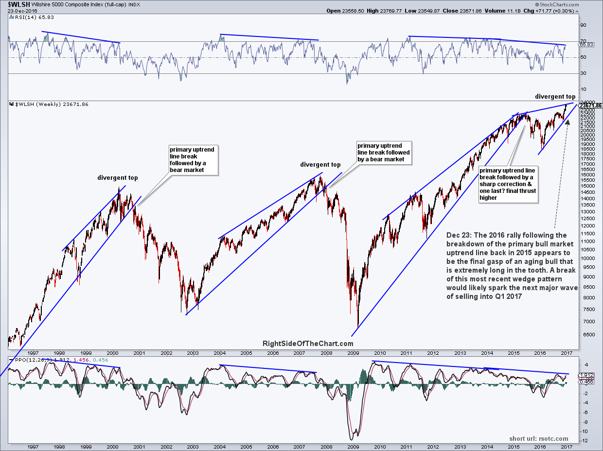
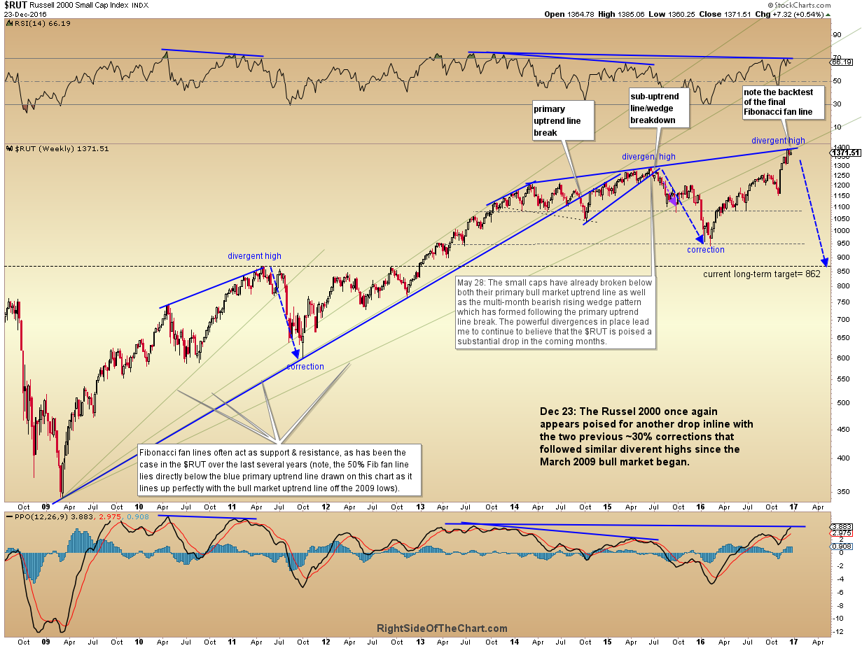
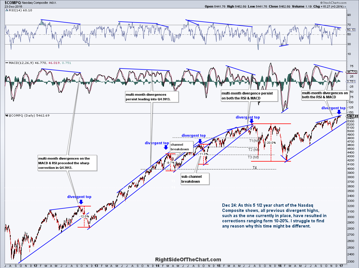
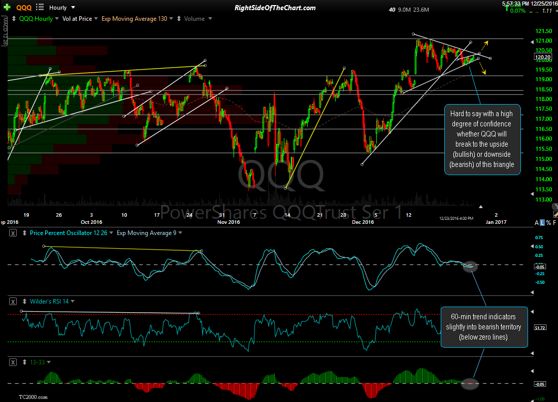
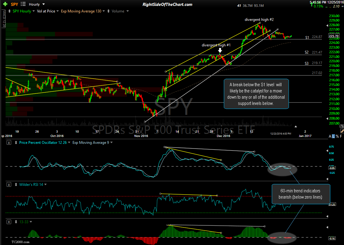
Starting with the technicals, the same negative divergences & deterioration in market internals & other potentially bearish developments that I’ve been highlight for months now have only continued to build to levels, which in many cases, haven’t been seen since the previous bull market peak in late 2009. Such divergences, including other past divergences & subsequent corrections/bear markets can be seen clearly on the weekly charts of the major equity indices below:
-

- $WLSH weekly Dec 23rd
-
- $COMP weekly Dec 23rd

-

- $RUT weekly Dec 23rd
-

- $COMPQ daily Dec 23rd
-

- QQQ 60-minute Dec 23rd
-

- SPY 60-minute Dec 23rd
-

- IWM 60-minute Dec 23rd

Fundamental Analysis
Moving away from technical analysis, while I could spend hours trying to cover all of the facets of fundamental analysis of the US stock market, let’s just stick with one of the most widely accepted valuation metrics for the US stock market, the Shiller PE Ratio. For those not familiar with the Shiller PE ratio and why it is considered a much more useful measure of how over or undervalued the stock market is when compared with the regular or tradition PE ratio, a relative brief but thorough explanation can be found here.
The Schiller PE Ratio for the S&P 500 currently stands at 28.2, which is 68.9% higher than the historical mean of 16.7. If fact, as the chart below illustrates, the Shiller PE Ratio has recent climbed to extreme levels only seen at three other periods in the history of the modern financial markets: Immediately before the crash of 1929 & the ensuing Great Depression; during the Dot-Com bubble of the late 90’s leading up to the market crash that kick-off in early 2000; during the housing/credit bubble leading up to the bull market top in late 2007 & the crash of 2008/Great Recession; & today. I’ve shaded that extreme level as the “Red Zone”.
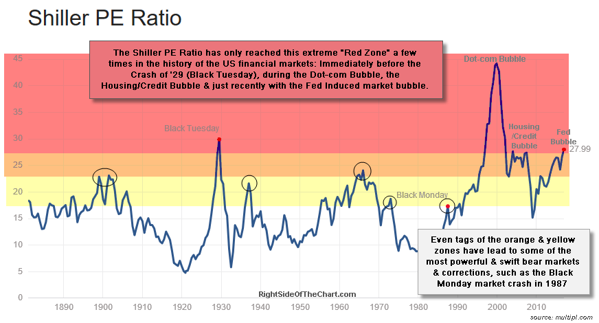
Shiller PE Ratio Dec 26th
Sentiment
Next up is sentiment. In trading & investing, sentiment is used as a contrary indicator with the logic being that if the majority of market participants are bullish, most willing buyers already have their fill of stocks, having committed all or most of their capital to the markets. Likewise, when the masses are bearish, they have already sold their stocks & moved that money into cash, bonds, real estate or some other alternative asset class and as such, have now become potential future buyers of stocks. In my experience, I’ve found market sentiment to be completely useless unless it is at rarely seen extreme levels in which case I find it to be very useful, particularly when used in conjunction with other confirming bullish or bearish indicators or technicals.
One of my favorite sentiment measures is the AAII Bull vs. Bear Spread, which is the difference of investors that are currently bullish vs. those that are currently bearish. I find the Bull/Bear spread more useful that simply using extremely high bullish or extremely low bearish readings as you could have, for example, an extreme bullish reading one week but that reading might also be accompanied by an unusually large number of “neutral” investors which therefore, could only result on a relatively low (non-extreme) number of bearish investors. By utilizing the Bull/Bear Spread, the extreme readings paint a much more accurate picture of the rare occasions when sentiment is truly skewed to a bullish or bearish extreme.
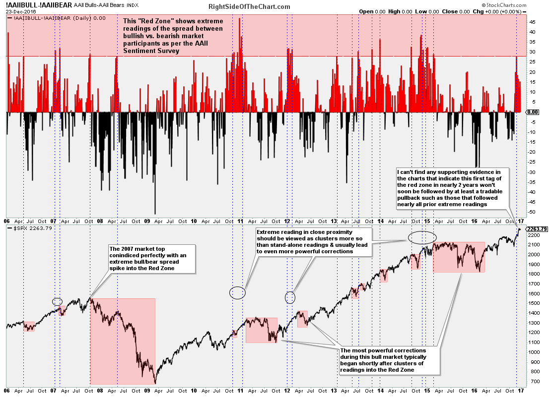
AAII Bull-Bear Spread Dec 23rd
Where the AAII Bull/Bear Spread is essentially a measure of what market participants and even non-participants are saying, as it is simply a weekly survey conducted as to whether one is bullish, neutral or bearish, hence, some of those surveyed can & often will be out of the market (in cash) as any given point in time, the $CPC (total Put-to-Call Ratio) is a another form of a sentiment survey except with the $CPC, it is a measure of where market participants are putting their money as it measures the total volume of put (bearish bets) to calls (bullish bets).
While there is certainly a hedging component to be accounted for (i.e.- some put buyers are hedging a long position & vice versa), just as with the AAII Bull/Bear Spread, extreme bullish or bearish readings in the $CPC, especially when combined/confirmed with other TA tools, can be a useful tool in helping to identify major turning points (corrections & rallies) in the stock market. The $CPC chart below shows all readings and clusters of readings (boxed areas of readings in close proximity) down to or below the 0.62 level. Such rarely seen plunges in the $CPC are the result of a surge in call buying vs. put buying & as this chart illustrates, without a single exception going back to the shortly before the bull market top in 2007, such extreme readings (or clusters) were followed by all of the largest corrections throughout this current bull market as well as the bulk of the great bear market of 2007-2009.
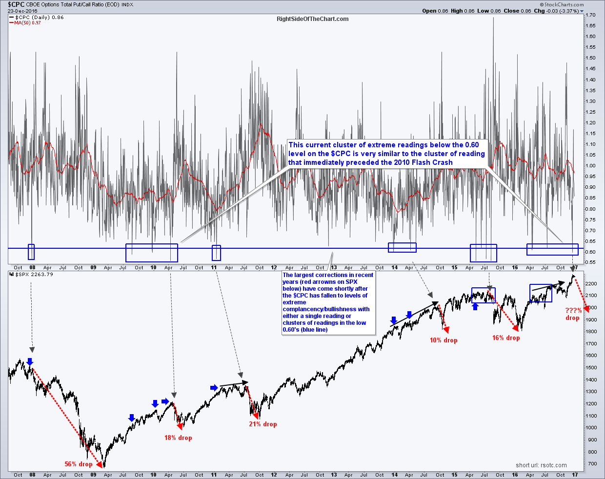
$CPC daily Dec 23rd
Bull Market Durations
2850 days. That’s how long it has been since the current bull market kicked off back on March 6, 2009 (or make it 2956 days if using the Nasdaq 100 which bottomed back on Nov 21, 2008). That gives the 2009-??? bull market the distinction of being, by a wide margin, the second longest bull market in history, behind the 3,453 day bull market that ended in 2000.
Although statistics will vary when conducting a web search on “average bull market duration”, the consensus seems to be an average historical lifespan of about 4 years with about a 145% average gain. That compares to the current bull at 7 years, 9 months & 21 days (through today, assuming that the market was open & went on to take out the Dec 13th high) & a gain of roughly 240% (S&P 500). Although records are meant to be broken, I think that it is fair to say that the current bull market is getting extremely long in the tooth.
Bottom-line: Nearly all trends (short, intermediate & long-term) in the US stock market remain bullish as this time although the odds for a substantial & quite possibly very swift correction continue to build. Longer-term investors such as those with funds in 401k or other retirement accounts might consider tightening stops on existing positions or gradually reducing exposure to equities although as always, there will be plenty of opportunities to make money on both the long & short side in 2017.
In the coming days I will be publishing the near & longer-term outlook for the other classes (bonds, commodities, precious metals, etc..) as well as any individual sectors that stand out as potential trading opportunities as we head into the new year. Swing traders might consider keeping things light for the remainder of the year as the low trading volumes & year-end positioning among individual & institutions is likely to cause an increase in whipsaw buy & sell signals as well as running any nearby stops. Finally, I’d like to wish everyone a very happy holiday season & may 2017 be your most profitable trading & investing year yet!!
-Randy Phinney