
In last month’s post titled It’s About Time, the similarities in duration between the three bull markets over the last couple of decades were highlighted. In this updated chart of the $OEX (S&P 100 Index) below, I’ve added the exact duration of each bull market from bottom to top (using assumption that the current bull market did not end with last Tuesday’s peak). The first bull market, which happened to follow a deer market instead of a bear market, lasted 5 years, 3 months and 16 days. The next bull market, which followed a vicious bear market, lasted exactly 5 years, 2 months and 18 days. The current bull market, which also came on the heels of a vicious bear market, has lasted 5 years, 2 months and 15 days through today, a mere 3 days shy of the previous bull market. Will this bull market roar on well past the duration of the previous two? Only time will tell. However, timing cycles aside, the current bearish divergences, waning momentum and proximity of the major US indices to their primary uptrend lines certainly increase the risk that the blue chips ($SPX, $OEX, $DJIA) may not have dodged the bullet that took down the Nasdaq & Russell 2000 from their early March peaks.
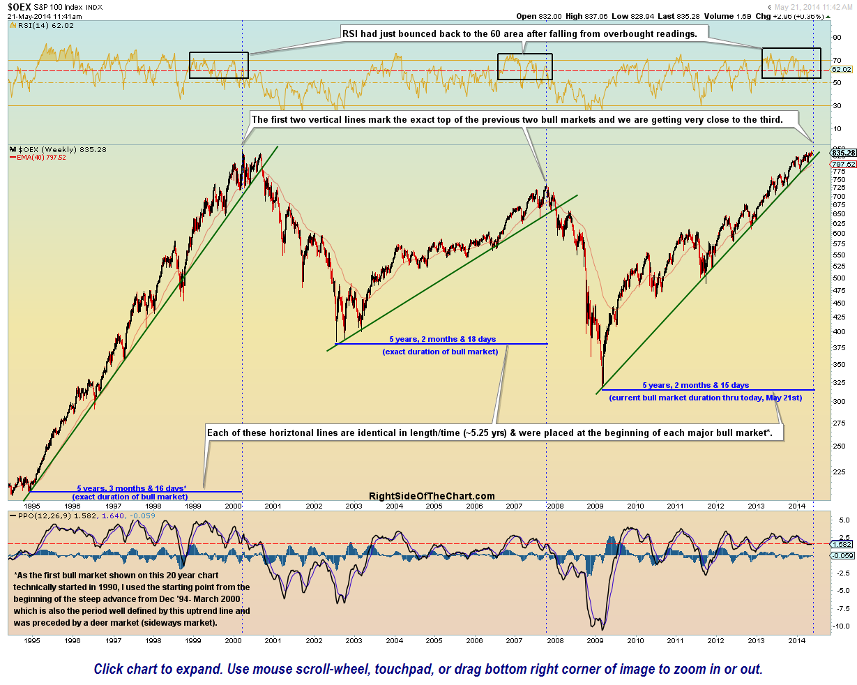
$OEX Bull Market Durations May 21st
Five weeks ago, in the April 14th post titled QQQ Bounce Scenario, I stated: “My 4th & final intermediate-term (downside) target was hit on Friday. That, coupled with the bullish divergences in place on the 60 minute time frame, means that the 1% gap up today was likely the beginning of a larger counter-trend rally….Keep in mind that it took us a while to get down here and so it might take several days, possibly weeks, to retrace a third or half of the move down from the March 7th peak in the $NDX/QQQ …. As such, the market updates might be light for a while unless anything significant develops.“
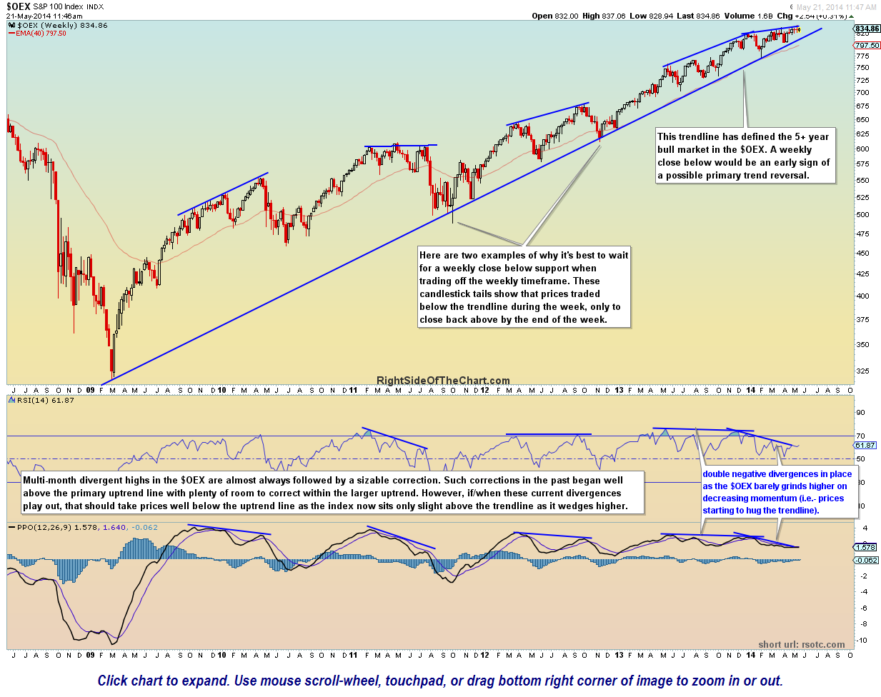
$OEX weekly May 21st
Since then, other than the fact that the aforementioned bearish divergences on the blue chip indices have continued to build, there have not been any signficant technical developments in the US equity markets that I’ve noticed. As mentioned yesterday, I plan to finish updating the trade ideas this week by removing any completed or stopped out trades as well as those which no longer offer an attractive R/R or clear technical picture, after which, I will turn my focus towards adding some new trading candidates. The chart above is the updated weekly chart of the $OEX with the primary trendline that I am patiently watching for a potential longer-term sell signal on the US markets.
One potentially bullish development that I am monitoring today is a possible golden cross on the 20 & 50 day ema pair for the Nasdaq 100. This moving average pair, although prone to the occasional whipsaws as with any other buy/sell signal, has done a fairly good job of defining bullish & bearish intermediate-term trends over the years. This trending indicator has been on a sell signal since the April 9th death cross (20 ema crossing below the 50 ema) but if the $NDX manages to close at or above current levels (as I type), we will get a golden cross (i.e.-buy signal) on the pair. Of course this is just one of many factors that go into my analysis and whenever the pair attempts a cross from above or below, I typically like to wait a few days to see if it sticks. From a quick glance at the chart below, one will notice several brief whipsaws where the pair briefly gave a false signal once a clear trend had already been established. This moving average pair also works well on the S&P 500 but as recently mentioned, that index has remained on a buy signal, barring two very brief whipsaw signals, going all the way back to December 2012.
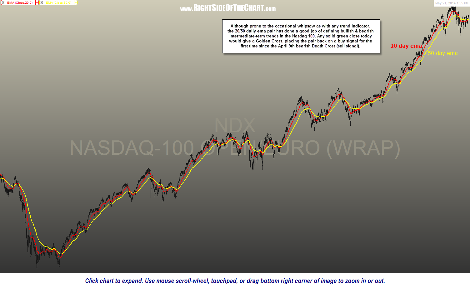
$NDX daily 20-50 ema May 21st