In reviewing the charts of the major US stock indices, other than the fact that the markets continue appear to have stalled out in choppy, sideways range over the last 3+ months, one of the most important developments in recent months is the very clear trend of deterioration in market breadth, particularly in the leading index, the Nasdaq 100. This chart highlights the bearish price action in the Nasdaq Composite index that has followed such divergences over the last 13 years plotting the $NAAD (Nasdaq Advancing vs. Declining Issues) above over the Nasdaq Composite below. The divergences currently in place, which are made up of a series of two consecutive divergent highs with a decent correction following the first divergent high, are only rivaled by those nearly identical double-divergences that preceded the 2007 bull market top.

$COMPQ vs $NAAD Oct 25th
Another metric used to assess market breadth is the number of stocks making new 52-weeks highs vs. new lows. While there are a fair number of brief whipsaw signals, bullish & bearish crossovers of 20-day ema on the Nasdaq New-Highs to New-Lows ratio have been quite useful in early identification of trend changes in the Nasdaq Composite Index as shown below.
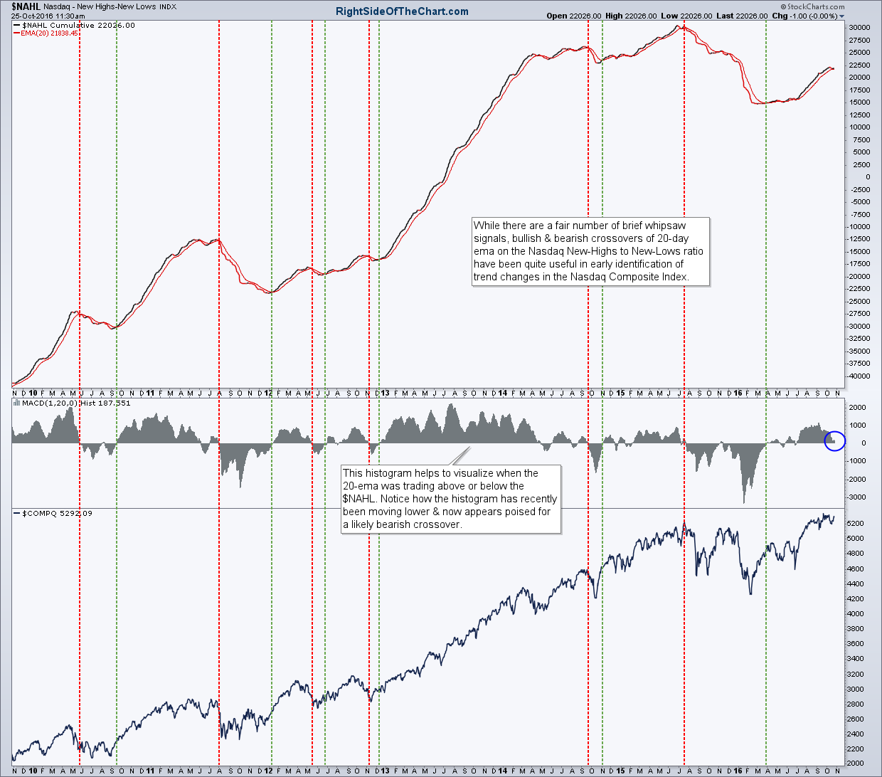
$NAHL trend indicator Oct 25th
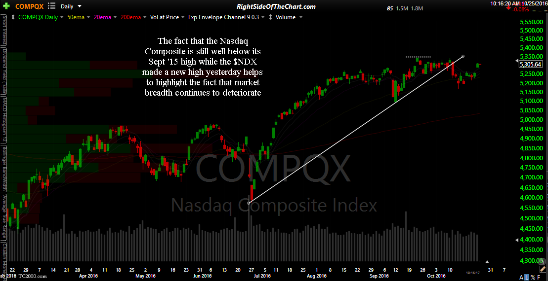
Market breadth aside, the fact that only a handful of the largest weighted components of the Nasdaq 100 have been doing the bulk of the heavy lifting lately can also be viewed by the fact that the top-heavy Nasdaq 100 is the only major index to recently hit a new high due to a handful of the top-weighted components (APPL, GOOG/GOOGL, MSFT, AMZN & FB) doing most of the heavy lifting recently. In fact, those five companies along account of over a 36% weighting in the Nasdaq 100. Here’s a quick look at the Nasdaq 100 compared to the other major US stock indices, including the Nasdaq Composite.
-

- $NDX daily Oct 25th

-

- $COMPQ daily Oct 25th
-

- $SPX daily Oct 25th

-
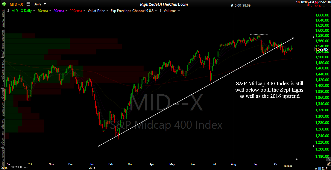
- $MID daily Oct 25th