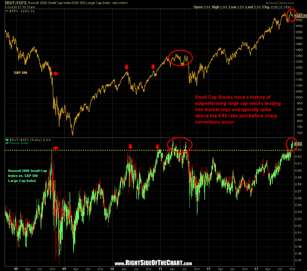
As a follow-up to last week’s Time To Dump The Trash? commentary, which discussed how the lower quality small crap cap stocks have a history of sharply outperforming the higher quality, large cap stocks (such as those found in the S&P 500 and Dow Jones Industrial Averages) during the final stages of an uptrend, I wanted to share the following chart. This chart essential tells the same story as the $SPX/$NDX/$RUT chart included in that previous discussion but shows a more quantifiable level whereby the outperformance of the Russell 2000 against S&P 500 has historically triggered sharp declines in the stock market. In addition to being a caution sign about holding or chasing the high flying small cap stocks at this time, another takeaway from this chart is that not only do the higher risk small cap stocks typically lead the way into market tops but the also tend to lead the way down once the market has peaked and the selling kicks in.
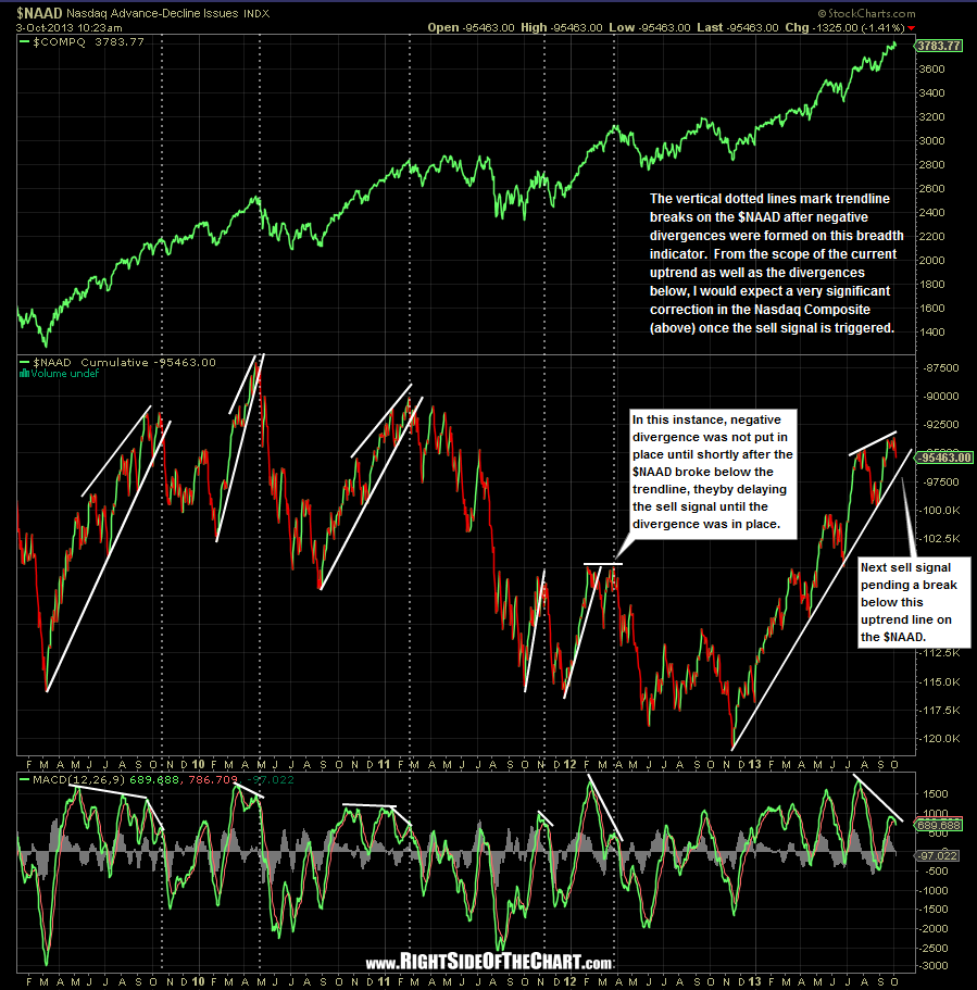
The Russell 2000 isn’t the only major index top-heavy with low-quality, high-risk stocks. The Nasdaq Composite has it’s fair share of smaller “junk stocks” as well. As such, it is not uncommon to also see the Nasdaq Composite outperform the $DJIA & $SPX in the final stages of a rally. The chart below is one of my favorite indicators in helping to identify possibly trend changes before most typical trend indicators confirm. Currently I’m focused on that very steep & long standing uptrend line on $NAAD (Nasdaq Advancing vs. Declining Issues) which has been in place for nearly a year now, by far the most extended run that this indicator has experienced in many years. The recent highs on the $NAAD were put in place with negative divergence on the MACD shown at the bottom of the chart. When using uptrend line breaks as a confirming sell signal on the $NAAD, my preference is to see those breakdowns preceded by negative divergence on the MACD indicator, as shown on the chart below.